
If you thought Microsoft Word was only for resumes, school reports, and the occasional passive-aggressive office memo, think again. Word can also help you create clean, professional business cards without forcing you to learn complicated design software or pretend you suddenly became a graphic designer overnight. For many small business owners, freelancers, job seekers, consultants, and side hustlers, that is good news.
The beauty of making business cards in Microsoft Word is simple: it is familiar, flexible, and surprisingly capable when you use the right method. You can start with a ready-made template, build a custom layout using label settings, insert your logo, adjust fonts, add a QR code, and print from home or save the file as a PDF for a print shop. No cape required. Just patience, decent images, and a willingness to do one test print before feeding premium cardstock into your printer like it is a slot machine.
In this guide, you will learn exactly how to make business cards in Microsoft Word, which method works best, what details to include, how to avoid ugly formatting disasters, and how to get a result that looks polished instead of “made this at 1:12 a.m. because the networking event is tomorrow.”
Why Microsoft Word Is a Practical Tool for Business Cards
Microsoft Word is not the fanciest design program on earth, but it has three major advantages for business cards. First, it is easy to use. Most people already know how to type text, insert pictures, and change fonts in Word. Second, it offers templates that remove much of the guesswork. Third, Word works well with label and card stock products that are already sized for standard business cards.
If your goal is to make a straightforward, attractive card with your name, title, business, phone number, email, website, and maybe a logo or QR code, Word is usually more than enough. It is especially useful when speed matters and you do not want to wrestle with a full-blown design suite just to place your email address on a rectangle.
What to Prepare Before You Start
Before opening Word, gather the ingredients for your card. A business card is tiny, which means every choice matters. You do not have room for clutter, vague messaging, or fifteen social handles plus a motivational quote. Keep it tight.
Essential information to include
- Your full name
- Your business or company name
- Your job title or role
- Your best phone number or email address
- Your website or portfolio link
- Your logo, if you have one
- An optional QR code, if it leads somewhere genuinely useful
Also prepare high-resolution artwork. If your logo looks blurry on screen, it will not magically become elegant on paper. Business cards are small, but print is brutally honest.
Method 1: Use a Business Card Template in Microsoft Word
The easiest way to make business cards in Microsoft Word is to use a built-in or downloadable template. This is the fastest option for most users because the layout is already done for you.
How to do it on the desktop version of Word
- Open Microsoft Word.
- Click File, then New.
- Search for business cards in the template search bar.
- Choose a template that matches your style and printing plan.
- Replace the sample text with your own details.
- Insert your logo or brand image.
- Adjust colors, font sizes, spacing, and alignment.
- Save the file, then print on compatible card stock or export as a PDF.
This method is ideal when you want a quick, clean result. Templates usually already follow a grid that fits standard card stock sheets, so you do not have to manually calculate dimensions unless you enjoy suffering recreationally.
How to do it in Word for the web
If you are using Word for the web, templates are still your friend. The online version is convenient for basic edits, but it is less flexible than the desktop version for advanced layout work. That means if you want quick edits and simple cards, the web version is fine. If you want more precise control, the desktop version is the better choice.
Method 2: Create Custom Business Cards with Labels in Word
If you want more control, or if you are printing on a specific brand of business card paper, the label method is often the smartest option. This approach lets Word create a page layout based on the exact product number of your card stock.
How to set up custom business cards using labels
- Open Word and go to the Mailings tab.
- Click Labels.
- Select Options.
- Choose the label vendor and product number that matches your business card paper.
- If you do not see your product number, create a custom label.
- Click New Document to generate a full page layout.
- Design one card, then copy and paste the design into the remaining cards if needed.
This method is especially helpful when using Avery-style printable business card sheets. Since Word can match the dimensions of the product, you reduce the risk of printing slightly off-center and creating ten cards that all look like they were trimmed during an earthquake.
When to use mail merge
Mail merge is useful when you want multiple cards with similar layouts but different information. For example, a business owner making cards for an entire team can store names, titles, phone numbers, and email addresses in Excel and merge the data into a label layout in Word. That can save a lot of repetitive editing and also reduce the chance of accidentally giving Steve in accounting the phone number for Linda in sales.
How to Design a Business Card That Looks Professional
Knowing how to make business cards in Microsoft Word is one thing. Making them look good is another. Because the card is so small, design discipline matters more than decoration.
Keep the content focused
Your card should communicate who you are, what you do, and how to contact you. That is the job. It is not a miniature billboard, a life story, or a desperate plea for attention. Choose the most useful contact details and leave the rest off.
Use readable fonts
Fancy script fonts may look charming for a wedding invitation, but on a business card they can quickly become a visual riddle. Use fonts that are clean and readable. For body text, keep the size comfortable. Tiny type might look sleek on your monitor, but in print it can become microscopic regret. Good hierarchy helps too: your name should stand out first, then your company or role, then your contact details.
Leave some white space
White space is not wasted space. It helps the important information breathe. A crowded card feels cheap and confusing. A balanced card feels intentional. Think of white space as the business card equivalent of good manners.
Match your branding
If you already have brand colors, a logo, or a type style used on your website, carry that same visual identity onto the card. Consistency helps people remember you. If your website looks modern and clean but your card looks like a 2007 nightclub flyer, your branding is sending mixed signals.
Use images carefully
A logo is often enough. A headshot can work in industries where personal connection matters, such as real estate, consulting, or coaching. A QR code can also be useful, especially if it leads to a portfolio, booking page, or digital contact card. But every extra element should earn its place. If it is not helping the card communicate faster, it is probably just taking up rent-free space.
Best Size, Layout, and Print Settings
The standard U.S. business card size is 3.5 by 2 inches. If you are printing at home with pre-cut or perforated sheets, follow the exact product template. If you are sending the design to a print shop, you may need a slightly larger file size that includes bleed, which allows trimming without leaving an accidental white edge.
For image quality, use high-resolution files. Low-quality graphics are one of the fastest ways to make a business card look unprofessional. If you plan to send your design to a commercial printer, saving as PDF is usually the safest move. It helps preserve layout, fonts, and image placement more reliably than handing over a loosely behaved Word file and hoping for the best.
When printing at home, choose paper settings carefully. Business cards are usually printed on cardstock, but printers vary. Some home printers handle thicker stock well, while others behave like offended royalty the moment you load anything heavier than plain paper. Check your printer’s supported paper weight and tray recommendations first.
Smart printing tips
- Do a test print on regular paper before using business card stock.
- Make sure your page scaling is set correctly.
- Confirm the printer is using the correct paper type.
- Print one-sided unless you know your stock and printer support double-sided printing cleanly.
- Let ink fully dry before separating perforated cards.
Common Problems and How to Fix Them
The text does not line up with the cards
This usually happens when the wrong product template is selected or the printer scales the page automatically. Turn off “Fit to Page” style scaling and confirm the exact stock number.
Your logo looks blurry
Replace it with a higher-resolution file. A tiny web logo pulled from an old email signature is rarely good enough for print.
The layout shifts when you edit one card
If you are using tables or labels, watch paragraph spacing, cell margins, and image wrapping settings. Even a small formatting change can nudge everything around.
The card looks cluttered
Cut content before cutting font size. A crowded card with six icons, three colors, two websites, and a quote about hustle culture is not “dynamic.” It is stressful.
The colors look different in print
That is common. Screens display color in light, while printers use ink or toner. Print a sample first, especially if your branding depends on specific shades.
Common Real-World Experiences When Making Business Cards in Microsoft Word
One of the most common real-world experiences people have when making business cards in Microsoft Word is discovering that the design looked perfect on screen and slightly chaotic in print. On the monitor, everything feels aligned, balanced, and stylish. Then the first print comes out and suddenly the logo is a little too high, the text feels smaller than expected, and the website that looked “minimal” now looks like it is hiding from the reader. This is normal. Business cards are small enough that even tiny spacing issues become obvious fast.
Another frequent experience is underestimating how much information fits on a card. Many people begin with optimism. They add a name, title, company, phone number, email, website, social handle, office address, slogan, and maybe a QR code. Five minutes later, the card looks like a crowded elevator. Word did not fail; the card simply reached its limit. Most successful designs come from editing down, not piling on. The strongest cards usually feel calm, direct, and easy to scan in two seconds.
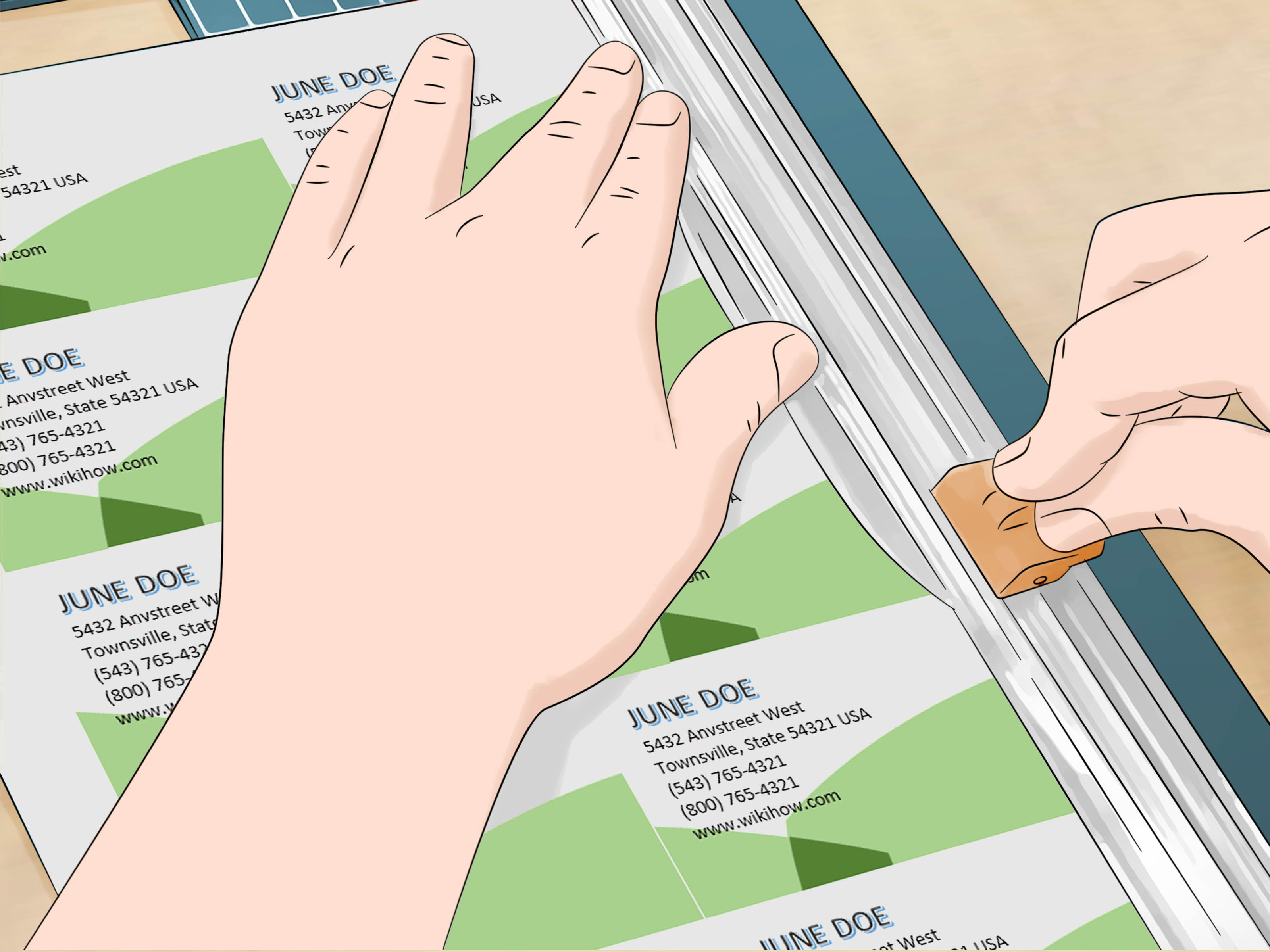
People also learn quickly that printable card stock has opinions. Some sheets feed beautifully through a home printer. Others drift slightly, smudge, or print just off-center enough to be annoying. That is why experienced users almost always do a test print on plain paper first. Holding the test sheet behind the card stock up to the light is a humble little trick, but it can save an entire pack of expensive paper and a lot of dramatic sighing.
There is also the classic font-size surprise. On a laptop, 8-point text may seem perfectly readable. In hand, on an actual business card, it can feel much smaller, especially for secondary contact details. A design that feels elegant on screen can become a squinting contest in real life. That is why practical users often print one sample, cut it out, and physically hold it at normal reading distance before finalizing the full run.
Another experience many users share is realizing that Microsoft Word is much better for business cards when the goal is clarity rather than extravagance. Word works best when the design is clean: a logo, a few strong text elements, balanced spacing, and maybe one accent color. It becomes less comfortable when users try to force it into doing elaborate graphic design tricks. In other words, Word is excellent at making professional cards, but it is not trying to audition as a luxury design studio.
Finally, many people end up loving the convenience. Once the template is set, updating a phone number, changing a title, swapping a logo, or creating cards for another team member becomes easy. That is where Word really shines. It is practical. It is familiar. And for many people, that is the difference between “I should make new business cards someday” and “I already printed them this afternoon.”
Conclusion
If you want a straightforward way to create professional-looking cards, Microsoft Word is a solid option. The template method is fastest for beginners, while the label method gives you more control for specific card stock and custom layouts. Either way, the winning formula is the same: use the right size, keep the content focused, make the text easy to read, test print before committing, and avoid turning your business card into a tiny overcrowded poster.
A good business card does not need to be flashy. It needs to be clear, polished, and memorable. When done right, a Word-made card can absolutely hold its own at meetings, events, interviews, and everyday networking. So yes, you can make business cards in Microsoft Word. And with a little care, they can look surprisingly sharp too.