If you’ve ever walked into a freshly painted room and thought, “Wow, this smells like a chemistry final,” you already understand the basic idea behind sensory-friendly paint and wallpaper. A sensory-friendly space is one that looks calm, feels comfortable, and doesn’t punch you in the face with odor, glare, or scratchy textures. It’s design that respects real humansespecially people with sensory sensitivities, migraines, asthma/allergies, autism, ADHD, PTSD, or anyone who simply wants their home to feel like a hug instead of a hardware aisle.
The good news: you don’t have to live in an all-white, echoey box to make a space feel soothing. With smart choices in low-VOC or zero-VOC paint, low-emissions wallpaper, and a few design tricks, you can get a home that’s both stylish and easier on the senses.
What “Sensory-Friendly” Actually Means (Hint: It’s Not One-Size-Fits-All)
Sensory processing challenges can make everyday inputlight, smell, sound, touchfeel turned up to max volume. Some people are oversensitive (easily overwhelmed), others are undersensitive (they seek more input), and many experience a mix depending on the day and situation.
That’s why sensory-friendly design isn’t a strict aesthetic. It’s a framework:
- Smell-friendly: reduce strong odors and chemical emissions (especially during install and curing).
- Visual-friendly: minimize harsh contrast, busy patterns, flicker-y lighting, and glare.
- Tactile-friendly: choose comfortable textures; avoid “surprise scratch” surfaces in high-contact areas.
- Predictable: create visual order so the brain doesn’t have to fight the room to relax.
Paint and wallpaper matter because they’re large-surface materials. When walls are the biggest “thing” you see and smell, they can either support calmor accidentally create sensory chaos.
Sensory-Friendly Paint 101: VOCs, Odor, and the Label Maze
Start with the indoor air reality check
Many building and household products release volatile organic compounds (VOCs) into the air. VOC concentrations can be higher indoors than outdoors, and paint is a common sourceespecially right after application. “Low odor” marketing is helpful, but it’s not the whole story: a product can smell mild and still emit chemicals, or smell strong because of additives like fragrance.
Know the difference: VOC content vs. VOC emissions
Paint cans often list VOC content (for example, grams per liter). But what your nose and lungs experience is VOC emissionswhat actually off-gasses into the room while drying and curing. If you’re designing for asthma/allergy or higher sensitivity, third-party certifications that test emissions can be extra useful.
What to look for when shopping
- Water-based / latex paints are generally lower VOC than oil-based options.
- Low-VOC or zero-VOC paint (check the fine printespecially if you’re tinting).
- Third-party certifications that focus on health and emissions, not just buzzwords.
- Fragrance-free when possible (added scent can be a sensory trigger even if VOCs are low).
Certifications that can help you sort the good from the “marketing poetry”
Here are commonly used signals designers rely on for low-emissions interiors:
- UL GREENGUARD Gold: indicates stricter VOC emission limits designed for sensitive populations and settings like schools and healthcare.
- Green Seal GS-11: a standard for paints/coatings that sets VOC limits and can address VOC contributions from colorants (important if you’re going darker than “cloud whisper”).
- Asthma & Allergy Friendly® (AAFA program): focuses on products intended to be better for people with asthma and allergies, with testing designed to look beyond simple VOC content and consider real-world emissions over time.
One practical takeaway: if you’re tinting paint, don’t assume “zero-VOC base” stays zero. Darker colors often require more colorant, and that can raise VOCs. If sensitivity is a priority, ask the paint desk about low-VOC colorants or choose brands/lines designed to keep emissions low even after tinting.
Sensory-Friendly Wallpaper: Calm Visuals, Safer Materials, Smarter Adhesives
Wallpaper can be sensory-friendly magic: it adds softness, depth, and personality without needing dozens of décor items (a.k.a. clutter). But not all wallpaper is created equal, especially when you consider material chemistry, inks, and adhesives.
Material choices that tend to be easier on sensitive homes
- Paper-based wallpaper: often breathable and less “plastic-y” in feel (check ink and coating type).
- Non-woven wallpaper (cellulose + textile fibers): popular for easier installation/removal; look for low-emissions credentials.
- Textile wallcoverings: can be cozy and acoustically helpful, but watch for dust-trapping textures in allergy-prone rooms.
What many sensitive households try to avoid
A common caution in healthier-materials circles is PVC/vinyl wallcovering. Concerns include the broader chemical profile of PVC and potential additives used in manufacturing. If you love the wipeable durability of vinyl, look for “cleaner vinyl” or lower-emissions options with transparent disclosures and reputable emissions certifications.
The hidden factor: adhesives and primers
Wallpaper paste and wall primers can be the real smell villains. A sensory-friendly approach is to:
- Choose low-VOC adhesives that align with recognized VOC limits (LEED projects often reference SCAQMD Rule 1168 for adhesives).
- Use only what you need and seal containers tightlydon’t let open paste “perfume” your home for days.
- Pick the least intense option that still performs for your wall type (bathrooms need different rules than bedrooms).
Peel-and-stick wallpaper: convenient, but ask better questions
Peel-and-stick is the rental hero we deserve. But the adhesive layer can be a sensitivity wildcard. If you’re designing for a high-sensitivity household, consider:
- Does the brand provide low-emissions certification (not just “eco-friendly” language)?
- Are inks GREENGUARD Gold or similarly low-emitting?
- Can you order a sample and live with it for a few days before committing?
Design Moves That Reduce Sensory Overload (Without Making Your Home Boring)
Color: choose “calm energy,” not “hospital beige”
For many people, softer, less saturated colors feel easier to processespecially in bedrooms, study areas, and decompression zones. That doesn’t mean everything must be pale. It means you use bold color like hot sauce: intentionally, and not on every wall.
Examples that often work well:
- Rest spaces: muted greens, warm grays, dusty blues, gentle clay tones.
- Focus spaces: mid-tone neutrals with one controlled accent (like a single wall or built-in).
- Play spaces: color is finejust avoid chaotic contrast and too many competing patterns.
Pattern: reduce “visual noise” with scale and spacing
High-contrast, tightly repeating patterns can feel like visual static to some people. If you want wallpaper but worry about overwhelm, try:
- Large-scale, slow patterns (big shapes, plenty of breathing room).
- Irregular murals or landscapes instead of small repeats.
- Soft gradients or tone-on-tone designs that add interest without shouting.
One great example seen in mainstream design coverage: wallpapers created specifically to be hypersensitivity-friendly often use muted tones and non-repetitive, irregular imagery to feel calmer than traditional patterns.
Finish and glare: pick the wall sheen that doesn’t fight your lighting
Glossy finishes bounce light and can create glareespecially under bright overhead fixtures. For sensory-friendly design:
- Matte can feel the most visually calm (great for low-glare bedrooms and reading areas).
- Eggshell is a practical compromise for living spaces (wipeable but not shiny).
- Satin/semi-gloss belongs in high-moisture or high-mess zones, used selectively.
Texture: tactile comfort + maintenance reality
Texture can be regulating (cozy linen wallpaper, a soft grasscloth look) or irritating (scratchy, dusty, pokey). For allergy-prone rooms, avoid heavy textures that collect dust. For tactile-sensitive people, keep high-touch walls smootherespecially near beds, desks, and hallways.
Installation Game Plan: Make It Sensory-Friendly Before, During, and After
Step 1: Plan for ventilation like it’s part of the design
The most powerful tool for reducing paint and adhesive exposure is still: fresh air exchange. Ventilate during application and while the product dries/cures. Use window fans to push air out, open doors/windows when weather allows, and keep HVAC filters clean. Don’t store open containers of paint or similar materials inside your living space.
Step 2: Build in a “sensitivity buffer”
- Paint/wallpaper when sensitive household members can be out for the day (or at least out of the room).
- Prioritize sleeping areas firstbecause eight hours in a fresh-paint room is a bold choice that no one asked for.
- Let finishes cure fully before adding rugs, bedding, or soft furnishings that can hold odors.
Step 3: Test patches and live with samples
For paint: try a sample board (not just a tiny wall swatch) and observe it across the daymorning glare is a different beast than evening lamplight. For wallpaper: order samples and leave them in the room for 48–72 hours. If anyone gets headaches, nausea, itchy eyes, or “my brain hates this pattern,” you’ve saved yourself a very expensive “oops.”
Step 4: Don’t mix a chemical cocktail
A common indoor air quality tip is to avoid using multiple high-emission products at once. If you’re renovating, stagger paint, flooring adhesives, cabinetry finishes, and major cleaning products rather than unleashing them all in one weekend like it’s a scented candle apocalypse.
Room-by-Room Examples: Sensory-Friendly Paint and Wallpaper in Real Spaces
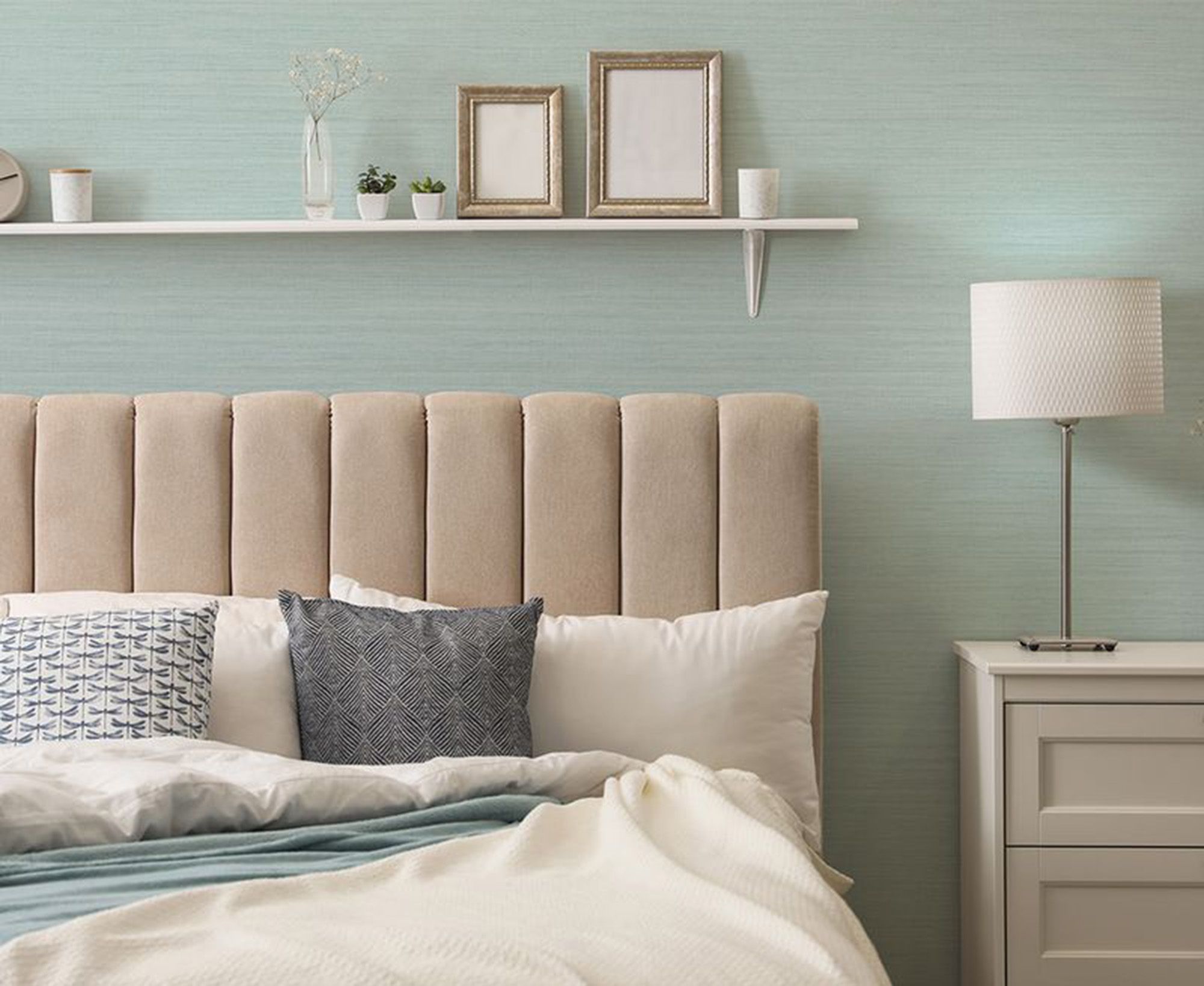
Bedroom: the “no surprises” zone
- Paint: matte or eggshell low-VOC/low-emissions paint in a soft mid-tone.
- Wallpaper: one accent wall with a calm mural or tone-on-tone texture; avoid tight repeats near the bed.
- Pro move: keep the wall behind the headboard visually quieter to reduce nighttime stimulation.
Kids’ rooms: soothing + durable (yes, both)
- Paint: washable eggshell, low-emissions line; skip added fragrance.
- Wallpaper: removable, low-emissions wallpaper for “interest without clutter.”
- Pro move: choose patterns with larger spacing; avoid high-contrast zigzags that can feel “busy” up close.
Home office or study corner: focus-friendly walls
- Paint: muted neutral or a calm color that doesn’t reflect glare onto screens.
- Wallpaper: subtle pattern behind the camera for video callspersonality without distraction.
Hallways and entry: sensory transition that sets the tone
- Paint: eggshell for durability; keep it visually steady so the whole home feels calmer.
- Wallpaper: if you want drama, use an irregular, large-scale design rather than a tight repeat.
Quick Checklist: How to Shop Like a Sensory-Friendly Pro
Paint checklist
- Low-VOC or zero-VOC (confirm how tinting affects VOCs).
- Prefer low-emissions certifications when sensitivity is high.
- Fragrance-free when possible.
- Choose matte/eggshell for low glare in calm spaces.
Wallpaper checklist
- Material transparency: paper/non-woven vs vinyl/PVC.
- Ask about inks and emissions testing (especially for peel-and-stick).
- Use low-VOC paste/adhesive aligned with recognized VOC limits.
- Order samples and “test drive” them in the room.
Conclusion: Beautiful Walls That Don’t Overwhelm Your Nervous System
Designing with sensory-friendly paint and wallpaper is really about respect: respect for indoor air quality, for visual comfort, for tactile preferences, and for the fact that people aren’t robots (even if some of us run on coffee like we’re battery-powered).
Choose low-emissions paint and thoughtfully selected wallpaper, control glare with the right sheen, avoid visually “loud” patterns where calm matters most, and treat ventilation like the secret MVP of the whole project. The result is a home that looks great and feels easier to live inday after day, breath after breath.
Experiences and Real-World Lessons from Sensory-Friendly Wall Projects (Extra)
I can’t claim personal, lived “I renovated my own house” storiesbut designers, parents, and sensitive homeowners tend to report the same kinds of wins (and a few predictable pitfalls) when they shift to sensory-friendly paint and wallpaper. Below are composite experiences based on common real-world scenarios people describe. Use them as “what usually happens” notes, not as a promise that every nervous system will react the same way.
Experience #1: The migraine-prone teen who couldn’t stand shiny walls
One of the most repeated lessons is that sheen can matter as much as color. In a small bedroom with a bright window, a previously “nice” satin finish created reflective hotspots in the afternoon. The room wasn’t uglyit was just visually exhausting. The fix wasn’t dramatic: repaint in a low-emissions matte or eggshell, then keep décor simple. People often say the room immediately felt “quieter,” especially during homework hours. The surprising part is that the color didn’t even have to change much. It was the reduction in glare that made the difference.
Experience #2: The “busy pattern” wallpaper that looked cool online… and chaotic in real life
Another common theme: wallpaper shopping on a screen is basically speed-dating. Everything seems charming until you spend real time together. A tight, high-contrast geometric print can look stylish on a product page, then feel like visual buzzing when it fills an entire wall. Many people with sensory sensitivities report they do best with large-scale patterns, murals, gradients, or tone-on-tone texturesdesigns that read as atmosphere, not as a constant demand for attention.
The “win” move here is the sample test. Homeowners who taped up multiple samples at eye level and lived with them for a few days often avoided expensive mistakes. A pattern that feels fine for five minutes can feel loud after five hoursespecially in bedrooms and quiet corners.
Experience #3: Asthma/allergy households discovering that “low VOC” isn’t the whole story
People frequently assume “low-VOC” equals “no problem.” Then tinting happens, or the room gets painted and wallpapered in the same week, and suddenly the air feels heavy. A typical learning curve is realizing that emissions over time (plus the mix of products used) can matter. Households that reported smoother projects tended to:
- Stagger work: paint first, let it dry/cure, then wallpaper (or vice versa).
- Vent aggressively: open windows, run fans, keep air moving outward.
- Choose low-emissions products across the board: paint, primer, paste, and even caulk.
- Keep soft goods out: don’t bring rugs, bedding, and curtains back in until the room is “done-done.”
Experience #4: The surprise heroone wallpaper accent wall that reduced clutter
Here’s a fun twist: sometimes wallpaper makes a room feel less stimulating. How? By reducing the need for extra visual “stuff.” In sensory-aware makeovers, people often say a calm, low-contrast wallpapered accent wall gave the room enough character that they could remove extra posters, shelves, and décor. The space felt more finished with fewer objects competing for attention. This is especially useful in small apartments, kids’ rooms, and home offices where clutter tends to grow like it pays rent.
The best results usually come from picking a wallpaper that functions like background music: present, pleasant, and not trying to steal the show.