If your brain hears “polka dots” and immediately pictures a 1950s swing dress, a kiddie bedroom, or that one mug that screams
“World’s Okayest Aunt”, you’re not wrong. But you’re also not up to date. Polka dot home decor is having a very real comeback, and the 2025 version
isn’t cutesyit’s confident. Think modern polka dots with better scale, smarter color, and just enough restraint to feel intentional (not accidental).
The secret? Treat dots like you’d treat jewelry: you don’t need to wear every necklace you own at once. A few well-chosen dotted momentson a rug, a pillow,
a lamp shade, a wallpaper accentcan add rhythm, softness, and personality to clean-lined spaces without turning your living room into a birthday party.
Why Polka Dots Feel Fresh Again
Design trends love a good cycle. What disappears for a while doesn’t really vanishit just waits until we miss it. Dots work right now because they’re simple,
graphic, and flexible. They can read playful in a bright palette, sophisticated in neutrals, artsy when imperfect, and even architectural when the scale gets big.
Another reason dots are back: people are warming up to patterns again. After years of ultra-minimal “everything beige forever,” many homes are adding visual
interest through pattern and texturewithout jumping straight into full maximalism. Dots are a friendly gateway pattern: not as bossy as a large floral,
not as rigid as a stripe, and not as loud as a checkerboard.
The “Modern Dot” Checklist (So It Doesn’t Look Juvenile)
Want polka dots that feel grown-up? Run your pick through this quick checklist before you commit.
1) Scale decides the vibe
Tiny, evenly spaced dots can skew vintage (or nursery) fast. Larger dotsespecially when there’s breathing room between themfeel more contemporary. A medium-to-large
dot on a neutral background reads graphic and modern, like a design choice rather than a theme.
2) Color makes it chic (or clownish)
Classic combos like black-and-white, navy-and-white, or softer neutrals (think nude-and-black or warm taupe-and-ivory) tend to feel tailored. High-saturation
primary colors (bright red, yellow, blue) can easily push dots into “playroom energy.” That can be great if you want itjust know what you’re ordering.
3) Choose a dot that’s not a perfect dot
Perfect circles can be adorable… and sometimes that’s the problem. For a more layered look, try dots that look hand-painted, ink-blotted, speckled, embroidered,
or slightly irregular. “Imperfect” reads artistic and modernlike you found it in a cool gallery shop, not the kids’ aisle.
4) Texture is the cheat code
If you’re worried about dots feeling flat or cartoony, bring them in through texture: tufted dots on a pillow, embroidered bedding, beaded details on a lampshade,
or raised/embossed fabrics. Texture makes the pattern feel more elevated and less “print on a T-shirt.”
Where Polka Dots Work Best (Room-by-Room Ideas)
Living room: small hits, big payoff
The living room is prime territory for dotted accents because it’s easy to swap things in and out. Start with one dotted item and repeat it oncetwice maxso it
feels deliberate.
- Throw pillows: Pair one dotted pillow with solid pillows in the same palette (and maybe one stripe if you’re feeling brave).
- Rugs: A dotted rug can soften a room full of straight lines. Look for neutral grounds and dots that feel graphic, not tiny and busy.
- Art: Abstract prints with dot motifs are an easy, modern way to nod at the trend without committing to upholstery.
Example combo: Cream sofa + black metal coffee table + dotted pillow in ivory/charcoal + one solid charcoal pillow. Modern, crisp, not preschool.
Bedroom: make it cozy, not “cute”
Bedrooms love softness. Dots can add a gentle movement that feels relaxingespecially in calm color palettes.
- Bedding with textured dots: Tufted or embroidered dots add depth without shouting.
- One dotted layer: Keep the duvet solid, add a dotted throw at the foot of the bed (or vice versa).
- Lampshades: A dotted shade is a sleeper hitpattern, but contained.
Example combo: White bedding + oatmeal linen headboard + navy-and-ivory dotted throw + a brass reading lamp. Classic, warm, quietly fun.
Kitchen + dining: dots as “confetti,” not wallpaper math
Kitchens are already busycabinets, counters, appliances, backsplash linesso treat dots like confetti: sprinkle, don’t dump.
- Table linens: A dotted tablecloth or napkins are an easy seasonal update.
- Dishware: A dotted serving platter or mugs can add charm without changing anything structural.
- Seat cushions: If you have breakfast bar stools, a dotted cushion is low-risk and high-cute (the good kind).
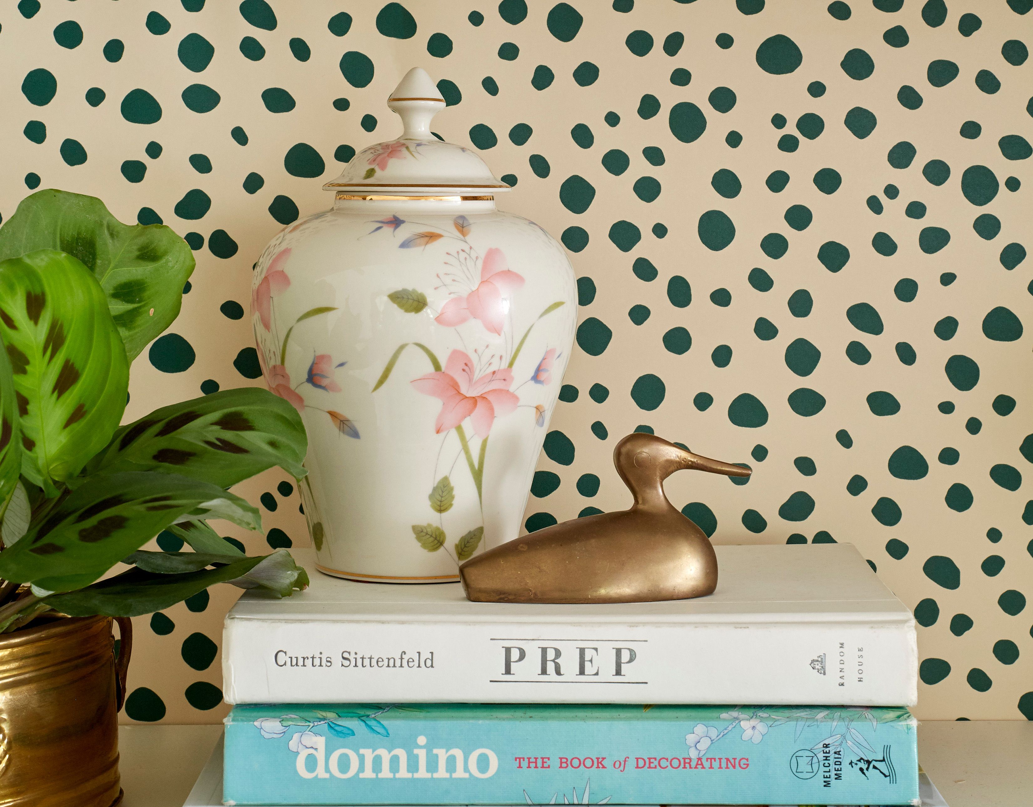
Bathroom: the dotted power move
Bathroomsespecially powder roomsare perfect for “bold in a small dose.” Polka dot wallpaper here can feel playful and sophisticated, especially when paired with
classic finishes like subway tile, polished chrome, or warm brass.
- Try black-and-white dots for a timeless look.
- Add one unexpected element: a pink towel set, a sculptural mirror, or a quirky sconce.
- Keep the rest simple: let the dots be the headline, not one of twelve headlines fighting in the same room.
Entryway: a little wink right at the door
Entryways are all about first impressions. A dotted runner, a dotted catchall tray, or even a small dotted artwork can add personality instantly.
Kids’ spaces: yes, but make it flexible
In kids’ rooms, dots can absolutely be bright and cheerful. The modern approach is to keep them removablepeel-and-stick decals, wall art, beddingso the room can
grow up without a full renovation.
How to Mix Polka Dots With Other Patterns Without Starting a Pattern Riot
Polka dots play surprisingly well with others. The trick is structure. If you mix patterns like you mix playlistsrandomly, at max volumeit gets chaotic. If you
mix patterns like a DJintentional transitions, consistent beatit looks designed.
Use the “Scale Ladder”
Pair patterns of different sizes: one large-scale (like a big dot or bold stripe), one medium (a smaller dot or geometric), and one subtle (a tiny texture or
barely-there microprint). Varying scale keeps the eye from getting stuck.
Pick a unifying thread
Choose one or two colors that show up across everything. Your dot can share a color with your stripe, your floral can share a background tone with your dot, and
suddenly the room looks coordinatedeven if the patterns are having a lively conversation.
Balance pattern with “rest”
Patterns need solid space the way jokes need pauses. If you’re adding dots, include solids (paint, upholstery, rugs, curtains) so the room still feels calm.
Example combo (easy mode): Black-and-white dots + black-and-white stripe + warm wood + lots of solid white. Graphic, modern, foolproof.
Example combo (brave mode): Navy-and-cream dots + muted floral + thin ticking stripe, all tied together with one repeating color (navy or cream).
Bold, but controlled.
5 Modern Ways to Use Polka Dots (That Don’t Feel Like a Costume)
1) Go tone-on-tone
Tone-on-tone dotslike cream on ivory or charcoal on blackadd depth without screaming “PATTERN!” This is ideal for minimalists who want interest without chaos.
2) Choose “negative space” dots
Some dot patterns feel airy because there’s generous space between dots. Those work beautifully in modern homes with clean lines.
3) Use dots as a boundary
Put dots in one contained area: a single accent chair, a small rug, a set of curtains, a powder room wall. Containment keeps it chic.
4) Add a metallic dot moment
Metallic or beaded dots (gold, brass, champagne) can read luxeespecially on pillows, lampshades, or framed textiles. This is “polka dots in a blazer,” not “polka dots at recess.”
5) Treat dots like art
A dotted motif in a modern print, a ceramic piece with dotted glazing, or a sculptural object with perforations can deliver the dot trend without literal polka dot fabric.
Common Mistakes (And How to Avoid Them)
- Mistake: Too many tiny dots everywhere. Fix: Increase scale or reduce quantityswap three dotted items for one better one.
- Mistake: Bright primary colors in large doses. Fix: Shift to neutrals, navy, brown, or muted tones for a more modern feel.
- Mistake: Mixing patterns at the same scale. Fix: Use one large, one medium, one small pattern.
- Mistake: No solids to calm the room down. Fix: Add “visual rest” with solid curtains, rugs, or upholstery.
- Mistake: Perfect circles + perfect spacing + high contrast everywhere. Fix: Try painterly, irregular, textured, or tone-on-tone dots.
Quick-Start Guide: Your First Week With Dots
- Day 1: Pick your dot vibegraphic (black/white), warm (brown/cream), coastal (navy/white), or soft (tone-on-tone).
- Day 2: Choose one dotted item that’s easy to return (pillow cover, tray, small rug, or art).
- Day 3: Place it in the room and live with it for 24 hours. Notice: does it feel playful, chic, busy, or calm?
- Day 4: Repeat the pattern once (a second pillow, a small vase, a framed print). Stop at two repeats for a clean modern look.
- Day 5: Add one solid that echoes the dot color (throw, candle, curtain tie, or even a book spine). Now it looks intentional.
- Day 6–7: If you still love it, consider a bigger movelike a rug or wallpaper in a small space.
Experience-Based Lessons: What Actually Happens When You Try Polka Dots at Home (An Extra )
Decorating advice is cute on paper. Real homes are where the plot twists happen: pets shed, kids touch walls, lighting changes everything, and that “subtle ivory”
turns into “surprise banana” at 3 p.m. in full sun. So here are experience-based lessons designers and homeowners commonly run into when they bring polka dots into
modern interiorsplus what tends to work in real life.
The One-Pillow Test saves money (and sanity)
People often want to jump straight to a dotted sofa or full-room wallpaper because they’re excited. Totally human. But the most successful makeovers usually start
with one dotted pillow cover or one dotted piece of art. Why? Because dots are more “mood changing” than you expect. In a bright room, high-contrast dots feel
crisp and energetic. In a dim room, the same dots can feel intensealmost like visual caffeine. The One-Pillow Test lets you see how your room’s light, wall color,
and existing textures react before you commit to the big-ticket item.
Scale looks different in-store than it does at home
A dot pattern that seems “medium” on a tiny fabric swatch can look either huge (if the dots are spaced wide) or busy (if the dots are tight) once it’s covering a
full curtain panel. A common workaround is to step backway backwhen you’re evaluating. If you can’t step back in the store, do the next-best thing: zoom out.
Hold the item at arm’s length, squint a little, and ask: “Do I see calm rhythm, or do I see visual static?” Calm rhythm is your modern win.
The powder room is the MVP of bold patterns
If someone says, “I love polka dots but I’m scared,” the powder room is usually the answer. It’s small, it’s contained, and it can handle a big personality.
In real homes, dotted wallpaper in a powder room tends to feel like a stylish surprise instead of an overwhelming daily reality. The key detail that makes it work
is pairing it with classic, simple materialssolid vanity, clean-lined mirror, uncluttered counter. Let the dots be the fun guest, not the entire guest list.
Mixing dots with stripes is easier than mixing dots with florals
Dots + stripes works because both are graphic and easy for the eye to organize. In practice, people get the best results when one pattern is dominant and the other
is secondary (for example: a dotted rug with one striped pillow). Dots + florals can be gorgeous, but it’s more sensitive to color and scale. If you try it, keep
one shared color (even a small one) so the patterns feel like they’re on the same team.
The “too busy” problem is usually a contrast problem
Many people blame the dots when a room feels busy. But what’s often happening is high contrast: dark dots on a bright background, repeated across multiple items,
with no solid breaks. The fix that tends to work fastest is adding a larger solid elementsolid curtains, a solid throw, or even repainting one wall a softer tone.
The dots don’t have to leave; they just need a calmer neighbor.
Bottom line: polka dots are surprisingly flexible in real homes when you use modern scale, smart color, and a little restraint. Start small, observe how the room
responds, then build. Your space should feel like younot like you lost a bet with a wallpaper catalog.
Conclusion: Make Dots Look Modern by Making Them Intentional
Polka dots are back because they’re timelessbut the way we use them has evolved. Modern home decor with polka dots is all about scale, palette, texture, and
placement. Choose dots that feel graphic or painterly, anchor them with solids, and repeat them just enough to look planned. Whether you go with a single dotted
pillow or a powder room wallpaper moment, you’ll get a space that feels fresh, stylish, and just playful enough to make you smile.