If your living room feels a little “meh,” you don’t need new furniture, a new rug, and a new personality.
You need paint. The right living room paint color can make a small space feel bigger, a dark room feel brighter,
and an “open concept” feel less like an airport terminal where everyone is waiting for snacks.
But picking paint isn’t as simple as “I like that one.” Color changes with light, undertones can pull surprise
green/pink/yellow, and your sofa will absolutely judge you if you ignore it. In this guide, you’ll get
designer-loved, real-world living room paint colorsplus how to choose one that looks good at 9 a.m. and
after your third episode of a streaming binge at night.
Before You Pick Up a Roller: 5 Things That Change Paint Color (A Lot)
Great paint decisions are 20% inspiration and 80% preventing regret. Here’s what matters most before you commit.
1) Natural light direction
North-facing rooms often read cooler and can make some grays feel icy. South-facing rooms get warmer, stronger light
and can turn “nice warm white” into “buttered popcorn,” especially at golden hour.
2) Undertones (the sneaky part)
Paint is rarely a “pure” color. A beige can lean pink, a white can lean creamy, and a gray can quietly be a
greige (gray + beige) wearing a trench coat. Undertones are why sampling is non-negotiable.
3) Fixed finishes you’re not changing
Flooring, stone fireplaces, large rugs, and big upholstered pieces matter more than your throw pillows.
Paint should coordinate with these “anchors,” not fight them like a reality TV reunion episode.
4) Sheen
Flat/matte hides wall imperfections but can scuff easier. Eggshell is the go-to for most living rooms because it’s
durable without looking shiny. Save high gloss for trim or a deliberate accent moment (not “oops, I bought the wrong can”).
5) Time of day
A color can look calm at noon and moody at night. Always view samples in morning, afternoon, and evening light.
If you only check once, paint will absolutely prank you later.
The Top Living Room Paint Colors That Transform a Space
Below are the most effective “wow, this room feels different” paint directionsneutrals, color-forward shades,
and modern classicseach with practical pairing ideas.
1) Warm White: Clean, Cozy, and Always in Style
A warm white living room paint color gives you that bright, airy feeling without going sterile. It works with nearly
every decor style, from modern to farmhouse to “I inherited this furniture and I’m making it work.”
- Best with: natural wood, linen textures, black metal accents, warm brass
- Avoid if: your room is very dim and you hate any hint of creaminess
- Pro move: use a crisp white trim to keep walls feeling intentional, not “leftover ceiling paint”
Try shades in the family of Sherwin-Williams Alabaster or Benjamin Moore White Dove if you want a soft, welcoming white
that doesn’t scream “new construction showroom.”
2) Creamy Off-White: The “Soft Filter” for Real Life
If warm white is a clean button-down, creamy off-white is a cashmere sweater. It’s flattering, forgiving, and makes a room
feel finishedespecially if you have warm-toned flooring, beige stone, or vintage pieces.
- Best with: warm woods, camel leather, terracotta accents, antique brass
- Style vibe: relaxed traditional, modern organic, transitional
- Pro move: pair with layered neutrals (ivory, sand, oat) so the room feels rich, not monotone
3) Greige: The Neutral That Doesn’t Get Boring
Greige is the reliable friend who shows up on time and brings snacks. It has the soft structure of gray plus the warmth
of beige, which helps living rooms feel calm but not chilly.
- Best with: most flooring types, white trim, black accents, earthy textiles
- Works for: open floor plans where the living room flows into a kitchen or hall
- Pro move: choose warmer greige in north-facing rooms; test undertones in your specific light
Popular references include Sherwin-Williams Agreeable Gray and Benjamin Moore Revere Pewterboth widely used because they
play nicely with a lot of decor and lighting situations.
4) Putty / Mushroom Taupe: The New “Grown-Up Neutral”
If you’re tired of cool gray but not ready for full color, putty and mushroom tones are the upgrade. They feel modern,
earthy, and quietly sophisticatedlike your living room learned how to host.
- Best with: warm whites, walnut woods, boucle, stone, woven textures
- Mood: calm, curated, slightly European (even if you’re in a suburb with a Target nearby)
5) Soft Beige or Khaki: Warm, Inviting, and Surprisingly Modern
Beige is backjust not the flat, builder beige that haunted early 2000s rentals. Today’s beige and khaki tones have depth,
often with subtle green or taupe undertones that feel natural and fresh.
- Best with: greenery, warm metals, creamy textiles, black-framed art
- Pro move: pick a beige with enough depth to stand up to your sofa and rug
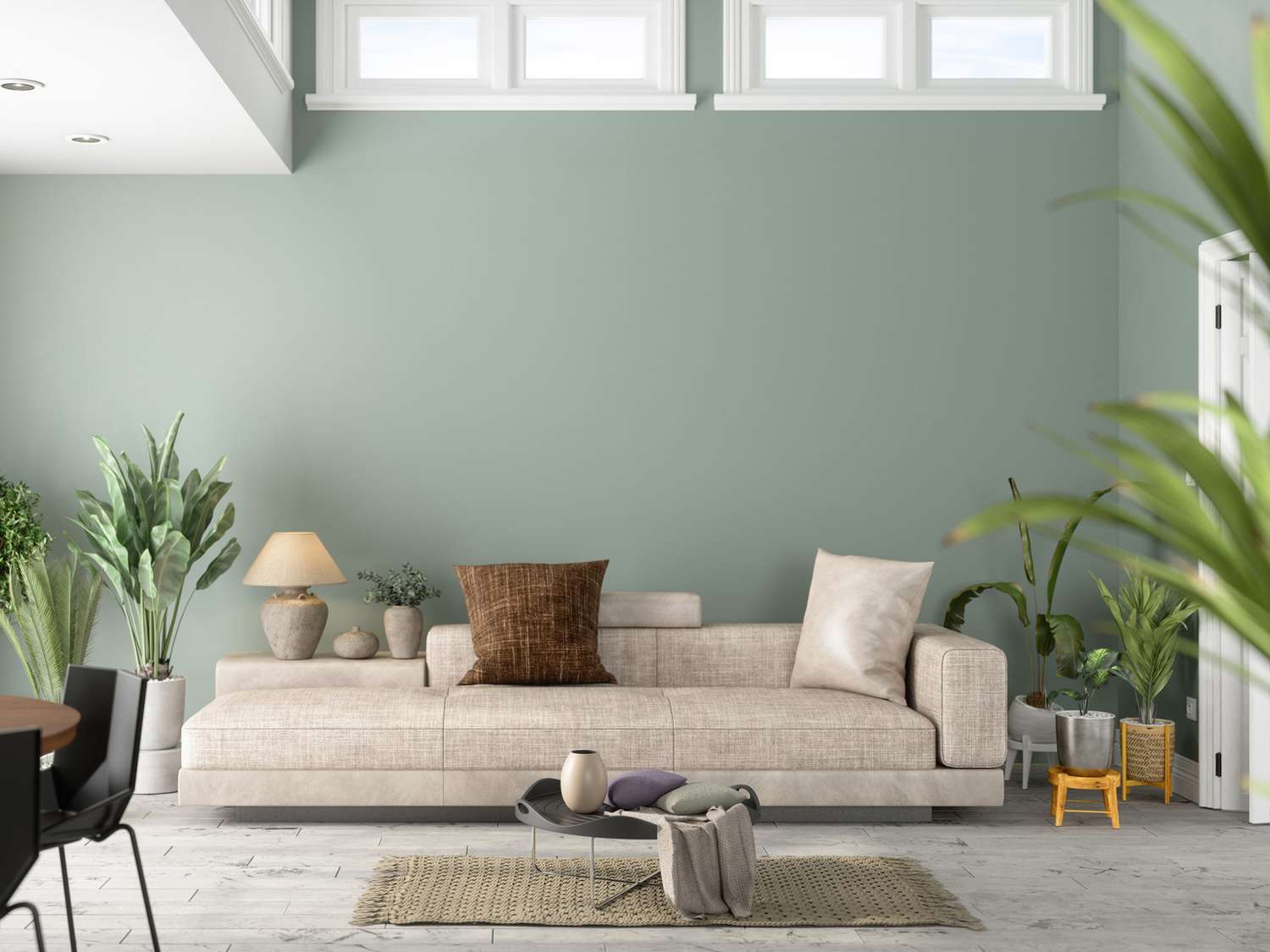
6) Sage Green: Calm, Natural, and “Instant Exhale” Energy
Sage green living room paint colors are a favorite because they feel soothing and grounded without going dark. They work
beautifully with both warm and cool accents, which makes them flexible for evolving decor.
- Best with: light oak, cream upholstery, black accents, warm brass
- Pro move: if you’re nervous, paint just the fireplace wall or built-ins first
7) Green-Gray (Like Evergreen Fog): Neutral’s Cooler, Moodier Cousin
A green-gray sits in that sweet spot between neutral and color. It adds depth while still acting as a backdrop for art,
rugs, and furniture. In rooms with lots of natural textures, it looks especially elevated.
- Best with: wood beams, leather chairs, woven rugs, off-white trim
- Mood: cozy, modern, nature-adjacent
8) Dusty Blue / Blue-Gray: Relaxing Without Feeling Cold
Blue in a living room can feel serene, but the magic is choosing a muted version. Dusty blues and blue-grays read calm,
not cartoonish. They’re excellent for rooms where you want a peaceful vibe that still feels inviting.
- Best with: creamy whites, tan leather, warm woods, brushed brass
- Pro move: add warm textiles (oatmeal throws, tan pillows) so the room doesn’t feel chilly
9) Inky Navy: Drama That Still Feels Classic
Navy is the little black dress of living room paint colors. It’s bold, timeless, and makes everything around it look
more expensiveespecially art and brass lighting. It also plays well with both modern and traditional decor.
- Best with: white trim, brass accents, light rugs, warm woods
- Where it shines: an accent wall, a library-style living room, or a room with good natural light
- Pro move: keep the ceiling lighter if the room is small to avoid “stylish cave” territory
10) Deep Forest or Moss Green: The “Moody Luxury” Upgrade
Dark green walls can make a living room feel intimate and high-end. The trick is balance: lighter rugs, thoughtful lighting,
and some reflective surfaces keep it rich instead of heavy.
- Best with: vintage wood, gold frames, creamy upholstery, layered lighting
- Pro move: add at least three light sources (overhead + lamp + lamp) so it glows at night
11) Muted Terracotta / Rust: Warmth That Feels Like a Hug
Earth tones like terracotta, clay, and muted rust bring instant warmthgreat for social spaces where you want energy without
chaos. These tones also flatter wood furniture and natural fibers.
- Best with: cream trim, natural linens, rattan, warm metals
- Pro move: pair with soft whites and warm neutrals to keep it sophisticated
12) Dusty Blush / Mauve: Subtle Color With Serious Style
Before you say “pink living room?!”, hear me out. Dusty blush and muted mauve are essentially neutrals with personality.
They look especially beautiful with warm woods, creamy whites, and soft, textured fabrics.
- Best with: brass accents, walnut, ivory upholstery, warm art palettes
- Pro move: keep the rest of the palette understated so the walls feel intentional, not sugary
13) Charcoal: The Bold Neutral That Adds Architecture
Charcoal is for when you want “wow” without committing to a bright color. Used on a fireplace wall, built-ins, or even
the entire room (if you have good light), it adds structure and contrast that makes decor pop.
- Best with: white trim, light rugs, pale woods, big art pieces
- Pro move: choose a charcoal with a warm base if you want cozy; cooler charcoals feel more modern
Easy Color Pairings That Make a Living Room Look “Designed”
If choosing a single paint color makes your eye twitch, try a simple formula: walls + trim + one anchor accent.
Here are a few combinations that consistently look pulled together.
Palette A: Warm and Airy
- Walls: warm white or creamy off-white
- Trim: crisp white
- Anchor accents: walnut wood, black metal, woven textures
Palette B: Calm and Natural
- Walls: sage green or green-gray
- Trim: soft white
- Anchor accents: linen, oak, antique brass, botanical art
Palette C: Moody and Classic
- Walls: navy, forest green, or charcoal
- Trim: bright white
- Anchor accents: warm metals, light rugs, layered lighting
Palette D: Modern Earth Tone
- Walls: putty taupe or muted terracotta
- Trim: creamy white
- Anchor accents: stone, clay decor, warm woods, minimal black accents
Paint Finish Tips for Living Rooms (So Your Walls Don’t Look Like a Flashlight Test)
Finish matters almost as much as color. Most living rooms do best with matte or eggshell on the walls:
matte hides imperfections; eggshell offers a bit more durability for daily life (kids, pets, that one friend who always
touches walls for no reason).
- Ceilings: flat
- Walls: matte or eggshell
- Trim and doors: satin or semi-gloss for wipeability and contrast
- Accents (optional): gloss if you want dramalike a lacquered fireplace wall
A Quick “No Regrets” Checklist
- Sample 2–4 contenders and view them in morning, afternoon, and night light.
- Test next to your sofa, rug, and flooringnot just on a random wall corner.
- Decide if you want your living room to feel bright, cozy, or moody first.
- Choose a trim color that supports the wall color (crisp for modern, creamy for warm/traditional).
- Commit to lighting: moody colors need multiple light sources to look intentional.
Real-World Experiences: What It’s Like Living With These Colors (Extra )
Paint advice is great, but living with a color is where the truth comes outusually around day three, when you’re walking
through the room holding laundry and thinking, “Is this… green? Why is it green?” Here are common, very real-feeling
experiences people have after painting their living rooms, plus how to make sure you land on the happy side of the story.
Experience 1: The Warm White “Everything Looks Cleaner” Moment
Warm white often delivers an immediate upgrade: the room feels brighter, your art looks sharper, and even your
hand-me-down bookshelf suddenly seems “curated.” The funny part? People usually underestimate how much lighting matters.
With warm white, switching to warmer bulbs (or adding a lamp) can transform the vibe from “clinical” to “cozy” in one evening.
The biggest win is flexibility: you can change pillows, rugs, and seasonal decor without repaintingwarm white basically
says, “Go ahead, be chaotic with accessories. I can handle it.”
Experience 2: Greige Turns Into a Shape-Shifter
Greige is famous for looking different every time you walk into the room. In the morning it can read like a soft beige;
by late afternoon it might cool down and look more gray. This isn’t a flawit’s the feature. The key is choosing the
direction you prefer in your room. If you want it warmer, pick a greige with beige undertones and pair it with warm
textiles (oatmeal throws, tan leather, wood frames). If you want it cleaner and more modern, crisp trim and black accents
will make it feel more tailored.
Experience 3: Sage Green Becomes the “Compliment Magnet”
Sage green tends to get the most “Whoa, this feels nice in here” reactionsbecause it reads calm and intentional without
being loud. People often report that the room feels more restful, especially at night, but still bright enough during the day.
The one surprise? Some sage tones can lean a little gray under cool lighting. If your living room uses cooler bulbs, consider
swapping to warm-white bulbs or adding warm accents like brass, camel, and natural woods to keep the color from looking flat.
Experience 4: Navy Feels Fancy… Then You Realize You Need Better Lamps
Navy walls can make a living room look magazine-worthy fastuntil nighttime hits and the room goes “deep sea cave” because
you only have one overhead light. The fix is simple: layer lighting. A floor lamp near the sofa, a table lamp on a console,
and maybe a picture light or sconce makes navy look rich instead of gloomy. People who love navy most are the ones who also
embrace contrast: lighter rugs, lighter upholstery, and art with bright mats or frames keep the space energetic.
Experience 5: Terracotta Makes Everyone Want Snacks
Warm clay and muted rust tones create a social, welcoming energy. It’s not uncommon for people to say the living room feels
“warmer” emotionallynot just visually. Terracotta can be bold, though, so the best experience comes from balance: creamy trim,
soft neutrals in big furniture, and natural textures (linen, jute, wood). If you go all-in with terracotta plus busy patterns,
the room can start to feel like it’s shouting. A calm rug and simple window treatments keep it grown-up.
Experience 6: Charcoal Is Stunning… If You Respect the Undertone
Charcoal looks dramatic and architectural, but it has rules. A charcoal that leans cool can feel sleek and modern; one that
leans warm feels cozier and more traditional. People who love their charcoal living rooms often did two things: they tested
large samples and they paired the color with enough light elements (trim, rug, art) to create breathing room. The payoff is
hugecharcoal makes everything look intentional, like your living room hired a stylist and paid in candles.
Conclusion: Pick a Color That Fits Your Life, Not Just Your Pinterest Board
The best living room paint colors aren’t just trendythey work with your light, your floors, and how you actually use the room.
Start with the mood you want (bright, cozy, moody), test samples like a responsible adult, and remember: lighting is the secret
ingredient that makes “pretty color” become “wow, my living room feels like a new space.”