There are few images more gloriously strange than an old analog TV test pattern. It is part engineering tool, part public artwork, and part accidental mood board for every retro-futurist with a soldering iron and too much affection for humming electronics. Long before streaming apps begged you to “continue watching,” a television station could end the night with a still frame that looked like geometry had gone to broadcasting school. Circles, grids, grayscale bars, corner markers, color patches, and that unforgettable sense that the machine was quietly daring you to adjust it correctly.
If you want to recreate an analog TV test pattern today, you are not just making a pretty picture. You are rebuilding a practical language once used by engineers, repair technicians, camera operators, and station staff to judge whether a signal was healthy, whether a CRT was behaving, and whether a picture looked right before real programming went on the air. That is why these patterns feel so satisfying. They are decorative, yes, but they were never merely decoration. They were diagnostic poetry with sync pulses.
This article breaks down what an analog TV test pattern actually did, which visual elements mattered most, how classic patterns evolved from Indian Head cards to SMPTE bars and European-style electronic patterns, and how you can recreate one in a way that looks authentically analog instead of “sort of retro-ish if you squint.” We will also talk about the small details that sell the illusion: overscan, bloom, scan softness, phase weirdness, and the gentle chaos that makes old television look alive.
Why Analog TV Test Patterns Existed in the First Place
An analog test pattern had one job: reveal problems fast. In the broadcast era, a station needed a stable reference image to check geometry, focus, contrast, black level, white level, linearity, and later color. Viewers at home could use the pattern to tweak brightness and tuning. Engineers could use it to verify whether the transmitted signal matched the standard. Service technicians could stare at it like detectives, then announce dramatic things such as, “Aha, the horizontal hold is drifting,” which is the television-repair equivalent of spotting a villain’s footprint.
That practical role explains why classic patterns look the way they do. The circles exposed stretching. Grids exposed pincushion distortion and nonlinearity. Fine wedges and resolution bursts showed whether detail was being smeared away. Grayscale bars exposed crushed blacks and blown highlights. Color sections showed whether hue and saturation were behaving themselves. In other words, every shape earned its keep.
In the earliest black-and-white era, many stations relied on fixed-image systems such as monoscopes. Instead of aiming a camera at a printed card, a monoscope produced a built-in test image from a tube with the pattern embedded in it. That made the result stable and repeatable, which is exactly what engineers love and what drama teachers fear.
From Indian Head to SMPTE Bars: The Look Changed, the Mission Did Not
When most people think of a vintage American TV test pattern, they picture the famous Indian Head pattern. It became iconic not simply because it looked memorable, but because it packed a surprising amount of information into one frame. The central circle helped expose geometry errors. The grayscale chips helped with contrast and brightness. Resolution wedges and line structures helped reveal sharpness and bandwidth limits. Corner details helped show whether the image was centered or being eaten by overscan.
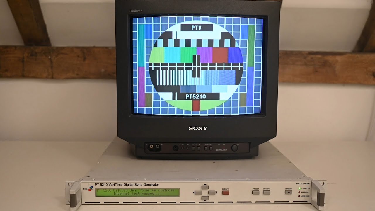
Later, color television introduced a new set of problems, so the language of test patterns changed. Suddenly the image had to prove not only that luminance was correct, but that chroma amplitude and phase were correct too. That is why SMPTE color bars became so important. The bars were less romantic than the Indian Head pattern, but they were ruthlessly useful. With a waveform monitor and vectorscope, they let technicians confirm whether the signal sat where it should sit. In analog video, “close enough” was often a creative way of saying “someone is about to look sunburned on air.”
Outside the United States, electronic patterns such as the Philips PM5544 became beloved because they looked crisp, symmetrical, and unmistakably technical. They also lend themselves beautifully to recreation projects today because their structure is modular. If you can generate circles, bars, markers, and timing-friendly edges, you can build something that immediately feels authentic.
What Makes a Test Pattern Feel Truly Analog
If you are recreating an analog TV test pattern for web publishing, video art, a hardware project, a retro game, or an actual composite-video generator, the worst mistake is making it too perfect. Real analog television was standardized, but it was not sterile. It was a world of nominal frequencies, reference levels, line timing, and small imperfections. The beauty came from the dance between strict engineering and slightly unruly hardware.
1. Geometry With Personality
Classic CRT sets were notorious for geometry quirks. Circles could become ovals. Straight vertical lines could bow inward or outward. Corners could look like they had opinions. A recreated pattern should include geometry targets that invite the eye to notice distortion. If you are simulating a vintage display, adding mild barrel distortion, edge softness, or overscan crop will often make the result feel more believable than a mathematically perfect render.
2. Meaningful Grayscale
A good analog-style pattern needs black, near-black, midtones, and bright whites that are easy to compare. Engineers once used these areas to judge setup, contrast, and clipping behavior. Today, grayscale still matters because it gives your recreation visual credibility. If every tone is either “black-ish” or “aggressively white,” the image looks like a modern design parody. Real test patterns lived in the subtle middle.
3. Chroma That Behaves Like Chroma
Color bars should not just be bright rectangles. They should feel like signal references. In NTSC-oriented recreations, that means understanding why 75% bars became standard for basic testing. They were safer and more practical for routine line-up than full-amplitude bars, which could push systems too hard. If you are designing a visual recreation rather than a measurement-grade signal, you do not need to become a human vectorscope, but you should still respect the proportions and intent.
4. Softness, Not Blur Soup
Analog images were not razor-sharp, but they were not mush either. The sweet spot is controlled softness: slightly rounded edges, a little halo around bright areas, and perhaps a trace of composite color bleed on high-contrast transitions. Too clean looks digital. Too dirty looks broken. The goal is not “damaged VHS after a difficult decade.” The goal is “healthy broadcast signal meeting an imperfect household CRT.”
The Technical Backbone You Should Respect
Even if your recreation is mainly visual, understanding the underlying analog rules improves the final result. In classic U.S. NTSC broadcasting, the image standard was built around 525 lines, two-to-one interlace, a roughly 59.94 Hz field rate, a 4:3 picture shape, and a color subcarrier at approximately 3.579545 MHz. That framework affected everything from how motion looked to how fine patterns behaved on screen.
This is why old test patterns often feel different from modern digital calibration graphics. They were not just static designs dropped onto a screen. They were built to survive transmission, modulation, decoding, display behavior, and the wonderfully messy reality of consumer television sets. A line that looked clean on paper might ring, smear, or shimmer once it met the actual signal chain.
That is also why vintage calibration culture leaned heavily on tools such as waveform monitors and vectorscopes. The human eye is dramatic, sentimental, and easily tricked by room lighting. Instruments are less poetic but more useful. In practical terms, if you are recreating a pattern for video output, it helps to preview it on the kind of display that matches your target. A pristine LCD may flatter choices that look wrong on a CRT shader, while a CRT emulation may exaggerate flaws that would never matter in a museum-style still image.
How to Recreate an Analog TV Test Pattern Today
Choose Your Historical Flavor
First, decide what kind of test pattern you are recreating. Are you inspired by the black-and-white Indian Head style? A station sign-off card with circles and wedges? SMPTE color bars? A Philips-style electronic pattern with concentric circles and color blocks? This choice matters because each version carries a different mood and technical emphasis.
If you want nostalgia with strong American broadcast vibes, a monoscope-inspired pattern is a wonderful choice. If you want a cleaner engineering aesthetic, an electronically generated pattern modeled after later analog references may be better. If your audience knows post-production more than broadcast history, SMPTE bars provide immediate recognition.
Build the Frame With Purpose
Once you choose a style, design the frame around function rather than random retro decoration. Include a central circle for geometry. Add grid lines or framing markers to reveal overscan and shape distortion. Use grayscale bands for contrast judgment. Include high-frequency detail areas for apparent resolution. If color is part of the design, use bars or patches that feel organized and reference-driven, not merely cheerful.
A strong recreation also respects spacing. Old test patterns were often visually dense, but not chaotic. Their elements were laid out so that someone could diagnose a problem quickly. If your design feels like a poster first and a calibration tool second, it may still be pretty, but it will not fully sell the concept.
Add Analog Behavior, Not Just Analog Graphics
This is where many recreations either become convincing or fall flat on their beautifully rendered faces. You do not only want the pattern; you want analog behavior. Consider adding slight scanline texture, phosphor-like glow, faint edge ringing, modest noise, subtle luma/chroma misregistration, and a small overscan crop. Gentle vertical jitter or horizontal waviness can work too, but use restraint. You are aiming for “broadcast equipment with character,” not “television surviving a thunderstorm in a haunted basement.”
If you are generating actual composite or RF-style output through hardware, the analog feel may happen naturally. If you are designing digitally, you will need to simulate it. In either case, watch for one common mistake: overdoing chroma bleed. A little red or blue softness goes a long way. Beyond that, the image stops feeling authoritative and starts feeling seasick.
Calibrate Your Recreation Against Reality
Ironically, recreating a calibration image requires calibration. Compare your design on multiple displays. View it large and small. If possible, send it through a CRT filter, a composite emulator, or real retro hardware. If you are serious about authenticity, use scopes. Check whether whites clip too aggressively, whether blacks collapse into featureless mud, and whether color patches maintain useful separation.
Old-school practice also reminds us to consider the room. Monitor appearance changes with ambient light, and even experienced eyes can drift. A pattern judged in a bright room may feel too dark in a dim editing space. That is not failure. That is television reminding you it has always been both science and performance.
Common Mistakes That Make a Recreated Pattern Look Fake
The first mistake is making it too modern. Ultra-clean lines, perfectly flat color, and zero display texture make the pattern look like a vector poster inspired by television rather than television itself.
The second mistake is stuffing the design with random retro cliches. A convincing analog test pattern does not need every effect from a vaporwave toolkit. It needs disciplined structure, correct proportions, and believable signal behavior.
The third mistake is ignoring aspect ratio. Classic analog broadcast imagery was built for 4:3. Cramming the design into widescreen without thoughtful adaptation usually makes it feel wrong immediately. If you must publish in widescreen, consider presenting the pattern inside a 4:3 frame within the composition.
The fourth mistake is confusing “old” with “broken.” A proper test pattern was supposed to help diagnose faults, not embody every fault at once. Keep the base image stable, then season it lightly with analog imperfections.
Why This Old Broadcast Language Still Feels Fresh
Recreating an analog TV test pattern is satisfying because it combines art, history, and engineering in one frame. It scratches several creative itches at once. Designers love the geometry. Hardware hackers love the signal path. Video nerds love the standards talk. Nostalgic viewers love the emotional punch of a screen that looks like it came from a quieter hour of the night. Everyone wins, except maybe the person who now feels compelled to buy a CRT “just for one project” and then accidentally starts a collection.
There is also something deeply modern about the appeal. In a world of frictionless digital media, test patterns remind us that images used to be physical events. They traveled through circuits, frequencies, phosphors, and coils. They could drift. They could bloom. They could misbehave. Recreating them is a way of putting some texture back into visual culture.
Conclusion
To recreate an analog TV test pattern well, start by respecting its original purpose. It was a measuring stick, not just a nostalgic wallpaper. Choose the historical style that best fits your project, build the composition around functional visual elements, and then introduce analog behavior with a light hand. Let geometry tell the truth, let grayscale breathe, let color act like signal, and let the display feel just imperfect enough to be alive.
The best recreations do more than imitate old television. They explain why old television looked the way it did. That is the difference between a retro graphic and a convincing analog artifact. One says, “Remember this?” The other says, “Here is how the machine thought.” And that, frankly, is much cooler.
Experience Section: What Recreating an Analog TV Test Pattern Feels Like in Practice
The experience of recreating an analog TV test pattern is oddly addictive because it begins with nostalgia and ends with obsession. At first, the task seems simple: draw some bars, add a circle, maybe sprinkle in a few grayscale blocks, and call it a day. Five minutes later, you are zoomed in at 800 percent wondering whether the lower-right patch should feel more like near-black or “black with a tiny bit of hope.” That is when you realize the project has pulled you out of casual design mode and into full broadcast-goblin mode.
One of the most memorable parts of the process is the moment a pattern stops looking like modern artwork and starts feeling like television. It usually does not happen because of one big breakthrough. It happens because of small, fussy adjustments. The circle gets a little softer. The bars become slightly less saturated. The edge of a bright area blooms just enough. Suddenly the frame no longer feels printed. It feels transmitted. That shift is incredibly satisfying.
There is also a funny emotional contrast built into the work. On one hand, it is technical. You are thinking about aspect ratio, line behavior, overscan, and signal references. On the other hand, the project is deeply sensory. You judge it with your gut as much as your eyes. If the pattern feels too clean, it is wrong. If it feels too broken, it is wrong. You learn to chase a very specific kind of rightness: disciplined, slightly imperfect, and undeniably alive.
Another common experience is discovering that every display tells a different story. What looks convincing on a laptop may feel too sterile on a large monitor. What feels beautifully authentic through a CRT shader may become exaggerated on a phone screen. That back-and-forth can be frustrating, but it is also part of the charm. Analog television was never a one-size-fits-all medium. Recreating its look means accepting that context changes perception.
And then there is the joy of showing the finished pattern to other people. Someone who grew up with late-night sign-offs will often react instantly. They may not remember the engineering details, but they remember the mood: the quiet room, the soft hum of the set, the strange authority of a screen full of circles and bars. Younger viewers often respond differently. They see it as futuristic, graphic, and weirdly elegant. That crossover appeal is part of what makes the project worthwhile. A good analog test pattern can feel historical and modern at the same time.
In the end, recreating one is more than a design exercise. It is a hands-on lesson in how images used to live in the world. They were not just files. They were signals with personalities. And once you have spent a few hours chasing the perfect balance of structure, softness, and signal-like behavior, you start to understand why these patterns still fascinate people long after the broadcasts themselves have gone dark.