Mobile carousels are the peanut butter of app design: they go on everything, they look good at first glance,
and if you spread them too thick you’ll glue someone’s mouth shut. Done well, a carousel can help people
discover features, browse content faster, and take action without feeling like they’ve entered a never-ending
scroll tunnel. Done poorly, it becomes a “banner blindness” generator that users swipe past like it owes them
money.
This guide walks through when carousels actually boost engagement (and when they don’t), plus practical design,
copy, accessibility, and measurement tips you can apply immediately. You’ll also get a field-tested “experience”
section at the endbecause the real world loves to humble perfect mockups.
What a Mobile Carousel Is (and What It’s Not)
A mobile carousel is a horizontally scrollable collection of itemscards, images, offers, articles, videos, or
stepswhere users move between items by swiping, tapping arrows, or using a page indicator. Material Design
describes carousels as a way to show a collection that scrolls on and off the screen, often with visual content
and optional text labels.
What it’s not: a magic trick that lets you cram eight priorities into one tiny slot and call it “simple.”
Carousels are a trade-off. They can save space and highlight multiple items, but they also hide content behind
interactionmeaning users must notice the carousel and then choose to explore it.
When Carousels Improve Engagement (and When They Quietly Hurt It)
Carousels work best when the user’s goal is browsing
Carousels shine in “shopping-mode” or “exploring-mode” moments, such as:
- E-commerce: featured categories, “new arrivals,” personalized recommendations, recently viewed items
- Media & news: top stories, trending clips, continue-watching rows
- Travel & events: destinations, deals, upcoming events by date
- Education: lesson modules, course cards, related topics
In these contexts, horizontal swiping can feel natural because the user expects a collection and wants quick
scanning. A carousel can reduce friction by letting people compare items without navigating away.
Carousels struggle when you’re trying to “announce something important”
If your carousel is the only place critical information liveslike a security notice, a major pricing change,
or a must-see onboarding stepbe careful. UX research has repeatedly noted that people often scroll past
carousels and that carousel content can be hard to discover, especially on mobile where “sequential access”
makes scanning slower.
Translation: if the content is important enough to matter, it may be important enough to deserve a stable,
visible placement (or at least a strong alternative like a dedicated list page).
Choose the Right Carousel Type for the Job
1) Content discovery carousel (multiple cards)
A row of cards (products, articles, playlists). Typically used on home screens and category hubs. This is the
“Netflix row” pattern: fast scanning, quick taps, repeatable sections.
2) Image gallery carousel (single item focus)
One primary image at a time, often with a page indicator. Great for product photos, property images, or
step-by-step visuals.
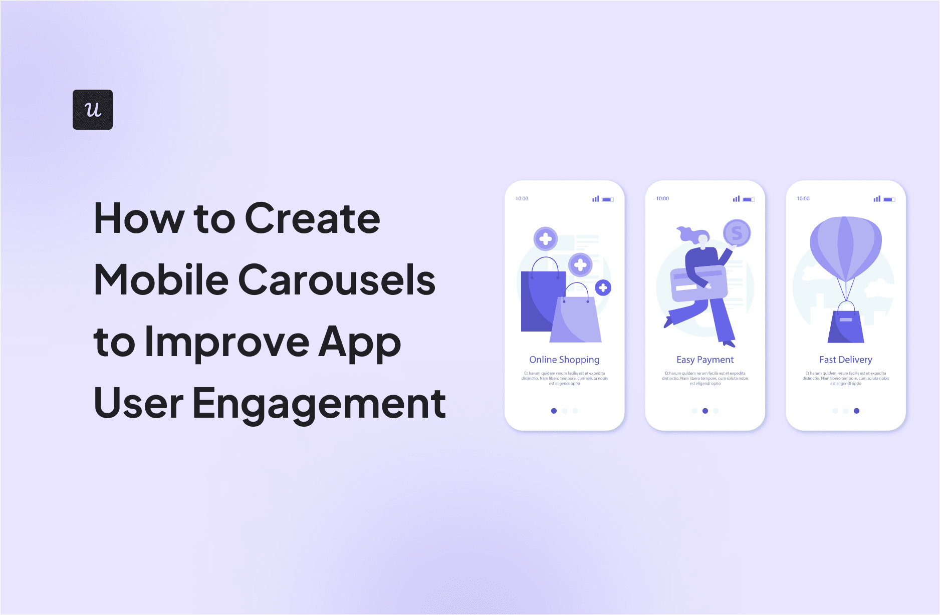
3) Onboarding or feature tour carousel (sequential storytelling)
A series of screens with concise text and illustrations. It can build confidence and reduce first-session
confusionif it’s short, skippable, and actually helpful.
4) Promotional “hero” carousel
The classic rotating banner. Use cautiously. If it exists to keep stakeholders happy, at least design it so
users can control it, understand it, and pause it.
Design Principles That Make Carousels Feel Effortless
Make it obvious that it’s swipeable
Mobile carousels have a discoverability problem: users don’t always realize they can swipe. Help them out with:
- Partial next card “peek” (show a sliver of the next item)
- Page indicators (dots or progress) that clearly signal multiple items
- Clear section titles like “Recommended for you” or “Continue watching”
- Consistent card sizing so the row reads as a set, not random tiles
If you use page indicators, follow platform expectations. Apple’s page controls and Android page indicators are
widely recognized patterns, especially for galleries and onboarding flows.
Limit the number of items shown “up front”
Carousels feel engaging when they’re curated, not endless. A good rule is to show a small, high-quality set
(often 5–10 items) and add a “Show all” or “See more” escape hatch to a full list.
Material’s accessibility guidance even recommends offering a “Show all” option so users can access content in a
vertically scrolling page instead of being trapped in sideways land.
Use snapping and predictable motion
Snapping (paging) helps users land on clean positions and reduces “half-card limbo.” Keep swipe physics
consistent across the app. If a carousel behaves differently on every screen, users will assume the app is
haunted.
Keep controls big enough for real thumbs
Touch targets are not the place to be ambitious. Apple’s HIG commonly references a minimum hit area of
44×44 pt for tappable controls, and Material guidance commonly recommends at least
48×48 dp. Design your next/previous buttons, “See all,” and card CTAs so they’re comfortably tappable,
even for “walking-and-scrolling” usage.
Content Strategy: What Goes Inside the Cards
Write carousel copy like a billboard, not a novel
Carousel cards are scanned quickly. Use:
- Short headlines (think 5–9 words)
- One clear value statement (why should I care?)
- One clear action (tap, save, play, shop, compare)
If every card has a different CTA style, users have to re-learn the rules for each slide. Pick a consistent CTA
pattern for that carousel and stick to it.
Curate with intent: “Because you…” beats “Because we said so”
Engagement rises when content feels relevant. If you’re personalizing, make it understandable:
“Because you watched…” or “Inspired by your saved items.” Transparency builds trust and reduces the “why is this
in my face?” reaction.
Match visuals to the decision
For product or content discovery, strong imagery improves scanning. For onboarding and education, simple
illustrations plus crisp text often outperform busy screenshots. The goal is speed of understanding.
Interaction Rules: Stop Auto-Scrolling Like It’s 2012
If it moves on its own, users must be able to control it
Auto-rotating carousels can create problems: people lose their place, miss content, or feel rushed. Accessibility
guidance also emphasizes giving users the ability to pause motion and ensuring changes are communicated properly
to assistive technologies.
If you must auto-rotate (promos, headlines, “hero” space), follow these guardrails:
- Pause on touch (and don’t resume immediately)
- Offer a visible pause/stop control
- Never advance while the user is reading (don’t rotate if the card has focus)
- Respect reduced motion settings and minimize animation
Don’t hijack the back gesture
On mobile, edge swipes often mean “go back.” If your carousel starts at the screen edge and captures that gesture,
you’re creating accidental navigation battles. Add safe padding or ensure the carousel doesn’t interfere with
system gestures.
Accessibility: Make Carousels Work for Everyone (and Avoid Legal/UX Debt)
Carousels can be accessibility troublemakersespecially when hidden slides still receive keyboard focus or when
screen readers announce confusing changes. WebAIM specifically warns about hidden slides receiving focus if
developers don’t properly hide inactive content.
Accessibility checklist for mobile carousels
- Focus management: Only the active slide (or visible cards) should be focusable; hidden content shouldn’t steal focus.
- Clear labels: Buttons like “Next” and “Previous” need accessible names, not mystery icons.
- Pause/stop motion: If it auto-advances, users must be able to pause it.
- Announce changes carefully: Screen readers shouldn’t be spammed with constant announcements.
- Touch targets: Keep CTAs comfortably tappable (44×44 pt iOS, ~48×48 dp Android guidance).
- Color contrast: Text over images needs readable contrast; add scrims/overlays when necessary.
Even if you’re building a native app, accessibility expectations are increasingly standardized across platforms.
For teams in regulated environments (including U.S. federal contexts), Section 508 and related guidance exist to
ensure digital experiences work for people with disabilities.
Performance: The Fastest Carousel Is the One That Doesn’t Download Everything
Engagement dies when a carousel feels sluggish. Users don’t think, “Ah, yes, network latency.” They think,
“This app is annoying.” Fix it with practical engineering choices:
Load smart
- Lazy-load images (load what’s visible first, then prefetch the next 1–2 items)
- Use appropriately sized images (don’t ship desktop-sized assets to mobile)
- Cache aggressively (especially for home screen carousels users see daily)
- Show skeleton states so layout doesn’t jump while content loads
Keep the UI stable
Jumping card heights and shifting indicators make the carousel feel broken. Define consistent aspect ratios,
reserve space for text, and keep pagination controls anchored.
Measure Engagement Like You Mean It
If you don’t measure, you’ll keep the carousel because “it looks nice.” That’s not a metric. Track behavior that
maps to engagement and value.
What to track
- Impression: Did the carousel actually render in view?
- Interaction rate: Swipes per user, taps per card, “See all” clicks
- Card CTR: Taps divided by impressions per card (rank cards by real performance)
- Downstream conversion: Add-to-cart, subscription start, save, share, watch time
- Retention impact: Compare cohorts exposed to carousel changes vs. baseline
A/B test the parts that matter
Carousels are easy to A/B test because you can swap ordering, visuals, copy, or even the presence of a carousel.
Great experiments include:
- Carousel vs. static grid: Does the carousel increase discovery or just hide content?
- Curated 6 items vs. 12 items: Does “more” help or overwhelm?
- Peek vs. no-peek: Does showing the next card improve swipe engagement?
- “Show all” placement: Button in header vs. footer vs. last card
Practical Examples You Can Borrow (Without Copy-Pasting Your Competitor’s Soul)
E-commerce home screen
Use two carousels max above the fold:
- “Pick up where you left off” (recently viewed) high intent, high CTR
- “Recommended for you” personalized, but with clear reasons (“Based on your saved items”)
Add a “See all” link for each carousel, and keep each card’s primary action consistent: product name + price +
one CTA (e.g., “View” or “Add”).
Streaming app discovery
Use “continue watching” as a carousel with progress overlays. This turns the carousel into a task list, not a
billboard. Keep it user-controlledno auto-rotating while someone tries to find the show they paused.
Onboarding carousel
Keep it to 3–5 screens. Each screen should answer one question:
- What is this app for?
- What’s the benefit to me?
- What should I do first?
Include a visible Skip and avoid burying permissions prompts inside the carousel. Onboarding is a
welcome mat, not a hostage negotiation.
Mobile Carousel Checklist (Quick, Useful, and Only Slightly Judgy)
- Does the carousel solve a browsing problem, not a stakeholder problem?
- Is it clearly swipeable (peek, indicators, consistent layout)?
- Are the items curated (not endless) and supported by “Show all”?
- Is it user-controlled (no chaotic auto-rotation)?
- Are touch targets comfortable (44×44 pt / ~48×48 dp guidance)?
- Is it accessible (no hidden-focus bugs, meaningful labels, pause motion)?
- Is it fast (lazy-load, cache, stable layout)?
- Are you measuring outcomes (CTR, conversion, retention), not vibes?
Conclusion
Mobile carousels can absolutely improve app user engagementwhen they’re designed as a browsing tool, not a
content dumping ground. Make swipe behavior obvious, keep content curated, provide a “Show all” option, respect
accessibility and motion preferences, and measure performance with real analytics. In other words: design a
carousel that behaves like a helpful shelf in a store, not a rotating billboard on a windy highway.
Experience Notes: What Teams Learn the Hard Way (So You Don’t Have To)
Here’s the part most carousel guides skip: the messy reality of shipping carousels across design, engineering,
analytics, content, and (yes) internal politics. The most common “experience pattern” product teams report is
that carousels start as a simple UI idea and quickly become a multi-department agreement problem. Marketing
wants more slides. Product wants personalization. Design wants clean spacing. Engineering wants fewer image
assets. Analytics wants clear events. And users want the app to stop moving things around while they’re trying
to tap.
One practical lesson: the best-performing carousels usually earn their keep by serving an existing user intent.
“Continue watching,” “recently viewed,” “your saved items,” and “because you searched for…” carousels tend to
feel helpful rather than promotional, because they reduce effort. Teams that lead with intent often discover a
surprising upside: they can show fewer items and still get higher engagement. That’s because relevance beats
volume. A tight set of six cards that match what the user cares about will typically outperform a dozen generic
cards that try to cover every possible audience.
Another hard-earned insight is that discoverability is not a one-time problem solved by adding dots. Yes, page
indicators help, but “peek” matters more than most people expect. When teams change a carousel from full-width
single cards to slightly clipped cards that reveal the next item, swipe interaction often increasesbecause
users can see there’s more content without having to guess. It’s the visual equivalent of leaving a book
slightly open on a table: it invites curiosity.
Teams also learn quickly that auto-rotation creates support tickets. Users complain that the app “keeps changing”
or that they “can’t tap the thing” because it moved. Even when complaints are rare, auto-rotation can quietly
reduce comprehensionpeople don’t read; they chase. If a carousel must auto-advance, many teams find that pausing
on touch and never resuming until the user leaves the screen prevents the “fighting the UI” feeling.
On the engineering side, performance surprises are common. A carousel looks lightweight in a design file, but in
production it might load multiple high-resolution images, custom fonts, and tracking beacons. Teams that treat
carousels as performance-critical componentslazy-loading, caching, and prefetching only what’s nextavoid the
classic trap where the home screen becomes the slowest screen. And there’s a sneaky bonus: faster carousels
don’t just “feel nicer,” they often improve engagement because users don’t abandon the page before interacting.
Accessibility “gotchas” show up late if nobody plans for them early. Teams often discover too late that hidden
slides can still be focusable, or that screen readers announce confusing updates when the slide changes. The
teams that do best usually adopt a simple habit: treat each carousel item like a mini-page with clear structure,
and ensure only visible content is interactive. That mindset reduces bugs and makes the component easier to test.
Finally, teams learn that carousel success is rarely about the carousel aloneit’s about the system around it.
The strongest results come from a content pipeline that refreshes recommendations, a ranking logic that adapts to
behavior, and analytics that make it obvious which cards perform and why. When teams can answer “Which card drove
the most downstream value this week?” they stop guessing and start improving. That’s when a carousel becomes an
engagement engine instead of a shiny UI accessory.