When Windows 8 first arrived, Microsoft’s touch-first app vision felt bold, shiny, and just a little bit undercooked. The interface looked futuristic, the Live Tiles had personality, and the full-screen apps clearly wanted to drag Windows into the tablet era. The problem? Many of those early apps felt like concept cars without door handles. They looked impressive in the showroom, but living with them every day could be frustrating. Windows 8.1 changed that story in a meaningful way.
Spend real time with the new Modern UI apps in Windows 8.1 and one thing becomes clear: Microsoft stopped treating the built-in apps like decoration and started treating them like tools. They were still colorful, still touch-friendly, and still eager to show off the company’s design language, but now they were also more practical. That matters because built-in apps set the tone for the whole platform. If your default Mail app is weak, your calendar feels half-finished, and your photo tools are barely tools at all, the operating system itself feels unfinished. Windows 8.1 did a lot to fix that impression.
This hands-on look is not about whether Windows 8.1 solved every complaint people had about Windows 8. Spoiler alert: it did not. But if you focus specifically on the Modern UI apps, the update feels less like a patch and more like a course correction. The apps became easier to browse, easier to trust, and much easier to use for actual day-to-day tasks.
The Big Shift: From Showroom Software to Everyday Utilities
The smartest thing Windows 8.1 did was make its Modern UI apps feel less like full-screen demos. In Windows 8, several built-in apps looked clean but lacked depth. In Windows 8.1, Microsoft filled in the missing basics. That sounds simple, but it changed the whole mood of the platform.
Instead of asking users to admire the design and forgive the missing features, Windows 8.1 started delivering the things people expected from real apps: stronger organization, better navigation, more useful controls, and tighter cloud syncing. That made the ecosystem feel more mature, especially on tablets and hybrid PCs where these apps were supposed to shine.
Mail, Calendar, and People Finally Start Pulling Their Weight
Mail grows up
If there is one app category that can instantly expose a weak operating system, it is email. Nobody wants their inbox to feel like an art project. The Mail app in Windows 8.1 improved in exactly the places that matter most. It became easier to filter unread messages, create and manage folders, flag important email, and work with drafts without playing hide-and-seek through the interface.
That may not sound glamorous, but it is the difference between “cute app” and “usable app.” In practical terms, Mail stopped feeling like a companion app and started feeling more like a lightweight productivity client. Better compose tools also helped. Writing messages felt less cramped, and small touches such as easier copy-and-paste and smarter suggestions in the recipient field made the app more comfortable for real work.
The biggest win was confidence. Once an email app lets you organize messages the way you expect, you stop treating it as temporary. You actually use it. That is a massive upgrade in user trust, and Windows 8.1 needed exactly that.
Calendar becomes more readable and less awkward
Calendar also matured nicely. The new look improved readability, which sounds minor until you remember how often calendars fail because they are visually annoying. A work-week view made scheduling less cluttered, and better meeting support made the app more useful for students, professionals, and anyone whose life is ruled by appointments and reminders.
Windows 8.1 did not turn Calendar into a full Outlook replacement, but it did make it far easier to live with. That is a recurring theme in this update: not every app became best-in-class, but many of them became good enough to keep open without grumbling.
People remains interesting, if not essential
The People app improved too, though it remained more of a mixed bag. It was cleaner and easier to navigate, and it still worked as a social-and-contact hub in classic Microsoft fashion. For some users, that was handy. For others, it still felt like an app in search of a stronger reason to exist. But even here, Windows 8.1 showed progress. The app felt more deliberate and less like a tile that was merely happy to be invited.
Photos, Camera, and SkyDrive Make the Platform Feel More Complete
Camera gets simpler and more capable
Windows 8.1 made the Camera app easier to understand, which is exactly what a camera app should be. Quicker access to photo and video capture, exposure settings, timers, and other controls made it friendlier on tablets and touch devices. More importantly, basic editing tools were no longer an afterthought. Cropping, rotating, red-eye fixes, lighting adjustments, and other simple enhancements made the app useful for everyday cleanup.
This is where Microsoft started to understand the Modern UI formula. A touch-first app does not need every advanced option under the sun. It just needs the right features in the right places. Windows 8.1’s Camera app felt closer to that ideal. It handled quick tasks well, and that made it easier to stay in the Modern interface instead of bouncing back to the desktop every five minutes.
Photos stops feeling like a pretty hallway
The Photos app also benefited from a smarter layout and more practical editing options. It was not trying to become Photoshop, and honestly, that was probably for the best. Instead, it became a cleaner place to browse images and make quick corrections without turning the process into a project.
That matters on a touchscreen device. When you are using a tablet on the couch, at the kitchen table, or on a flight, you do not want to launch a heavyweight editor just to fix a slightly dark picture. Windows 8.1’s Photos app respected that reality. It handled the casual stuff well enough to be worth using.
SkyDrive finally behaves like file storage, not a teaser trailer
Few improvements in Windows 8.1 were more satisfying than the work done on SkyDrive. In the original Windows 8 era, the cloud storage experience often felt like it was missing the obvious basics. In Windows 8.1, SkyDrive became far more practical. You could cut, copy, paste, rename files, and manage offline availability with a lot less friction.
That change may not have the sparkle of a flashy new app, but it was one of the most important quality-of-life upgrades in the system. A cloud app that actually behaves like a file manager is a huge deal, especially on tablets where local and online files need to feel connected instead of awkwardly distant cousins at a family reunion.
Reading List and IE11 Quietly Become Standout Features
One of the best surprises in Windows 8.1 was how much nicer web consumption became. Reading List was a genuinely smart addition. It gave users a clean, system-level way to save content from websites and apps, then revisit that content later across Windows devices. In other words, it was less about bookmarking and more about preserving your “I’ll read this later when I’m pretending to be productive” intentions.
Reading List worked because it understood app life in Windows 8.1. You could save articles from Internet Explorer, from other apps, and from the content-rich Bing app ecosystem. It felt connected rather than isolated, and that gave the entire Modern UI a stronger sense of continuity.
Internet Explorer 11 in the Modern environment also became much more pleasant. Reading View made long-form articles easier to enjoy, especially on touch devices. Better tab handling, synchronized history and favorites, and improved mouse-friendly controls helped close the gap between the Modern browser and the desktop version. Windows 8.1 even added smarter ways to show the address bar and tabs for users on larger screens, which made the browser feel less stubborn.
In daily use, that meant the Modern web experience stopped being something you tolerated and started becoming something you might actually choose.
The Bing App Family Is Still the Show-Off Friend of the Group
Microsoft’s Bing-powered apps were among the best expressions of its design ideas, and Windows 8.1 doubled down on them. News, Weather, Sports, Finance, Travel, and Maps already looked good, but the update gave the family more polish and better consistency. Search improvements inside several of these apps made them easier to navigate, while layout refinements helped them feel less like isolated experiments.
The real crowd-pleasers, though, were the new arrivals: Food & Drink and Health & Fitness. These apps showed Microsoft at its most ambitious. Food & Drink was more than a recipe box. It mixed recipes, shopping lists, meal planning, and cooking content into one polished experience. The famous hands-free mode, designed to let you move through recipes without touching the screen, was one of those ideas that made people either say “That’s brilliant” or “My webcam thinks my hand is a ghost.” Still, it was inventive, and Windows 8.1 needed a little invention.
Health & Fitness was similarly ambitious. It bundled workout content, health tracking, nutrition information, and wellness tools into a single app. Was it the last word in fitness software? No. But it was the kind of rich first-party app that made Windows 8.1 feel more substantial out of the box.
These apps also revealed something important about Microsoft’s strategy. The company knew third-party app depth was still uneven, so it invested in first-party experiences that made the platform look more capable on day one. Smart move.
Little Utilities Make a Bigger Difference Than You’d Expect
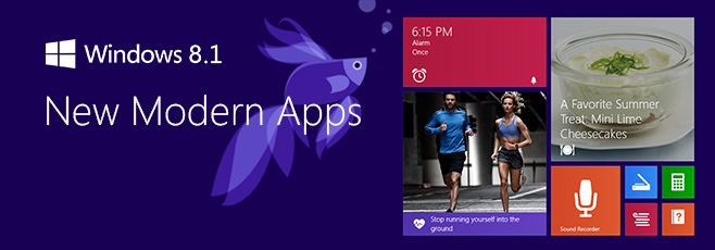
Some of Windows 8.1’s nicest app improvements came from tools that are easy to overlook. The new Calculator app, for example, was a quiet star. It went beyond basic arithmetic and added scientific functions and a handy unit converter. On a touch device, that made it feel more modern than the classic desktop calculator while still being genuinely useful.
Alarm and Sound Recorder followed the same pattern. They were simple, clean, and focused. They did not try to become life coaches or podcast studios. They just handled quick tasks well. That may not sound thrilling, but well-executed basics are part of what makes an operating system feel finished.
Xbox Music also received a welcome redesign. Navigation felt more sensible, and the overall layout was easier to scan. Instead of forcing users through a clumsy maze of horizontal panels, the app became more structured and approachable. The result was a media app that felt less like a demo kiosk and more like an actual music hub.
The Windows Store Finally Looks Like a Place You’d Browse on Purpose
The redesigned Windows Store was one of the clearest signs that Microsoft was listening. In Windows 8, the Store could feel sparse, clunky, and oddly hard to browse for a company trying to build an app ecosystem. Windows 8.1 cleaned that up. Featured apps became easier to see, categories became easier to jump between, and lists such as trending, top free, top paid, and new arrivals made discovery more intuitive.
App pages were also improved. Instead of hiding details and reviews behind awkward navigation, Windows 8.1 made the experience feel more like a proper storefront. Personalized recommendations helped too, and automatic app updates reduced the maintenance burden on users. That last change was particularly important because nothing says “healthy ecosystem” like apps that keep themselves current without needing a ceremonial reminder.
Did the Store suddenly become unbeatable? Not even close. But it looked more alive, and that was half the battle.
Hands-On Verdict: Windows 8.1’s Modern Apps Feel Like Version 2.0 in the Best Way
What stands out after spending time with the new Modern UI apps in Windows 8.1 is not one killer feature. It is the cumulative effect of dozens of sensible improvements. Mail became practical. Calendar became easier to trust. Camera and Photos became useful enough for everyday fixes. SkyDrive became functional. IE11 became comfortable. Reading List became clever. The Bing apps became richer. The Store became easier to explore.
That does not mean Windows 8.1 erased every weakness. The larger app ecosystem still lagged behind rival platforms in some categories, and desktop-versus-Modern tension did not magically disappear. But the built-in apps did a lot of heavy lifting. They made Windows 8.1 feel more coherent, more mature, and far less eager to trip over its own design philosophy.
In a weird way, Windows 8.1’s Modern UI apps are some of the most interesting software improvements Microsoft has ever made. They do not scream for attention. They simply show what happens when a company looks at a flashy first attempt, admits it was missing the basics, and then comes back with something far better. That is not glamorous. It is just good product work. And sometimes, good product work is the coolest feature in the room.
Extra Hands-On Experience: Living With Windows 8.1 Modern UI Apps Day to Day
Using Windows 8.1’s Modern UI apps over the course of a normal day creates a very different impression than just glancing at screenshots or reading a feature list. In the morning, the Start screen feels more alive when the live tiles are actually feeding you useful information instead of just sitting there like colorful refrigerator magnets. Weather gives you a quick temperature check, Mail tells you whether your inbox exploded overnight, Calendar reminds you that yes, your afternoon is doomed, and News throws a few headlines at you before coffee has had a chance to negotiate with your brain.
Once you move into work mode, the benefit of the updated Mail and Calendar apps becomes even more obvious. You are not opening them because they are pretty. You are opening them because they can finally handle everyday tasks without making you sigh dramatically at the screen. Filtering unread email, flagging messages to revisit later, and jumping between folders all feel much smoother than they did before. Calendar is especially nice on a touch device because it feels visual without becoming messy. A tablet propped up on a desk with the Modern Calendar app open actually makes sense now, which was not always true in the earlier Windows 8 days.
Later, when the workday shifts into casual browsing, Windows 8.1 starts to show its personality. Reading List becomes one of those features you do not think much about until you start relying on it. You spot an article in Internet Explorer, save it, move on, then come back later from another device. It is simple, but it smooths out the experience of using Windows across screens. That same logic applies to SkyDrive. The fact that cloud files feel more like regular files takes away a surprising amount of friction. You spend less time wondering where something lives and more time just opening it.
In the evening, the entertainment and lifestyle apps make the system feel more complete. Xbox Music looks cleaner and is easier to navigate while you are half-paying attention and doing three other things. Food & Drink is the sort of app that makes you want to believe in the future, especially when it promises hands-free cooking help. Even when that feature feels a bit temperamental, the app itself still makes recipe browsing, meal planning, and shopping-list building feel polished. Health & Fitness has the same energy: maybe not perfect, but undeniably ambitious.
The best part of the Windows 8.1 Modern app experience is that it no longer feels like you are constantly being pushed back to the desktop to do anything serious. You still can, of course, because this is Windows and the desktop is never exactly shy. But with 8.1, staying in the Modern environment for longer stretches finally feels reasonable. That is the real victory. The apps do not just look better; they support a better rhythm of use. And when software gets out of the way enough for you to build a rhythm around it, that is usually when you know it is finally working.
Conclusion
Windows 8.1 did not win people over by pretending the original Modern UI app strategy was flawless. It won points by improving the parts users touched every day. The result was a suite of built-in apps that looked polished, felt more capable, and made Windows 8.1 easier to recommend on tablets, hybrids, and even traditional PCs. For anyone curious about Microsoft’s touch-first era, these apps are where the platform made its strongest case for itself.