From the street, this historic villa in Auckland looks like the picture of good behavior: a classic timber façade, traditional roofline, and all the charm you’d expect from a gracious Ponsonby home. Step inside, though, and the house quietly switches to “party at the back” mode: sculpted plaster walls, a long, gallery-like kitchen, glimpses of a pool, and furniture that feels equal parts museum-worthy and deeply lived in.
The project, featured on Remodelista, is the work of interior designer Katie Lockhart and Jack McKinney Architects, a pairing that treats the home like a shared composition. The original villa at the front stays largely intact, honoring Auckland’s heritage protections, while a new rear extension rewrites the language of the house in calm, contemporary terms. The result is a historic villa renovation that feels at once global and intensely rooted in New Zealand light, weather, and everyday family life.
In this tour, we’ll unpack how the team pulled off this balancing act, what makes the interiors so quietly addictive, and what you can borrow for your own renovationeven if you don’t happen to live on a leafy Auckland street.
A Villa in Ponsonby with Big Ideas
The house is an Edwardian-era villa on a compact site in Ponsonby, one of Auckland’s most character-filled neighborhoods. The owners work in creative fields and came to the design team with a rich set of references: a love of modernist simplicity, soft color, and especially the tropical modernism of Sri Lankan architect Geoffrey Bawa, whose houses blend lush landscapes with restrained architecture and tactile surfaces.
There were constraints, of course. As with many historic New Zealand villas, the front elevation and roofline were effectively off-limits. The original structurea timber shell with a hipped metal roofhad to remain legible from the street. The real freedom lay behind the original ridge line, where McKinney could extend, carve, and bend the house toward the garden.
Rather than “modernizing” the entire building into one anonymous open-plan box, the team made a deliberate decision: let the old part stay politely historical and let the new portion speak in a different, more sculptural dialect. The experience of moving through the home becomes a journeyfrom the familiar to the experimental, from enclosed rooms to an airy, garden-framed living level.
Heritage at the Front, Modernist Calm at the Back
Respecting the Street
At the front, the villa keeps its quietly dignified demeanor. Original timber details, classic windows, and traditional proportions are preserved or carefully restored. Inside these rooms, finishes are edited and freshened, but not radically reimagined. The idea is that neighbors walking past still recognize the house they’ve always seen; nothing shouts, nothing grandstands.
This approach is common in sensitive villa renovations: keep the familiar face intact, and let the innovation happen where only the homeowners and their guests experience itdown the hallway, toward the light, and out to the garden.
Opening to Light and Garden
As you move toward the back of the house, the mood shifts. Ceiling heights increase; daylight intensifies; the architecture loosens up. The new volume steps down toward the garden, creating a more generous living level that spills out to outdoor space and pool views. Large panes of glazing, carefully framed, turn the garden into part of the interior composition rather than mere backdrop.
Instead of copying the villa’s gables in a timid pastiche, the extension introduces a more monolithic, sculpted form. It’s not loud, but it is confident: clean lines, strong geometry, and planes of concrete or plaster that feel almost carved rather than built. Inside, this reads as a continuous, calm envelopeideal for the layered furnishings and textures that Lockhart introduces.
The Architecture of Jack McKinney: Sculpted but Soft
Jack McKinney’s work across Auckland often plays with the idea of “formal in the front, experimental at the back,” especially in villa and cottage renovations where heritage overlays demand subtlety on the street side but allow more freedom toward the rear. Here, that strategy turns into a clear narrative: the old villa as threshold, the new addition as destination.
The extension emphasizes volume and light rather than showy features. Roof forms and ceilings are shaped to pull light deep into the plan and to create a sense of drawthe feeling that you’re being gently pulled through the house toward the kitchen, the dining table, and eventually the garden.
Architectural elements double as interior features. A long, low wall becomes the backdrop for walnut cabinetry. A carefully designed staircase, appearing to float in natural oak, becomes a sculptural object rather than a purely functional connector. The architecture is minimal but far from thin; it’s the kind of minimalism that rewards touch and close inspection.
This attention to mass and proportion also gives Lockhart a strong framework to respond to. The interiors never fight the architecture; they ride along with it, emphasizing lines, thickening edges, and softening transitions.
Katie Lockhart’s Interior Palette: Textured, Global, and Grounded
A Troweled Plaster Canvas
One of the most striking features of the renovation is the wall treatment: trowel-polished plaster that wraps most of the new spaces in a soft, chalky texture. Instead of crisp painted drywall, you get surfaces that look and feel hand-worked. Depending on the light, they read as warm white, sandy beige, or the palest hint of terracotta.
The color story draws from Italian terracotta tiles, New Zealand’s coastal light, and the clients’ love of Bawa’s tropical modernist houses. In some areas the plaster deepens slightlybarely-there peach or grey-greenscreating subtle zoned moments without resorting to bold accent walls. The overall effect is almost spa-like but still family-friendly: marks and scuffs add character rather than screaming to be repainted.
Toward the center of the plan, an interior garden adds a literal touch of tropical modernism. Lush planting softens the join between old and new portions of the house, and acts as a visual punctuation mark between living, dining, and circulation spaces.
Furniture as a Cast of Characters
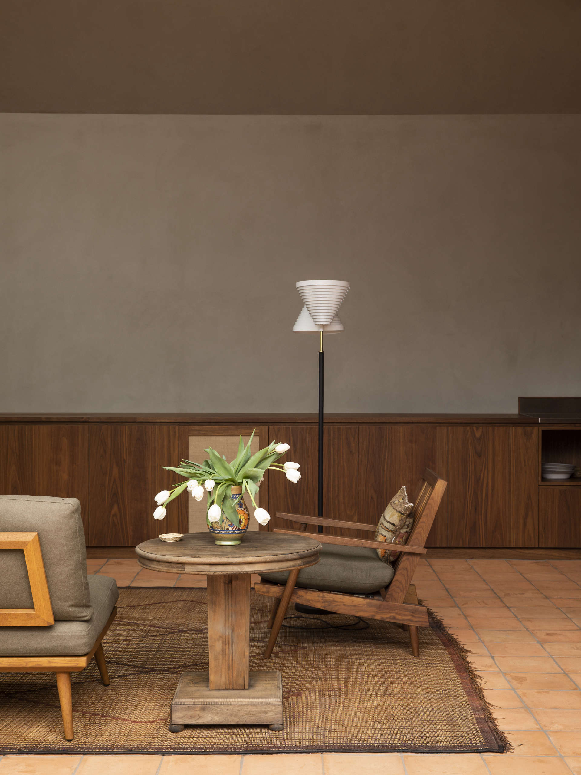
Lockhart is known for combining midcentury and contemporary pieces with Japanese and European influences, and this project is a masterclass in that layered approach. The living room centers on a low, deep sofa with tailored lines, paired with custom-crafted timber chairs and benches. Vintage rugsthink Tuareg mats or timeworn kilimsadd pattern and patina without overwhelming the calm envelope.
Lighting is treated almost like jewelry: a mix of sculptural pendant and floor lamps, some by Scandinavian and Japanese designers, create pools of warm light that emphasize the plaster surfaces and natural textures. Rather than a grid of recessed downlights, the room feels illuminated in layers, with specific momentscorners, reading spots, the dining tablethoughtfully lit.
Accessories are edited, not absent. Ceramic pieces from Japanese makers and New Zealand potters share shelf space. Objects are grouped in small, intentional constellations, giving the eye something to land on without tipping into clutter.
The Kitchen as One Long Line
Instead of the now-expected island-and-bar-stools formula, the design team chose a single, continuous run of walnut cabinetry along one wall, paired with stainless steel worktops and a built-in cook zone in pale marble. It reads almost like a piece of furniture or a low sideboard, running from living room through to the kitchen, visually stitching the spaces together.
Applianceslargely from local favorite Fisher & Paykelare fully or partially integrated into the cabinetry, keeping the kitchen’s profile calm and horizontal. A single floating shelf holds a curated mix of ceramics, keeping everyday items within reach while preserving the restful, gallery-like feel.
With no island in the way, the dining table becomes the true heart of the space. A custom timber table and chairs by a local maker sit between kitchen and living area, functioning as meal hub, work surface, homework station, and extra prep zone when cooking gets serious. It’s a simple but powerful lesson: in a compact plan, let one element do multiple jobs beautifully.
Vertical Moments: Stair and Bath as Micro-Worlds
Vertical circulation might be the most overlooked part of many renovations, but here the stair becomes another key player. A “floating” timber stair in pale oak rises alongside plaster walls tinted in a slightly different tone, with a framed slab of marble above catching the light like a minimalist artwork. The experience of going upstairs turns into a small ceremony rather than a rushed transition.
In the bathroom, the design riffs on one of Lockhart’s earlier projects, using small-format tiles in a saturated yet soothing color and custom timber cabinetry for storage. The fixturestowel rails, taps, lightingare chosen for clean lines and tactile finishes, turning a compact room into a spa-like retreat that still works hard for a busy family.
Design Lessons from a Collective Composition
1. Start with a Shared Story, Not Just a Mood Board
The success of this historic villa renovation in Auckland starts with a shared narrative: the clients’ travels, their love of tropical modernism, and their attachment to the old villa. Rather than assembling random “Pinterest favorites,” the team distilled these influences into a clear storylineheritage at the front, monolithic calm at the back, all filtered through a tactile, earth-toned palette.
For your own project, agreeing on a story“urban farmhouse around a courtyard,” “quiet apartment with one dramatic room,” “1930s bones, Japanese-inspired interiors”can be more useful than fixating on specific products from day one.
2. Let Architecture and Interiors Talk to Each Other
One reason the house feels so cohesive is that architecture and interiors were conceived together. The long run of cabinetry responds directly to the structural wall; the stair design is carried through in timber detailing and lighting; the plaster colors are chosen to flatter the natural light shapes created by the roof forms.
If you’re renovating, try to bring your architect and interior designer into the conversation earlyor, if you’re taking the DIY route, sketch layouts and material ideas at the same time. Avoid the common trap of finalizing floor plans and only then wondering where the furniture might actually go.
3. Choose a Few Materials and Go Deep
This home doesn’t rely on dozens of finishes. Instead, it leans into a short listtimber, plaster, terracotta, marble, and textilesand explores variations in tone, texture, and scale within that set. The result is rich but not busy, and it’s easier to maintain because everything feels intentional.
In your own renovation, consider picking three to five main materials and repeating them throughout. You can still introduce personality through art, lighting, and textiles, which are easier to change as tastes evolve.
4. Let Furniture Do the Zoning
Without a kitchen island or maze of half-walls, the main level relies on furniture to define zones. The sofa clusters seating, the dining table anchors the center, and a shift in rug texture marks the transition to more casual lounging. This keeps the plan visually open but functionally organized.
If your space feels chopped up, try removing a partition and seeing whether furniture arrangements can quietly do the same job. A long table, a low bench, or a change in rug underfoot can be surprisingly powerful dividers.
5. Prioritize Sightlines and Small “Wow” Moments
Instead of one big feature wall or a showy chandelier, the house relies on layered sightlines. From the front hallway, you catch a glimpse of the garden extension. From the sofa, your eye tracks the plastered wall down to the kitchen and out toward the pool. From the stair, you see both interior garden and skylit volumes.
Think about what you want to see from each key spot in your homefront door, sofa, bed, kitchen sinkand plan finishes and lighting accordingly. A well-framed view or a beautiful material at the end of a corridor can be more satisfying than yet another “statement” light fixture.
How to Bring This Look Home (Without Moving to Ponsonby)
You might not be able to import Auckland’s exact light or the villa’s DNA, but you can definitely borrow some of its design thinking.
- Experiment with plaster or plaster-like finishes. Limewash or high-quality matte paints can give walls that soft, atmospheric quality without full-on plastering.
- Invest in one “hero” table. Let your dining table be the social and functional hub rather than defaulting to a kitchen island.
- Choose a calm, earthy palette. Think terracotta, sand, olive, charcoal, and off-white, with the occasional deep green or inky blue for depth.
- Curate, don’t accumulate. Group ceramics, books, and objects in small, intentional clusters rather than filling every surface.
- Use lighting like punctuation. Layer floor lamps, table lamps, and a few carefully chosen pendants instead of relying solely on ceiling cans.
- Bring the garden inside. Even a small interior planter, cluster of large potted plants, or a green view from the kitchen sink nods to the indoor–outdoor connection that defines this villa renovation in Auckland.
Behind the Scenes: What a Renovation Like This Feels Like
It’s easy to look at polished photos of a historic villa renovation and assume the process was as tranquil as the finished plaster walls. In reality, projects like this one are as much about managing experienceof clients, designers, and buildersas they are about materials and floor plans.
Imagine being the homeowners. You start with a beloved but slightly tired villa: beautiful bones, questionable past renovations, and a layout that doesn’t quite fit contemporary family life. You’re attached to the house but equally ready to change it. When you meet your architect and interior designer, you’re not just hiring them to arrange walls and tiles; you’re inviting them into your daily routines, your tastes, your long-term hopes for how you’ll live.
The early design phase is often the most exhilarating. This is when someone like Jack McKinney sketches out how the villa might open to the garden, where an indoor courtyard could sit, how tall the ceiling in the new living room might be, and how the heritage façade can remain intact while the back of the house becomes something entirely new. You’re looking at plans and sections, squinting to imagine how those lines translate into sunlight on your kitchen floor.
In parallel, a designer like Katie Lockhart is quietly building a world around those lines: the color of the plaster, the exact shade of walnut, the way a specific rug will sit beneath the sofa, how a dining table will relate to the window mullions. This is the “collective” part of the compositionarchitecture inspiring interiors, and interiors in turn suggesting refinements to the architecture. As a client, you’re pulled into this conversation, weighing options that feel both thrilling and slightly terrifying: do we really commit to terracotta tile everywhere? Is that shade of plaster too pink at sunset? Are we brave enough to skip the kitchen island?
Then comes construction, otherwise known as “living with uncertainty.” For a time, the house is not a serene villa but a half-disassembled shell. There are days when it’s hard to see past the dust and temporary framing. You walk through what will become the new living room and see only exposed timber and rough concrete. You wonder if the plaster will feel too heavy, if the kitchen run is too long, if the decision to forgo overhead cabinets will come back to haunt you.
This is where trust in the design team matters. The architect knows how the volumes will hold light once the scaffolding is gone. The interior designer understands that once the rugs are down, the sofa is in place, and the table is set, the room will feel balanced. They’ve seen similar moves work in other projects, and they’re editing on your behalfremoving the extra details that creep in when nerves rise and helping you hold onto the original clarity of the concept.
The turning point tends to be when finishes start going in. The first room of plaster is completed, and suddenly you see the softness you’d only glimpsed in sample boards. The walnut cabinetry arrives and instantly grounds the space, making the extension feel less like a building site and more like a home. Light fittings are hung, their warm glow making the plaster walls read like silk instead of stone. You stand at the long dining table, with garden on one side and living room on the other, and realize that the absence of an island is not a compromise but the whole point.
Once you move in, the experience evolves again. You discover favorite daily rituals that the design quietly supports: morning coffee at the dining table with light pouring in from the garden; kids’ toys corralled along the long cabinetry run; a solo evening on the sofa with only a floor lamp and the glow from the pool outside. The floating stair becomes a familiar friend rather than a showpiece; the indoor garden shifts with seasons. The house stops being “the project” and becomes simply “home.”
For anyone considering a renovation inspired by this Auckland villa, the takeaway is simple: the most successful projects are not just visually coherent; they are emotionally coherent as well. They translate your life, your travels, and your preferences into a space that quietly supports you. They ask you to be a little braver than you thought you’d be with materials or layout, but they pay you back every single day in the form of calm rooms, thoughtful details, and a sense that every elementfrom plastered wall to planted courtyardbelongs exactly where it is.