Blue is basically the “supportive best friend” of bedroom design: it shows up, calms everyone down, and somehow looks good
with your messiest laundry chair. From barely-there powder blue to dramatic, deep navy, blue can feel coastal, classic,
modern, moody, or cozysometimes all in the same room, depending on your throw pillows’ mood swings.
This guide walks you through smart, stylish blue bedroom ideas across the whole spectrum (light to dark and every delicious
shade in between), with practical tips on lighting, undertones, palettes, and the easy design moves that make a blue room feel
intentionalnot accidental “blue because it was on sale.”
Why Blue Works So Well in Bedrooms
Designers keep coming back to blue because it’s versatile and emotionally “quiet” in the best way. Lighter blues can feel open
and breezy, while deeper blues can make a bedroom feel cocoon-like and luxe. Blue also plays nicely with a wide range of styles:
coastal, farmhouse, traditional, modern, maximalist, minimalist, and “I moved last weekend and this is what I have.”
The secret: blue is a shape-shifter
- Light blues brighten a room and feel airygreat for small bedrooms or low-contrast looks.
- Mid-tone blues (denim, slate, dusty teal) feel grounded and forgivingideal for everyday living.
- Deep blues (navy, ink, midnight) add drama and cozinessperfect for making a bedroom feel like a boutique hotel.
Start Here: Pick the Right Blue for Your Room’s Light
Two bedrooms can use the exact same “pretty blue” and get wildly different results. Why? Lighting and undertones.
Before you commit, consider these two reality checks:
1) North-facing vs. south-facing light
- North-facing rooms often read cooler. A blue with a touch of warmth (or a softer, dustier blue) can keep things from feeling chilly.
- South-facing rooms get warmer light, which can make some blues look brighter or slightly greenertesting matters.
2) Undertones and Light Reflectance Value (LRV)
Undertones are the “background flavor” in paintgray, green, violet, or even a hint of black. LRV is a measurement of how much
light a color reflects (lower LRV = darker, moodier). Deep navies typically have low LRVs, so they’ll soak up light and create
a richer, more enveloping vibe.
Practical move: test paint on multiple walls and check it morning, afternoon, and night. Bedrooms are basically lighting
shapeshiftersespecially once lamps are on and overhead lights start telling lies.
Light Blue Bedroom Ideas: Airy, Clean, and Effortlessly Calm
Light blue is the “fresh sheets” of paint colors. It’s crisp without being stark, colorful without being loud, and it can
make a bedroom feel bigger and brighter.
Idea 1: Light blue walls + creamy neutrals for a soft, polished look
Pair pale blue walls with warm whites, ivory bedding, and a textured headboard (linen, boucle, or woven). Add natural wood
nightstands to keep the palette from feeling too “icy.” Finish with one warm metal (brass or aged bronze) to make the whole
room feel intentional.
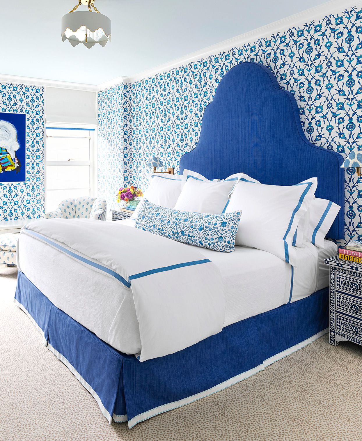
Idea 2: Powder blue + blue-and-white pattern for timeless charm
If you love classic bedrooms, lean into blue-and-white: striped bedding, floral curtains, or patterned pillows. Keep the walls
soft and let textiles do the talking. This looks great with traditional furniture shapes and simple artwork.
Idea 3: Blue-gray as the “I want blue, but not TOO blue” option
Blue-gray shades are famously versatile. They can read like a gentle neutral but still feel fresh. This is especially useful
if you want a calming color that works with lots of wood tones, mixed metals, and evolving decor (a.k.a. your taste changing
every six months).
Mid-Tone Blue Bedroom Ideas: The Sweet Spot Between Bright and Moody
Mid-tone bluesthink denim, slate, dusty cobalt, and muted tealare the “everyday heroes.” They’re bold enough to feel like a
design choice, but they won’t overpower the room (or your ability to relax).
Idea 4: Denim blue walls + warm wood for relaxed, modern comfort
Try a denim-like blue with oak or walnut furniture. Add white bedding for contrast, then pull the look together with a chunky
knit throw, a textured rug, and artwork that includes both warm and cool tones. This palette works beautifully in modern,
Scandinavian, and transitional bedrooms.
Idea 5: Dusty teal + greenery for a nature-leaning vibe
Blue-green shades can feel soothing and organicespecially when paired with plants, rattan, linen, and warm beige accents.
If your bedroom gets good daylight, a muted teal can feel fresh without going full tropical vacation poster.
Idea 6: Pattern-forward mid blues (wallpaper, stripes, gingham)
Want blue without painting the whole room? Consider wallpaper behind the bed or on one wall. A patterned blue wall adds
personality fast and gives you built-in direction for bedding and accents. Keep the rest of the room quieter so the pattern
can be the “main character,” not the “chaos coordinator.”
Deep Navy Bedroom Ideas: Cozy Drama That Still Feels Sophisticated
Navy is the little black dress of paint: reliable, flattering, and instantly elevated. It can read classic, modern, nautical,
moody, or romantic depending on what you pair it with.
Idea 7: Navy walls + warm accents (wood, brass, caramel, mustard)
Deep blue looks amazing when warmed up. Think caramel leather, honey-toned wood, brass lighting, and earthy textiles. Even one
warm accent color (mustard, rust, terracotta) can keep navy from feeling too seriousbecause your bedroom doesn’t need to look
like it’s filing taxes.
Idea 8: Color drenching for a “boutique hotel” cocoon effect
Color drenching means painting more than just the wallsthink trim, doors, and even the ceiling in the same color family.
With deep blues, this can be incredibly cozy and architectural. The trick is to add contrast through texture: linen bedding,
velvet pillows, matte ceramics, and a rug that brings in lighter tones.
Idea 9: Two-tone navy (paneling, half walls, or trim work)
If full navy feels intense, do it halfway: navy wainscoting with warm white above, or navy trim with lighter blue walls. This
adds structure and keeps the room feeling openespecially in smaller bedrooms.
Blue Bedroom Color Palettes That Practically Decorate Themselves
Blue is friendly, but it still wants good company. These pairings are consistently stylish, easy to build, and hard to mess up.
Palette 1: Blue + crisp white + natural wood
This is the clean, timeless combo. Use white bedding and light curtains, then bring in warmth with oak, rattan, bamboo shades,
or woven baskets. Great for coastal, farmhouse, and classic bedrooms.
Palette 2: Blue + cream + brass (soft and elevated)
Cream is warmer than bright white and makes blue feel more luxurious. Add brass sconces or a warm gold mirror to create a
polished, cozy glow.
Palette 3: Blue + blush or terracotta (unexpected, but gorgeous)
Blue and warm pink/earth tones balance each other beautifully. Try navy walls with a terracotta throw, or a dusty blue room
with blush pillows and warm wood. It feels modern and invitinglike you know what you’re doing, even if you picked pillows at
midnight.
Palette 4: Blue + green (layered and nature-inspired)
If you love a lived-in, layered look, mix blue with greens: olive accents, eucalyptus bedding, botanical prints. Keep one
color dominant and use the other as the supporting cast.
Texture Is the Difference Between “Calm” and “Cold”
The biggest mistake with blue bedrooms is going too flat: flat paint, flat bedding, flat lighting. Blue shines when it has
texture and warmth to bounce off of.
Layer textiles like a pro (without owning 400 pillows)
- Base: breathable cotton or linen sheets (white, cream, or a pale blue).
- Middle: a quilt or duvet in a slightly deeper or contrasting blue.
- Top: one textured throw (chunky knit, waffle, or faux fur) for coziness.
- Finish: 2–4 pillows max with varied textures (linen + velvet + embroidery works great).
Use warm lighting to flatter blue
Blue can look sharper under cool bulbs. In a bedroom, warmer bulbs and shaded lamps help blue feel softer and more relaxing.
If you paint the room a deeper shade, lighting becomes even more importantthink bedside lamps, sconces, and gentle overhead
options rather than one bright ceiling spotlight that interrogates your decor choices.
Small Bedroom? Blue Can Still Work (Yes, Even Navy)
Small spaces don’t ban deep colorsthey just need smarter strategy.
Option 1: A blue accent wall behind the bed
Paint the wall behind the headboard in a deeper blue, keep the other walls lighter, and use bedding that ties both together.
This creates depth and a focal point without swallowing the whole room.
Option 2: Paint trim and doors blue for subtle impact
If you want blue but prefer light walls, paint the trim, door, or even built-ins a beautiful blue. It’s a designer move that
adds character without turning the room into a paint showroom.
Option 3: Go dark, then go bright with contrast
Deep navy walls can make a small bedroom feel like a cozy retreat. Keep the bedding bright, add a mirror to bounce light, and
choose lighter wood tones to prevent heaviness.
A Quick Blue Bedroom Checklist (So You Don’t Overthink It for 9 Weeks)
- Pick your “anchor”: wall color, bedding, or a rugstart with one hero item.
- Choose 1–2 neutrals: white/cream + wood is the easiest win.
- Add one warm element: brass, caramel leather, terracotta, or warm oak.
- Build texture: linen, velvet, knit, woven shades, and layered rugs.
- Test paint: morning + night, lamps on + off (blue changes like it’s auditioning for a role).
Conclusion: Your Perfect Blue Bedroom Is a Shade (and a Strategy)
Whether you love whispery sky blue, dusty blue-gray, denim mid-tones, or full-on midnight navy, the best blue bedroom ideas
share the same formula: choose the right undertone for your light, balance blue with warmth, and layer texture so the room
feels soft and livable. Blue can be serene, dramatic, playful, classic, or modernso pick the version that fits your space
and your personality. And if you’re stuck, remember: bedding and lighting can rescue almost anything. Even that chair covered in
“clean” clothes.
Real-World Experiences: What It’s Like to Actually Live With a Blue Bedroom (500+ Words)
Designing a blue bedroom is fun in theorypaint samples, dreamy inspiration photos, a confident declaration that you’re going
“moody but calming.” Then real life shows up with uneven daylight, warm bulbs, cool bulbs, a comforter that doesn’t match what
you thought it was, and the shocking discovery that your “soft blue” looks like a sports drink at night.
Experience 1: The “same paint, different wall” surprise
One of the most common experiences people report is that blue can look different on each wall. A wall facing a window might
read bright and clear, while the opposite wall looks deeper or grayer. This is totally normal. The fix is simple: test a large
swatch on more than one wall and live with it for a day. If you only test one spot, you’re basically letting one corner of the
room make a decision for everyone else.
Experience 2: Light blue feels cleaner… until you add the wrong “white”
Light blue bedrooms often feel instantly fresherespecially with white bedding. But there’s a catch: not all whites behave the
same. A bright, cool white can make a pale blue look colder, while a creamy white can make it look softer and more inviting.
Many people end up “fixing” a too-cool light blue simply by switching bedding from stark white to ivory or warm white, then
adding a natural texture (like linen or a woven shade). It’s one of the cheapest ways to make a light-blue room feel finished.
Experience 3: Mid-tone blues are the least stressful to decorate
Homeowners who choose denim, slate, or dusty blues often find these shades easier to live with day-to-day. They hide minor wall
scuffs better than super-light paint and don’t demand perfect styling the way ultra-dark walls sometimes do. Mid-tone blues are
also flexible when your decor changes. Swap in new pillows, a different rug, or warmer wood and the room still works. If you
want “blue bedroom ideas” that won’t require a weekly styling photoshoot, mid-tone blue is the low-drama choice.
Experience 4: Navy is cozy… but it’s a lighting test, not a guessing game
People who go deep navy often describe the bedroom as “cozier” and more “luxurious,” especially at night. But they also learn
quickly that navy magnifies lighting problems. A single cold overhead light can make navy feel flat or harsh. The rooms that
look best typically have layered light: bedside lamps, a warm overhead option, and maybe a sconce or two. Once the lighting is
right, navy becomes less “dark cave” and more “boutique hotel.”
Experience 5: The “warmth rescue” is real
If a blue bedroom ever feels too cool, most people solve it the same way: add warmth. Warmth can be a wood tone (oak nightstands),
a metal (brass or bronze), a textile (camel throw, terracotta pillow, mustard accent), or even a warm-toned rug. It doesn’t take
much. One or two warm elements can make blue feel balanced and comfortable without changing the paint.
Experience 6: Blue looks better when you repeat it (but don’t overdo it)
A common “aha” moment is realizing that blue feels more intentional when it appears in at least three places: walls, bedding,
and one accessory (art, curtains, or a rug). This repetition makes the room feel cohesive. The trick is to vary the shades and
textureslight blue sheets, a slightly deeper quilt, and a patterned pillowso it feels layered rather than matched like a
uniform.
Bottom line: living with a blue bedroom is usually easier than people expect. Most “issues” are not paint disastersthey’re
lighting and styling adjustments. Test your blue, warm it up with texture, and let the room evolve. Blue is patient. Blue
understands. Blue will not judge your laundry chair (probably).