Green and gray is the design equivalent of ordering fries and a salad: you get comfort, you get freshness, and nobody has to pretend they’re not happy. A green & gray living room can feel calm and grown-up, but still livelylike a space that reads books and knows where the remote is at all times.
The magic is in the balance. Gray brings structure (hello, visual calm). Green brings life (hello, “my house doesn’t feel like a parking garage”). Done well, this color scheme works in modern, traditional, farmhouse, coastal, and even “I just moved and my couch is still in plastic” styles.
Why Green & Gray Works (Even If You’ve Been Burned by “Millennial Gray”)
Gray is a neutral that plays nice with almost everything. Green is nature’s neutralbecause the outdoors rarely clashes with itself. Together, they create a palette that’s easy to live with: soothing but not sleepy, stylish but not screaming for attention.
The secret sauce: undertones + contrast
- Undertones: A gray can lean blue, green, or warm (greige). A green can lean yellow (olive), blue (teal), or gray (sage).
- Contrast: If everything is the same “middle tone,” the room can look flat. You need light + medium + dark somewhere.
- Temperature: Cool gray + cool green = crisp and modern. Warm gray + olive green = cozy and earthy.
Pick Your Greens and Grays Like a Designer (Not Like a Person Panic-Scrolling Paint Chips)
Step 1: Choose the role of each color
Decide who’s the lead singer and who’s the backup vocalist:
- Gray as the base, green as the accent: Great for beginners, renters, and anyone who owns a gray sofa.
- Green as the base, gray as the anchor: Bolder, warmer, and instantly more “designed.”
- Green-gray blends: Sage/green-gray paint gives you both in one swipelike a two-in-one shampoo that actually works.
Step 2: Match saturation levels
A muted sage with a soft gray feels cohesive. A neon lime with a flat charcoal feels like a nightclub hosted in a basement. Keep the intensity similarespecially if you want a calm living room vibe.
Step 3: Use a simple 60-30-10 formula
- 60% = main color (walls or large rug)
- 30% = secondary color (sofa, curtains, major upholstery)
- 10% = accent (pillows, art, throws, ceramics)
Paint and Walls: The Fastest Way to Make Green & Gray Look Intentional
Paint is the biggest visual “surface area” decision you’ll make. Translation: it can make your living room look like a magazine… or like you lost a bet.
How lighting changes everything (and why your sample looked different at night)
Natural light direction matters. North-facing rooms tend to feel cooler; south-facing rooms get warmer, consistent light. That’s why the same green-gray can look cozy at noon and slightly haunted at 7 p.m. Test samples on multiple walls and check them morning, afternoon, and evening before committing.
Reliable wall strategies
- Soft gray walls + green accents: Light gray walls make greenery (plants and decor) pop without feeling busy.
- Green accent wall: A sage or deeper green behind the sofa creates a focal point with minimal commitment.
- Color drench (advanced but gorgeous): Paint walls and trim in the same green-gray for a cocoon effect, then layer textures.
- Wallpaper or mural moment: Green and gray are perfect for scenic murals or botanical patterns if you want drama without chaos.
Real paint-color inspiration (examples people actually use)
If you want a green-gray that behaves like a neutral, look at popular “gray-green” families: sage, sea-salt tones, and soft eucalyptus vibes. Examples frequently referenced by U.S. paint brands and shelter publications include green-grays like Sherwin-Williams Sea Salt and Evergreen Fog, and Benjamin Moore’s October Mist or Saybrook Sage. These shades tend to feel calm, modern, and easy to coordinate.
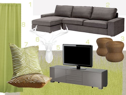
Furniture That Makes the Palette Feel Expensive (Even If Your Budget Is “Please Don’t Ask”)
Start with one anchor piece
In most living rooms, the anchor is the sofa. If yours is gray, you’re already halfway there. If yours is green, congratulationsyou’re bold and probably fun at parties. Either way, keep the anchor relatively solid and let smaller pieces do the pattern work.
Three easy sofa-and-green pairings
- Light gray sofa + sage green: airy, modern, and very forgiving with pets and kids.
- Charcoal sofa + olive: moody, cozy, and perfect with warm wood and brass.
- Warm greige sofa + eucalyptus green: soft, earthy, and timelesslike a fancy spa that also has snacks.
Don’t forget the “third color”
Green and gray shine brightest when something else adds warmth or sparkle: wood tones (walnut, oak), creamy whites, black accents, or brass. This keeps the room from feeling too cool or too monochrome.
Texture Is the Cheat Code
If your palette is calm, texture becomes the personality. And unlike personality, texture is easier to shop for.
Texture combos that always work
- Soft: boucle, chenille, velvet (green velvet pillows on a gray sofa = instant polish)
- Natural: linen curtains, jute rug, rattan basket, wood coffee table
- Structured: black metal, matte ceramic, ribbed glass, stone or faux-stone surfaces
Pattern without chaos
Want pattern but fear a “busy” room? Try one patterned item onlylike a rug or curtainsthen pull out small touches of green and gray from it. Think subtle stripes, botanicals, or vintage-inspired geometrics.
Styling a Green & Gray Living Room: What to Add (and What to Stop Adding)
Green accents that look intentional
- Plants: yes, real or fakeno judgment. Green with green is the easiest “match” on earth.
- Textiles: throw pillows, chunky knit blankets, curtains, or a slipcover on an accent chair.
- Art: landscapes, abstract greens, or black-and-white photography in warm frames.
- Ceramics & glass: smoky green vases or gray pottery look collected, not cluttered.
Gray elements that prevent “too much green”
- Rug: a gray or greige rug anchors everything and hides life’s little crimes (crumbs).
- Upholstery: gray sofa, gray curtains, or gray accent chair keeps the palette calm.
- Stone vibes: concrete-look planters, marble-ish trays, or slate-toned accessories add depth.
Common mistakes (and how to fix them fast)
- Everything is cool-toned and the room feels chilly. Add warm wood, creamy white textiles, or brass lighting.
- The room looks flat. Increase contrast: add a darker charcoal element or a deeper green (even just one pillow).
- Green looks “off” next to gray. The undertones are fighting. Swap either the green or gray to a closer undertone family (both warm or both cool).
- Too many small decor pieces. Edit. Keep fewer, larger items. Make your shelves look curated, not like a tiny museum gift shop.
Three “Room Recipes” You Can Copy (No Design Degree Required)
1) The Soft Sage Starter Kit (bright, calm, modern)
- Walls: warm white or very light gray
- Sofa: light gray
- Accents: sage pillows + one patterned rug with green hints
- Metals: brushed brass or warm nickel
- Wood: light oak coffee table
- Bonus: one oversized plant near the window
2) The Moody Library Lounge (cozy, dramatic, still inviting)
- Walls: deep green accent wall or full-room color
- Sofa: charcoal or dark gray
- Accents: olive throw + cream pillows for contrast
- Metals: black + antique brass mix
- Textures: velvet, leather, and a vintage-style rug
- Bonus: warm lighting (table lamps > overhead glare)
3) The Fresh Coastal Green-Gray (airy, relaxed, “weekend house” energy)
- Walls: green-gray (soft, misty tone)
- Sofa: medium gray or slipcovered neutral
- Accents: woven textures, striped pillows, sea-glass decor
- Metals: polished nickel or matte black
- Wood: driftwood tones or whitewashed pieces
- Bonus: botanical prints in simple frames
Experiences: What It’s Like to Live With a Green & Gray Living Room (The Good, the Real, and the “Oops”)
In real homes (not just staged ones), green and gray tends to be a surprisingly low-maintenance combinationwhen you set it up with everyday life in mind. One common experience: people start with a gray sofa because it feels “safe,” then realize the room looks a little… polite. Adding greenespecially a sage or eucalyptus toneusually fixes that instantly. It brings in the feeling of nature without demanding you repaint your entire life.
Another pattern shows up in smaller apartments: light gray walls can make a room feel bigger, but they sometimes read a bit sterile under cool bulbs. That’s where green does its best work. A couple of green pillows, a leafy plant, or even a muted green throw can soften the edges and make the space feel lived-in in the best way. People often say the room feels “calmer” after adding green, which makes senseour brains tend to associate greens with outdoorsy, restorative spaces.
Families and pet owners often discover a practical perk: gray hides scuffs and general chaos better than bright white, while green disguises dust better than black. The sweet spot is choosing a gray that isn’t too blue (unless you love a crisp, modern vibe) and a green that isn’t too neon. The most “livable” greens are usually a little gray themselvessage, olive, and green-graysbecause they don’t show every fingerprint or feel like they’re shouting.
There’s also a very real “undertone moment” that happens: someone buys a gray rug, then buys a green paint sample, and suddenly the green looks weirdly yellow or the gray looks purple. That’s not you being dramaticthat’s undertones doing their sneaky little thing. A fix people swear by is testing samples next to the actual room elements (rug, sofa fabric, flooring), not against a random white wall in isolation. Once the undertones align, the palette clicks and everything looks intentional.
Finally, the biggest lived-in lesson: lighting makes or breaks this scheme. Overhead cool bulbs can make gray feel icy and green feel dull. Warm, layered lightingfloor lamps, table lamps, soft LED bulbsmakes green look richer and gray look more velvety. People who switch lighting almost always report the room feels more “expensive” without buying anything new. And if you do nothing else, adding one large plant is the quickest way to make a green and gray living room feel complete. It’s like adding a finishing pinch of salt to a recipe: suddenly everything tastes (and looks) more like itself.
Conclusion: Your Green & Gray Game Plan
A green & gray living room works when it’s balanced: match undertones, build contrast, and layer texture like you mean it. Start with one anchor (sofa or wall color), add a “third color” for warmth, and let lighting do the heavy lifting. The result is a space that feels calm but not boringfresh but not fussyand stylish enough to impress guests without making you live like a museum guard.
Research basis (U.S. sources): guidance and inspiration were synthesized from major home and design publishers and paint brands, including Sherwin-Williams, Benjamin Moore, HGTV, The Spruce, Apartment Therapy, Better Homes & Gardens, Martha Stewart, Real Simple, Architectural Digest, Elle Decor, Southern Living, This Old House, and Bob Vila.