If spreadsheets had a love language, it would probably be “show me the numbers.” And few charts do that better than a break-even chart. It shows the exact point where your total revenue and total costs finally shake hands, stop fighting, and agree to call it even. No profit. No loss. Just financial neutrality with a side of relief.
If you run a business, manage a budget, launch products, or simply enjoy taming chaos with cells and formulas, learning how to make a break even chart in Excel is wildly useful. It helps you answer practical questions like: How many units do I need to sell? How much revenue do I need to stop losing money? And why does coffee suddenly taste better once the chart starts pointing toward profit?
In this guide, you’ll learn how to calculate the break-even point, build the data table, and create a clean break-even graph in Excel step by step. You’ll also get a worked example, formatting tips, common mistakes to avoid, and a practical section on what real experience teaches you after building these charts more than once.
What Is a Break-Even Chart?
A break-even chart is a visual that compares total revenue and total cost across different sales volumes. The point where the two lines intersect is the break-even point. That is the moment when revenue equals total cost.
In plain English, it answers one very important business question: When do we stop losing money?
A typical break-even chart includes:
- X-axis: units sold or sales volume
- Y-axis: dollars
- Total revenue line: how sales grow as units increase
- Total cost line: fixed costs plus variable costs
- Break-even point: where revenue and cost meet
This makes a break-even analysis easier to understand than a formula alone. Numbers are helpful. Pictures that explain numbers are even better.
The Formula Behind the Break-Even Point
Before you build the chart, you need the math. Thankfully, the formula is simple enough that Excel does not need to file a complaint.
Break-Even Point in Units
Break-Even Units = Fixed Costs / (Price per Unit - Variable Cost per Unit)
Contribution Margin
Contribution Margin = Price per Unit - Variable Cost per Unit
The contribution margin tells you how much each sale contributes toward covering fixed costs. Once fixed costs are covered, that same amount starts contributing to profit. That is why this number matters so much in any break-even analysis in Excel.
Break-Even Sales Dollars
Break-Even Sales = Break-Even Units × Price per Unit
For example, if your fixed costs are $12,000, your selling price is $50 per unit, and your variable cost is $20 per unit, then:
- Contribution Margin = $50 – $20 = $30
- Break-Even Units = $12,000 / $30 = 400 units
- Break-Even Sales = 400 × $50 = $20,000
That means you need to sell 400 units to break even. Unit 401 is where the party starts.
What You Need Before You Create the Chart
To make a break even chart in Excel, gather these inputs first:
- Fixed costs
- Variable cost per unit
- Selling price per unit
- A range of possible unit sales values
Your fixed costs stay the same regardless of output, such as rent, salaries, insurance, or software subscriptions. Your variable costs change with production, such as packaging, materials, shipping, or direct labor per unit.
Once you have those, Excel can calculate everything else.
Step-by-Step: How to Make a Break Even Chart in Excel
Step 1: Enter Your Assumptions
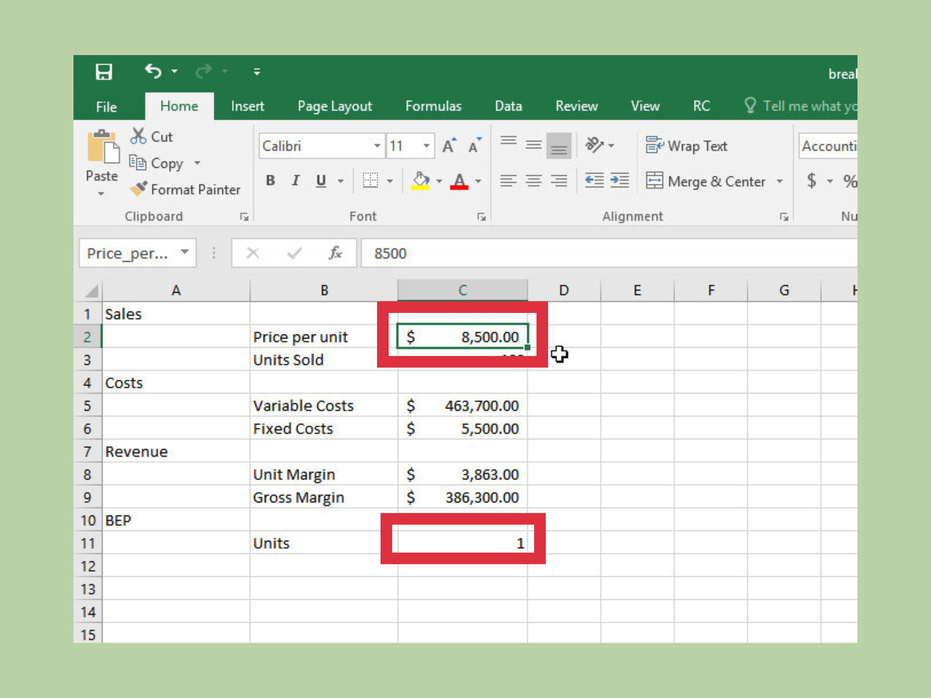
Open a new worksheet and create a small assumptions section near the top. For example:
| Cell | Label | Value |
|---|---|---|
| B2 | Fixed Costs | 12000 |
| B3 | Price per Unit | 50 |
| B4 | Variable Cost per Unit | 20 |
Then add a contribution margin formula in B5:
=B3-B4
Add the break-even units formula in B6:
=B2/B5
If you want break-even sales dollars in B7, use:
=B6*B3
Now you have the core calculation in place.
Step 2: Build the Sales Volume Table
Next, create a table that shows different unit levels. Put this lower on the sheet so your chart data stays neat.
| A10 | B10 | C10 | D10 |
|---|---|---|---|
| Units Sold | Total Revenue | Total Cost | Profit/Loss |
Under Units Sold, enter a sequence such as:
0, 100, 200, 300, 400, 500, 600, 700, 800
Make sure your range goes past the break-even point. If your chart stops before the intersection, Excel will politely pretend it never happened.
Step 3: Add Revenue and Cost Formulas
In B11, enter the total revenue formula:
=A11*$B$3
In C11, enter the total cost formula:
=$B$2+(A11*$B$4)
In D11, enter profit or loss:
=B11-C11
Copy those formulas down for the full range of units.
You now have the complete data needed for an Excel break-even graph.
Step 4: Add a Helper Point for the Break-Even Marker
This step is optional, but it makes your chart much clearer.
Set up two helper cells:
- F2: Break-Even Units →
=B6 - G2: Break-Even Dollars →
=B7
These cells will create a single plotted point that marks the exact intersection.
Step 5: Insert the Chart
Now select your data range for Units Sold, Total Revenue, and Total Cost. For example, highlight A10:C19.
Then go to:
- Insert
- Charts
- Choose Scatter with Straight Lines or 2-D Line
If you want the most accurate horizontal scale for numeric units, an XY (Scatter) chart is usually the better choice. If your unit intervals are evenly spaced and you want the simplest setup, a 2-D Line chart also works well.
Once inserted, Excel will plot your revenue line and cost line.
Step 6: Add the Break-Even Point Series
To add the break-even point marker:
- Click the chart
- Choose Chart Design > Select Data
- Click Add
- Name the series Break-Even Point
- Set X values to the break-even units cell
- Set Y values to the break-even dollars cell
Format that series as a marker with no line, so the dot stands out clearly.
Step 7: Add Axis Titles and a Chart Title
Good charts are like good haircuts: if people notice the structure, you probably did something right.
Add these labels:
- Chart Title: Break-Even Chart
- Horizontal Axis: Units Sold
- Vertical Axis: Dollars
You can also label the break-even point with text such as:
Break-Even: 400 Units / $20,000
Step 8: Clean Up the Formatting
To make your break-even chart easier to read:
- Use a clean white background
- Reduce extra gridlines
- Make the revenue and total cost lines thicker
- Keep the legend simple
- Format the Y-axis as currency
- Use data labels only where they add value
A break-even graph should explain the story in five seconds or less. If it looks like a spreadsheet exploded on contact, simplify it.
A Worked Example
Let’s use the same numbers from above:
- Fixed Costs = $12,000
- Price per Unit = $50
- Variable Cost per Unit = $20
Your formulas tell you:
- Contribution Margin = $30
- Break-Even Units = 400
- Break-Even Sales = $20,000
Your chart data would look something like this:
| Units Sold | Total Revenue | Total Cost |
|---|---|---|
| 0 | $0 | $12,000 |
| 100 | $5,000 | $14,000 |
| 200 | $10,000 | $16,000 |
| 300 | $15,000 | $18,000 |
| 400 | $20,000 | $20,000 |
| 500 | $25,000 | $22,000 |
At 400 units, the lines cross. That is your break-even point. Below it, total costs are higher than revenue. Above it, revenue pulls ahead, which is exactly what your accountant likes to see.
How to Use Goal Seek for a Faster Break-Even Analysis
If you want Excel to figure out the break-even volume automatically from a profit formula, use Goal Seek.
Here’s the setup:
- Create a cell for units sold
- Create a revenue formula:
=Units*Price - Create a total cost formula:
=Fixed Cost+(Units*Variable Cost) - Create a profit formula:
=Revenue-Total Cost
Then go to:
- Data
- What-If Analysis
- Goal Seek
Set the profit cell to 0 by changing the units sold cell.
Excel will return the break-even quantity. This is especially handy when building a more dynamic break-even analysis Excel model for presentations, pricing reviews, or scenario planning.
Common Mistakes to Avoid
Using Variable Cost Totals Instead of Variable Cost Per Unit
The formula needs the variable cost per unit, not the total variable cost for the month. Mixing those up will make your chart lie to you with impressive confidence.
Not Extending the Units Range Far Enough
If your highest unit level is below the break-even point, the lines may never intersect on the chart. That usually means the chart is incomplete, not that your business is cursed.
Forgetting Absolute References
Use dollar signs in formulas like $B$2, $B$3, and $B$4 so your assumptions stay fixed when you copy formulas down.
Choosing the Wrong Chart Type
A line chart is easy, but a scatter chart often gives you a more accurate numeric X-axis. If your unit values are irregular or not evenly spaced, go with scatter.
Overdesigning the Chart
You are explaining cost behavior, not auditioning for a graphic design reality show. Keep it clean and readable.
Why a Break-Even Chart Matters
A break-even chart is more than a school exercise or a finance-team decoration. It can help you:
- Set smarter sales targets
- Test new pricing strategies
- Understand the impact of rising costs
- Evaluate whether a product launch is realistic
- Communicate business risk clearly to managers or investors
It is also one of the easiest ways to connect financial planning with visual storytelling. A spreadsheet full of formulas is useful. A chart that shows the exact moment you cross into profitability is memorable.
And if you want an extra metric, calculate your margin of safety too. That shows how far your actual sales sit above the break-even point. In other words, it tells you how much room you have before things get uncomfortable again.
Experience Section: What Building Break-Even Charts in Excel Actually Teaches You
After you build a few break-even charts in Excel, something funny happens: you stop thinking of them as just finance visuals and start seeing them as decision-making tools. The first time most people make one, they focus on the mechanics. Enter the formulas. Insert the chart. Make the lines cross. Feel mildly victorious. The second time, they start using it to ask better questions. That is where the real value shows up.
One of the biggest lessons experience teaches is that the quality of the chart depends entirely on the quality of your assumptions. Excel will calculate beautifully with bad inputs. It will even do it quickly, which is frankly rude. If your fixed costs are incomplete or your variable costs are too optimistic, the chart may look polished while quietly steering you into a terrible decision. In real projects, the hard part is not usually the formula. It is defining costs honestly.
Another practical lesson is that break-even charts are excellent conversation starters. Teams that argue in abstract terms often become much clearer when the chart is on the screen. Instead of saying, “We need more sales,” someone can say, “We need 140 more units to break even at the current price.” Instead of saying, “Costs seem high,” someone can test what happens if variable cost drops by $2 or price rises by $3. The chart turns vague panic into measurable options, which is a much nicer vibe for meetings.
Experience also teaches you that simple beats clever almost every time. It is tempting to add trendlines, shadows, gradients, labels everywhere, and maybe a chart title that sounds like it belongs in a dramatic documentary. Resist that urge. The best break-even chart is usually the one a non-finance person can understand in under ten seconds. Two lines, one point of intersection, clear axes, and a short label often do more work than a heavily decorated dashboard.
There is also a human side to these charts. When business owners or project managers see the break-even point for the first time, reactions tend to fall into two categories. Either they say, “Oh, that’s actually doable,” or they say, “Oh. We need to talk.” Both reactions are useful. A break-even graph in Excel can be encouraging, but it can also be a reality check, and sometimes that is the more valuable service.
Finally, the more you work with break-even charts, the more you realize they are not just about breaking even. They are about understanding leverage. Small changes in price, cost, and volume can move the break-even point dramatically. That is the real lesson hiding inside the chart. It trains you to think less about raw revenue and more about structure: margin, cost behavior, and risk. Once you start seeing business that way, Excel stops feeling like a spreadsheet program and starts feeling like a strategy tool with gridlines.
Conclusion
Learning how to make a break even chart in Excel is one of those skills that looks technical but pays off in plain English. It helps you see when sales cover costs, how pricing affects profitability, and whether a business plan is realistic before reality gets the last laugh.
The process is straightforward: enter your assumptions, calculate contribution margin, build a units-and-dollars table, and chart total revenue against total cost. Add a break-even point marker, format the chart cleanly, and you have a powerful visual that explains the numbers fast.
Whether you are preparing a startup model, managing a small business, teaching finance, or trying to make sense of product economics, an Excel break-even graph is worth having in your toolkit. It is simple, practical, and far more persuasive than saying, “Trust me, the math works out.”