There are two kinds of tile people in the world: the “I want it to disappear” crowd and the “I want it to stare back at me” crowd.
If you’ve clicked anything with the words Shakespearian and Goth in the same sentence, congratulationsyou’re in
group two. These tiles aren’t trying to blend in. They’re here to monologue, steal the scene, and leave your backsplash feeling like it
just joined a secret society.
But “dramatic” doesn’t have to mean “haunted.” A Shakespearian-inspired tile moment can read as cultured, witty, and deliciously moodylike
candlelight in a library, not a fog machine in a basement. In this guide, we’ll break down what makes these tiles special, how to design
with them without overdoing it, and how to keep a limestone “art tile” looking sharp for the long haul.
What “Shakespearian-Inspired” Looks Like in Tile (Without the Ruffled Collar)
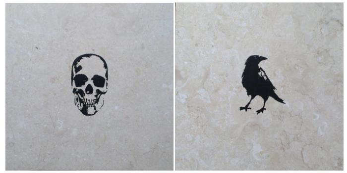
Shakespeare’s world is basically a buffet of visual cues: crowns, crests, daggers, stage symbols, romantic tragedy, political intrigue, and
the occasional skull that shows up like an uninvited guest at a dinner party. Shakespearian-inspired tile takes that imagery and distills it
into crisp iconographysymbols that feel old-world and theatrical, but still graphic enough to look modern on a wall.
The “touch of Goth” is the secret seasoning. Think high contrast, shadowy palettes, metallic gleam, and motifs that flirt with the macabre
(skulls, ravens, crosses, crests) without becoming costume décor. Done well, it reads less “spooky” and more “sophisticated drama.”
The goal is a space that feels layered and storiedlike your kitchen has opinions and your powder room writes poetry at midnight.
The Collection Vibe: A Little Tragedy, A Little Treasure
Remodelista highlighted a line of tiles that nails this mood by treating each tile as a small artwork: a centered icon on a stone “stage,”
with just enough negative space to keep it graphic rather than fussy. The result is a tile that behaves more like a framed print than a
repeating patternperfect when you want one unforgettable moment instead of a whole room yelling at you at once.
And that’s the key design insight: Shakespearian-inspired tiles work best when you treat them like punctuation, not wallpaper.
A few well-placed tiles can create a focal point with the power of a soliloquy. Too many, and it’s opening night… every night… forever.
Meet the Maker Energy: When Tile Becomes Art
A big part of the appeal is that these aren’t mass-printed lookalikes. They’re rooted in an artist-collaboration approachwhere the tile
brand acts like a gallery and the material becomes the medium. That matters because it changes how you design with them: you’re not just
“choosing finishes,” you’re curating a visual story.
Why centered motifs feel so “theatrical”
Centered icons have a stage-like quality: your eye goes straight to the “actor” (the motif), while the stone background provides the set.
This format also plays nicely with minimalismbecause even maximalist imagery looks more intentional when it’s cleanly framed and spaced.
Translation: you can get your drama without cluttering your visual field.
Why Limestone Is the Perfect Backdrop for Goth-Adjacent Glam
Limestone brings a soft, tactile warmth that balances darker themes. It’s not glossy like ceramic, not hard-edged like polished marble, and
not industrial like concrete. Honed limestone, in particular, gives you a matte, touchable surface that reads calm and architecturaleven
when the motif is a skull.
The stone also adds natural variation, which keeps the look from feeling flat or overly “graphic design poster.” That variation is your friend:
it’s the difference between “I bought a spooky tile” and “I installed a material with character.” The stone’s subtle movement makes metallic
inks (gold, platinum) look richer, and black-and-white motifs look more historic than harsh.
Where limestone shines (and where it needs boundaries)
Limestone can be practical in bathrooms and on walls when it’s properly sealed and thoughtfully placed, but it’s still a natural stone. It’s
porous, it can stain, and it doesn’t love harsh cleaners. If you want the vibe without the maintenance anxiety, use limestone art tiles in
places that don’t take daily splashes of hair dye, turmeric, or “I swear this red wine was a controlled pour.”
Design Playbook: How to Use Shakespearian Goth Tiles Without Summoning a Decor Poltergeist
1) The “gallery moment” backsplash
The easiest win is a backsplash with a calm field tile (simple limestone, pale zellige, classic ceramic) and a few motif tiles sprinkled in
like curated art. Think of them as the paintings on the wall of your kitchen museum. Place one above the range, one near open shelving, or
three in a neat row behind the sink.
- Pro tip: keep spacing consistent so the motifs feel intentional, not accidental.
- Pro tip: if the icon is dark, echo it once elsewherecabinet hardware, a light fixture, or a thin black frame.
2) The powder room “plot twist”
Powder rooms are made for bold moves because you’re not living in them for hours. A single wall of stone tile with one striking Shakespearian
motif over the sink can feel like a secret set piece. Add a moody paint color, a warm mirror, and suddenly your guests are texting people
from your bathroom like it’s a tourist attraction.
3) The entryway “crest and crown” welcome
If you love the idea of a dramatic threshold, use a motif tile in an entry niche, on a small wainscot panel, or as an inlaid “medallion”
moment in a stone floor (with proper planning and a pro installer). It’s the design equivalent of a wax seal on a lettersmall, formal, and
oddly satisfying.
4) The fireplace surround cameo
A fireplace surround is a natural place for theatrical detail. Use motif tiles sparinglyone centered above the mantel line, or a pair
balanced left and right. The flame gives you literal drama; the tile gives you visual drama. Together, it’s a cozy tragedy with a happy ending.
5) The “modern monastery” kitchen island panel
This one’s for the bold: a vertical panel of stone tile on the back of a kitchen island, with one motif tile centered like a plaque.
Pair it with simple bar stools and warm wood so the tile reads as art, not theme décor. Bonus: it’s far away from most messes.
Color, Contrast, and the Gentle Art of Not Overdoing It
Shakespearian-inspired tiles often come in a tight paletteblack, white, and metallicsbecause that’s where the drama lives. The trick is to
use contrast strategically. High contrast (black on pale stone) reads graphic and modern. Low contrast (white on pale stone) reads subtle and
mysterious. Metallics read ceremoniallike jewelry for your walls.
Pairing guide: what works with what
- Black motif + pale stone: crisp, editorial, great with modern cabinetry.
- White motif + pale stone: quieter, more “found artifact,” perfect for calm spaces.
- Gold or platinum motif: luxe and theatricalbest with warm metals, creamy paint, and soft lighting.
If you’re flirting with the goth side, remember: goth is a mood, not a mandatory black ceiling. You can keep everything else bright
and let the tile do the storytelling. A white kitchen with one raven tile? That’s intrigue. A black kitchen with twenty raven tiles? That’s
a bird sanctuary with commitment issues.
Grout matters more than you think
Grout is the subtitle of your tile story. Match grout to the stone for a seamless, gallery-like look. Choose a darker grout only if you want
a more graphic gridand only if you’re prepared for the grid to become the main character. When the tile is already theatrical, subtle grout
usually keeps the performance classy.
Practical Notes: Installation, Sealing, and Keeping the Drama on the Wall (Not in Maintenance)
Natural stone art tiles reward good prep. The most common “why does this look weird?” problems come from layout mistakes, inconsistent spacing,
and uneven substrate. With centered motifs, a tile that’s off by a quarter inch can look like it’s leaning out of a portrait frame.
Installation best practices
- Dry lay first: plan exactly where each motif tile goes before anything is set.
- Use a level layout line: your eye will notice a drifting “art row” immediately.
- Ask for clean cuts: don’t place motif tiles where they’ll be awkwardly sliced at corners.
- Respect stone variation: mix tiles from different boxes as you go to keep the look natural.
Sealing 101 (stone edition)
If your tile is limestone (or any natural stone), sealing is not optional in most real-life homes. Sealer helps reduce staining and makes
surfaces easier to clean. The two big categories are penetrating sealers (go into pores, usually minimal look change) and topical sealers
(sit on the surface, can change sheen, may need more maintenance).
Your tile maker may also apply a proprietary finishespecially for inked or screen-printed surfaceswhich can change the care instructions.
In other words: follow the manufacturer’s recommendations first, and use general stone-care rules as your backup plan.
Cleaning rules that save your tiles from tragedy
- Avoid acids: vinegar, lemon-based cleaners, and harsh “magic” products can etch calcareous stone like limestone.
- Skip abrasives: scouring powders and rough pads can scratch stone and dull finishes.
- Go gentle: mild, pH-neutral cleaners and soft cloths are your best friends.
- Be cautious with steam: heat and moisture can be a bad combo for natural stone and some sealers.
Budget Strategy: How to Get the Look Without Paying for a Whole Castle
Art tiles are rarely the cheapest tiles in the room. But they don’t need to be everywhere to work. In fact, they look more expensive when
they’re used sparinglybecause your eye reads them as intentionally placed, not randomly repeated.
A smart strategy is to treat motif tiles like jewelry: buy a few statement pieces and surround them with a simpler “outfit.” Use plain stone
or a classic ceramic as the field tile. Then place the Shakespearian tiles where they’ll get attention: above a faucet, near a light source,
or centered on a feature wall. You’re paying for impact, not square footage.
Common Mistakes (AKA: How a Great Tile Idea Becomes a Design Meme)
Over-theming
If you add Gothic tiles, Gothic wallpaper, Gothic chandelier, Gothic mirror, and Gothic towel hooks, your bathroom doesn’t feel curatedit
feels like it has a newsletter. Pick one hero element (the tile) and let everything else support it quietly.
Wrong lighting
Dramatic tiles love good lighting. If your space has cold, harsh overhead light, metallic motifs can look flat and black motifs can look
severe. Warm, layered lighting (sconces + ceiling light) makes stone feel rich and intentional.
Placing motifs where they’ll be constantly abused
If a motif tile is directly behind a stovetop where it will be blasted with oil, tomato sauce, and the occasional “how did that get up there?”
moment, you’re signing up for more cleaning than you want. Put the drama where it’s admirednot where it’s punished.
Conclusion: Make It Literary, Not Gimmicky
Shakespearian-inspired tiles with a touch of goth are at their best when they feel like a discovered treasure: a symbol with history, placed
with intention, and balanced by calm materials. Use them like art. Give them space. Let stone be stone. And keep the rest of the room from
auditioning for the same role.
The payoff is huge: a home detail that feels personal, witty, and a little mysteriouslike your design choices have read books and aren’t
afraid to quote them (quietly, in the corner, with excellent lighting).
Real-World Experiences: Living with Shakespearian Goth Tiles (The Extra You Asked For)
People who choose statement “art tiles” often describe the first few weeks as a tiny adjustment periodbecause you don’t just have a
backsplash anymore; you have a conversation starter. Guests notice it immediately, and the comments tend to come in two waves. Wave one is
simple: “Whoa. What is that?” Wave two is more specific: “Is that a raven?” “Is that a skull?” “Why does your kitchen look like it belongs
to a very stylish novelist?” It’s the rare home finish that gets treated like artwork rather than “nice tile.”
Day-to-day, the experience is less dramatic than the lookespecially if you’re using the tiles in a protected spot like a powder room or an
island panel. In kitchens, homeowners often say the biggest surprise is how much lighting changes the mood. In bright daylight, the limestone
reads airy and natural, and the motif looks graphicalmost like an illustration. At night, under warm lamps, the same tile becomes softer,
moodier, and more “old world.” Metallic inks, in particular, behave like jewelry: they can look subtle from across the room and then suddenly
glow when you walk past at an angle.
Maintenance experiences vary based on placement and habits. People who already prefer gentle cleaners barely notice the “extra” care needs.
But if your cleaning style is “grab the strongest spray and declare victory,” natural stone will force a small lifestyle change. Many end up
keeping a simple pH-neutral stone cleaner under the sink and wiping splashes soonerless because the tile is fragile, and more because they
want to protect the finish and keep the motif crisp. The good news is that sealed stone is often easier to wipe clean than people expect;
the bad news is that vinegar is no longer invited to the party.
Another common experience is what designers call “restraint satisfaction.” At first, some homeowners worry they didn’t use enough motif tiles.
Then they live with it and realize the minimal approach is what makes it feel expensive. One crest tile above a sink can feel like a custom
detail you’d find in a boutique hotel. Ten crest tiles in a row can feel like a themed restaurant. Most people grow to love the breathing room
around each motif because it keeps the room flexiblemeaning they can swap a mirror, repaint a wall, or change hardware later without the tile
clashing or taking over.
Finally, there’s a subtle emotional payoff people mention: the tiles feel personal. Not in a “family photo collage” way, but in a “this house
has taste and a point of view” way. It’s a small daily pleasure to wash your hands in a powder room and catch a glimpse of a tiny symbol that
feels like a secret. That’s the real magic of Shakespearian-inspired goth tile: it’s not just décorit’s atmosphere you get to live with.