Somewhere on the internet, there’s a place where color theory goes to scream, chairs are built by people who clearly hate knees, and fonts live in daily fear of being stretched to oblivion. That place is the “Ugly Design” page – and Bored Panda’s feature “40 Crimes Against Good Taste From The ‘Ugly Design’ Page” turns its weirdest finds into an unforgettable gallery of design disasters.
But this collection is more than just a roast of bad taste. It’s also a crash course in what not to do in design, whether you’re decorating a room, building a website, or slapping a motivational quote onto a coffee mug. Let’s walk through why we love these crimes against good taste, what they say about how humans see beauty, and how you can learn from them without repeating their mistakes in your own projects.
Meet the “Ugly Design” Page: Where Good Taste Goes to Die (Lovingly)
The “Ugly Design” Instagram account has become a cult favorite for people who enjoy watching design go completely off the rails. Curated by Swiss founders Jonas Nyffenegger and Sébastien Mathys, the page gathers the worst of the worst from everyday life: cursed furniture, painful typography, bizarre architecture, and products that make you whisper, “But… why?”.
Bored Panda has featured these finds in multiple compilations, including a roundup of 40 examples that feel like personal attacks on good taste. The vibe is simple: take a perfectly normal object – a couch, a stairway, a lamp – and make it so visually confusing that people have to stare just to figure out what went wrong. The end result is an oddly satisfying mix of horror, delight, and secondhand embarrassment.
What makes the “Ugly Design” page so addictive is its combination of sincere craftsmanship and absolutely unhinged choices. Many of these objects are well made. The stitching is neat, the welds are clean, the installation is solid. It’s just that someone, somewhere, made one spectacularly bad call on color, shape, placement, or purpose – and that’s where the magic (and the comedy) happens.
Why We Can’t Stop Looking at Bad Design
You’d think people would prefer beautiful, functional, minimalist design. And yes, that’s great… in theory. But the internet runs on chaos, and ugly design delivers it in glorious high definition.
There are a few reasons these “crimes against good taste” are so compelling:
- They break the rules we take for granted. We’re used to door handles being reachable, chairs being sit-able, and fonts being legible. When those assumptions are shattered, the result is funny, unsettling, or both.
- They make us feel like design experts. You don’t need a degree to look at a carpeted bathroom or a lipstick-red toilet and think, “That’s wrong.” Bad design is instantly recognizable, which makes people feel smart and in on the joke.
- They show how thin the line is between genius and disaster. Many “ugly” designs are one decision away from being cool, experimental, or even iconic. That tension keeps us scrolling.
- They’re a safe way to judge things. Laughing at a horrible couch or cursed logo feels less mean than judging people. The villain is the object, not the person.
Other design-fail roundups across the web – from bad graphic design to unusable websites – echo the same idea: we’re fascinated by what happens when creativity loses its brakes. Ugly design is the car crash of aesthetics: we shouldn’t look, but of course we do.
Common Crimes Against Good Taste (With Exhibits A, B, C…)
Even though the “Ugly Design” page covers every possible category, a few types of mistakes show up again and again. Think of them as the main “charges” in this ongoing case against good taste.
1. Form Completely Ignores Function
One of the most common sins in these Bored Panda collections is design that forgets why the object exists in the first place. For example:
- A staircase with steps of random heights and widths, turning a simple walk upstairs into a balance test.
- A chair shaped like jagged geometric art, where actually sitting down feels like a chiropractic risk.
- A sink placed directly above an electrical outlet, making washing your hands feel like a game of “Will I get electrocuted today?”
These designs might look “interesting” in a photo, but they fail the simplest question: can a normal person use this without confusion, pain, or hazard? If the answer is no, you’re not looking at “avant-garde”, you’re looking at a form-over-function crime scene.
2. Color Palettes That Physically Hurt
Color is powerful. It can calm, energize, or guide people through a space. Or, in the wrong hands, it can cause instant regret.
The “Ugly Design” gallery is full of:
- Neon-on-neon combos that make text impossible to read.
- Bathroom tiles patterned so aggressively they look like optical illusions.
- Walls painted in mismatched shades that clash like a shouting match in RGB.
Many web and UX experts point out that bad color contrast is one of the fastest ways to ruin usability. If your audience has to squint, tilt their head, or back up from the screen just to process what they’re seeing, your design has officially turned hostile.
3. Typography Crimes and Graphic Design Fails
Fonts are supposed to communicate messages clearly. In the wild world of ugly design, they do anything but.
Bored Panda’s graphic-design-fail collections are full of offenders:
- Inspirational quotes written in swirly cursive over busy photos, making the words unreadable.
- Words broken in the wrong places so they accidentally spell something unfortunate.
- Stretching and squeezing fonts until letters look like they’re begging for mercy.
Graphic design pros often warn that typography is a silent deal-breaker. You can have a decent layout and solid imagery, but if your text is chaotic, the whole design feels cheap or confusing.
4. Architecture and Interior Nightmares
Some of the most memorable “crimes” in the “Ugly Design” universe are architectural or interior decisions that feel like pranks:
- Random columns blocking doors and walkways.
- Windows placed at ankle height for no obvious reason.
- Buildings shaped like objects that really shouldn’t be building-shaped, if you know what we mean.
Architecture-shaming communities thrive because bad building design affects everyone. You don’t need to understand structural engineering to know that a hotel façade resembling a giant kitchen appliance is… a choice.
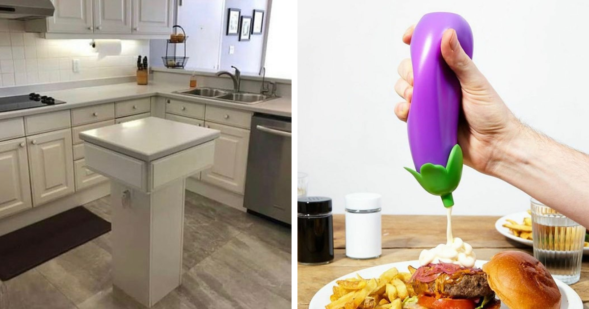
5. Products Nobody Asked For (And No One Should Have Designed)
Finally, there are the products that leave you speechless: clothing with cursed patterns, kitchen gadgets that solve problems no human has ever had, and decorative items that feel like props from a surreal comedy sketch.
These “solutions in search of a problem” are a classic sign that design has drifted away from real-life users. Instead of thinking about who will use the product and how, someone chased novelty for novelty’s sake – and ended up featured on “Ugly Design” instead of in a showroom.
What Designers Can Learn From the “Ugly Design” Page
It’s tempting to treat these 40 crimes against good taste as pure entertainment and move on. But if you’re a designer, decorator, or business owner, they’re also a goldmine of practical lessons.
When UX and web design experts analyze bad websites, they point to the same mistakes we see in these ugly physical designs:
- Too much clutter. Too many visual elements competing for attention create instant overwhelm.
- Poor hierarchy. Users don’t know where to look first, so they give up.
- Ignoring accessibility. Fonts that are too small, colors with poor contrast, or layouts that are hard to navigate can make designs unusable.
- Surprise where there should be predictability. People expect doors to open a certain way, buttons to behave consistently, and navigation to be intuitive. Breaking these patterns isn’t “creative”; it’s confusing.
The takeaway is simple: if a design looks “cool” but confuses real users, it fails its job. The best designs feel almost invisible because they work so smoothly. The worst ones end up on Bored Panda.
How Bored Panda Turns Design Fails into Internet Gold
Part of the charm of the Bored Panda feature on “Ugly Design” is the way it curates these disasters. The photos are funny on their own, but the captions and context make them even better, inviting readers to react, comment, and share.
The site’s editors often:
- Arrange images so the absurdity escalates as you scroll.
- Highlight especially strange details you might miss at first glance.
- Quote followers or the original poster to add a human reaction to the moment of discovery.
This transforms the “Ugly Design” content from a random feed of fails into a community experience. People don’t just see the design; they remember the feeling of seeing it for the first time – which is exactly why the article format works so well.
How to Enjoy Ugly Design (Without Repeating It)
Want to scroll the “Ugly Design” page like a pro – and maybe become a better designer in the process? Try this mini field guide:
- Ask what the object is supposed to do. Then check how many design decisions actively fight that purpose.
- Look for one change that would fix it. Could a different color, layout, or placement save the design?
- Spot the pattern of mistakes. Is it a color issue, a readability issue, a safety issue, or just aesthetic chaos?
- Translate it to your own work. If this were an app, a website, or a living room, what’s the equivalent mistake you should avoid?
- Enjoy the chaos, but respect the lesson. Laugh today, design better tomorrow.
My Experience Falling Down the “Ugly Design” Rabbit Hole
The first time you land on the “Ugly Design” page, it usually starts innocently. You see one cursed lamp shaped like something it should absolutely not be shaped like, you chuckle, and you think, “Okay, that’s enough internet for today.”
Then you scroll. And scroll. And scroll.
Before you know it, you’ve mentally redesigned half the objects in your own home. You start questioning every decision you’ve ever made: “Is my couch secretly ugly? Did I commit a crime against good taste with that accent wall? Is my favorite mug one decision away from being featured next to a toilet with carpeted seat covers?”
One of the most surprising parts of going through a full Bored Panda gallery about “Ugly Design” is how it rewires your designer brain. Somewhere between the 12th cursed staircase and the 27th horrifying bathroom, you start to notice patterns:
- Bad design is rarely about a lack of effort. Many of these objects clearly took time and skill.
- The disaster usually happens at the concept level, not the execution. Someone had an idea that should’ve been gently stopped in a meeting… but wasn’t.
- The ugliest designs almost always ignore the user. They serve the ego of the creator or the gimmick of the moment instead of real people.
After spending time with these 40 crimes against good taste, everyday life starts to feel like a design audit. You notice when a sign is placed too high to read, when a website’s buttons change size on every page, or when the pattern on a restaurant floor makes it impossible to tell where the steps begin.
And yet, there’s something oddly inspiring about it all. These failures are reminders that:
- Not every idea needs to be safe to be memorable.
- Experimentation will occasionally go very wrong, and that’s okay.
- You can learn a lot by studying what doesn’t work – sometimes more than from what does.
If you work in design, marketing, content, or branding, taking a “field trip” through the “Ugly Design” universe can actually sharpen your instincts. You start asking better questions: “Is this readable? Is this comfortable? Will this still make sense in a year?” You think harder about accessibility, usability, and visual hierarchy – not just aesthetics.
And if you’re just here for the laughs, that’s valid too. There’s genuine joy in seeing a truly ridiculous lamp or an unforgivable sofa and knowing that, at the very least, you didn’t buy it. The “Ugly Design” page and Bored Panda’s roundups give us a communal place to gasp, cringe, and laugh together at the wild things humans create when no one says “maybe don’t.”
In the end, these 40 crimes against good taste are less of a warning and more of a mirror. They show us what happens when we forget the basics: clarity, comfort, context, and care. They also prove that even when design fails spectacularly, it can still bring people together – around a screen, in the comments, and in that shared moment of “Who approved this?”
Final Thoughts: Ugly Design, Beautiful Lessons
“40 Crimes Against Good Taste From The ‘Ugly Design’ Page | Bored Panda” is hilarious, yes, but it’s also quietly educational. It reminds us that:
- Good design is about people first, aesthetics second.
- Bad design is rarely boring – and that’s why it spreads so quickly.
- Studying failures is one of the fastest ways to improve your own taste and skills.
So go ahead and enjoy the chaos. Laugh at the cursed couches, tragic typography, and baffling buildings. Then, when it’s your turn to design something – a product, a room, a website, a logo – remember what you saw here. Let the “Ugly Design” page be your “never again” board, and use its crimes against good taste as fuel to create things that are bold, thoughtful, and beautifully usable.