Choosing exterior paint colors sounds easy until you realize your house is basically a 3D object that lives outdoors, gets blasted by sunlight, and has to look good next to your neighbor’s “bold” decision from 2009. The good news: you don’t need a design degree (or a crystal ball). You just need a smart plan and a palette that respects your home’s architecture, your roof color, and the fact that paint swatches lie under fluorescent store lighting.
This guide gives you 42 exterior color schemes mapped to common architectural stylesfrom Colonial and Craftsman to Midcentury and Modern Farmhouse. Each scheme includes a body color, trim color, and an accent (front door, shutters, or small details). Use them as-is or mix-and-match like a playlist: keep the vibe, swap the song.
Before You Pick a Palette: The 5-Minute Curb-Appeal Checklist
1) Start with what you can’t paint
Roof shingles, brick, stone, pavers, concrete, and even your driveway are the bossy roommates of exterior design. Your paint color should coordinate with these fixed materials, not fight them.
2) Use the “60–30–10” rule
- 60% body/siding (the main color)
- 30% trim (windows, fascia, columns)
- 10% accent (front door, shutters, brackets, railings)
3) Pick trim like you pick frame styles
High-contrast trim (white on deep color) emphasizes details and looks crisp. Low-contrast trim (slightly lighter or darker than the body) feels modern and quieterlike your house is whispering, not shouting.
4) Remember sunlight is a filter (and it’s not subtle)
Bright sun makes colors look lighter and can wash out undertones; shade makes them look deeper and sometimes moodier. Test samples outside in morning, midday, and evening. Yes, this sounds extra. No, you won’t regret it.
5) Decide what you want your house to “say”
Do you want timeless (neutrals, classic contrasts), cozy (warm earth tones), fresh (soft blues/greens), or dramatic (charcoal, black, deep navy)? The style of your home can handle more personality than you thinkif the proportions are right.
42 Exterior Color Schemes by Architectural Style
Each idea below lists a Body, Trim, and Accent. Adjust warm vs. cool (and light vs. dark) to suit your roof, stonework, and setting. If your neighborhood has an HOA, consider this your friendly reminder to check the rules before you fall in love with “Midnight Thunderstorm Noir.”
Classic & Traditional Homes (1–12)
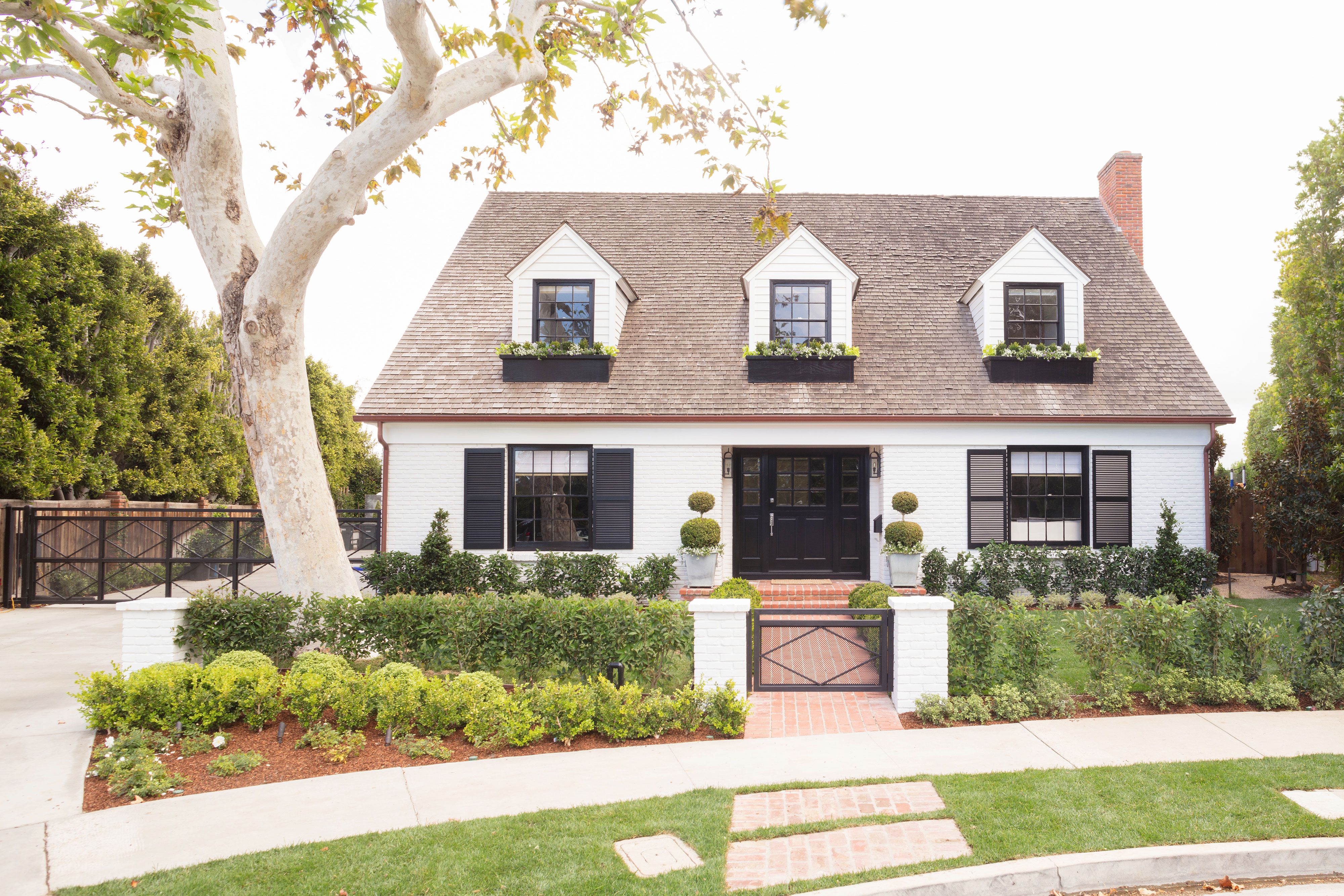
- Georgian / Federal Classic: Body: warm white. Trim: crisp white. Accent: glossy black shutters + a true red door for historic, balanced formality.
- Colonial Revival Contrast: Body: soft cream. Trim: bright white. Accent: charcoal shutters + a deep navy door to keep symmetry sharp, not stiff.
- Cape Cod Coastal Neutral: Body: foggy gray. Trim: clean white. Accent: muted blue door for that “salty air, clean lines” vibeeven inland.
- Greek Revival Monumental: Body: pale warm white. Trim: slightly brighter white. Accent: black or bronze door for a column-forward, museum-calm look.
- Traditional Brick Refresh: Body: keep natural brick. Trim: warm white. Accent: hunter green or black door to make brick feel intentional (not “stuck in time”).
- New Traditional Warm Modern: Body: light greige. Trim: soft white. Accent: matte black windows/rails for a clean upgrade that still feels friendly.
- Classic Americana: Body: creamy white. Trim: white. Accent: navy shutters + a red doorlike a crisp button-down for your house.
- Farmhouse Heritage: Body: bright white. Trim: white. Accent: black windows + natural wood door to blend classic simplicity with modern edge.
- French Country Limestone: Body: creamy beige (limestone-inspired). Trim: soft taupe. Accent: dusty blue shutters for relaxed elegance.
- Tudor Storybook (But Make It Livable): Body: warm greige stucco. Trim: creamy off-white. Accent: espresso “timber” details + oxblood door.
- Italianate Town Charm: Body: pale taupe. Trim: bright white. Accent: deep green door to highlight brackets and tall windows.
- Shingle Style Subtle: Body: weathered cedar or cedar-toned stain. Trim: soft white. Accent: deep navy door for classic coastal restraint.
Cottages, Coastal, and Countryside (13–21)
- Beach Bungalow Cheer: Body: pale aqua. Trim: white. Accent: coral doorplayful without turning your house into a popsicle.
- Key West / Caribbean Bright: Body: soft butter yellow. Trim: bright white. Accent: turquoise door for vacation energy year-round.
- English Cottage Garden: Body: mossy green. Trim: creamy white. Accent: black door + copper lighting for that “tea and roses” mood.
- Storybook Cottage Warmth: Body: soft blush or warm putty. Trim: warm white. Accent: forest green door to ground the sweetness.
- Lake House Deep Blue: Body: lake blue. Trim: white. Accent: natural wood door + black railings to echo water and dock hardware.
- Mountain Cabin Modern Rustic: Body: deep olive. Trim: dark bronze. Accent: stained wood doorearthy tones that don’t disappear into the trees.
- Stone Cottage Neutral Layering: Body: warm putty. Trim: soft white. Accent: slate-blue door for a calm, old-world feel.
- Country Ranch “Soft & Sunny”: Body: light beige. Trim: warm white. Accent: muted red door for a welcoming, farmhouse-adjacent touch.
- Desert Cottage Calm: Body: sand. Trim: creamy beige. Accent: teal door to add color without fighting the landscape.
Craftsman, Prairie, and Arts & Crafts (22–30)
- Craftsman Classic Nature: Body: sage green. Trim: warm cream. Accent: brick-red door to complement earthy stone and wood details.
- Craftsman Rich & Cozy: Body: russet brown. Trim: tan. Accent: deep teal door for a grounded palette with a surprise wink.
- Arts & Crafts “Smoky Heritage”: Body: smoky blue-gray. Trim: off-white. Accent: ochre or mustard door to echo historical warmth.
- Bungalow Golden Hour: Body: muted mustard. Trim: ivory. Accent: espresso brackets/rails for warmth that still feels tailored.
- Prairie School Horizontal: Body: warm greige. Trim: deeper bronze-brown. Accent: burgundy door to emphasize long lines and trim bands.
- Prairie Modern Neutral: Body: soft taupe. Trim: charcoal. Accent: natural wood doorsimple, architectural, and very “intentional.”
- Craftsman “Green + Cream + Black”: Body: olive green. Trim: creamy white. Accent: black sash/windows to sharpen all the handcrafted details.
- Wood-and-Stone Lodge: Body: dark stain (cedar/walnut). Trim: black. Accent: stone left naturalbecause sometimes paint’s job is to step aside.
- Historic Porch Pop: Body: soft tan. Trim: warm white. Accent: glossy black door + a muted blue porch ceiling for classic charm.
Ranch, Midcentury, and Postwar Favorites (31–38)
- Ranch Refresh (Classic): Body: soft taupe. Trim: white. Accent: aqua door for a friendly upgrade that fits long, low rooflines.
- Ranch Refresh (Modern): Body: light greige. Trim: soft white. Accent: stained wood door + black house numbers for a clean update.
- Split-Level Balance: Body: blue-gray. Trim: bright white. Accent: sunny yellow doorgreat for breaking up tall facades.
- Midcentury Minimal: Body: warm white. Trim: charcoal. Accent: orange door (or teak) to channel Palm Springs without the airfare.
- Midcentury Desert Modern: Body: dusty terracotta. Trim: cream. Accent: turquoise door to play nicely with stone, gravel, and cacti.
- A-Frame in the Pines: Body: deep forest green. Trim: black. Accent: natural wood door so the triangle feels sleek, not campy.
- Contemporary Ranch Dark Trim: Body: pale gray-beige. Trim: black. Accent: cedar door for contrast that doesn’t feel harsh.
- Atomic Pastel (Tasteful Edition): Body: soft mint. Trim: warm white. Accent: coral or tomato-red doorretro, but not cartoonish.
Mediterranean, Southwest, and Stucco Styles (39–42)
- Spanish / Mediterranean Classic: Body: warm stucco white. Trim: minimal (tone-on-tone). Accent: deep cobalt door to pair beautifully with terracotta roofs.
- Mission Revival Earthy: Body: creamy beige. Trim: soft white. Accent: dark bronze or wood door for a grounded, sun-baked look.
- Santa Fe Adobe Iconic: Body: clay rose. Trim: brown. Accent: turquoise dooryes, it’s classic for a reason.
- Modern Desert Neutral: Body: sand. Trim: charcoal. Accent: sage door to keep things organic, modern, and landscape-friendly.
How to Make Any Scheme Look Custom (Not “Builder Beige #7”)
Use undertones on purpose
Two “grays” can behave like completely different species: one leans blue, another leans green, another secretly loves purple. Match undertones to permanent materials: cool roof + cool paint; warm stone + warm paint.
Upgrade with paint placement, not just paint color
- Highlight architecture: Paint brackets, gables, and window trim to show off craftsmanship.
- Minimize awkward features: Downplay mismatched additions with a unified body color and low-contrast trim.
- Make the door a “hello” moment: A front door is a small surface with big personality potential.
Pick sheen like a pro
Flat hides imperfections but can hold dirt; satin is a common sweet spot for siding; semi-gloss on trim adds durability and a subtle “finished” look. Translation: your trim should look like it moisturizes.
Wrap-Up: The Best Exterior Color Is the One That Fits Your House
The smartest exterior paint palettes respect three things: your home’s architectural style, your home’s fixed materials, and your home’s light. Start with a scheme that matches your style, test it outside, and adjust the warmth/coolness until it feels “right.” When in doubt, keep the body color classic and put the fun on the front doorbecause repainting a door is a weekend project, not a life event.
of Real-World Experience (So You Don’t Repaint Twice)
Here’s what homeowners and designers consistently learn the hard wayso you don’t have to. First, the same color can look like five different colors depending on the time of day. A “perfect greige” in the morning can read slightly green at noon, then turn mysteriously mauve at dusk. That’s not the paint being dramatic; it’s your environment filtering it. Trees cast green light, nearby red brick bounces warmth, and north-facing walls stay cooler and darker. The fix is boring but effective: paint big test patches (or sample boards) and move them around the house for a few days.
Second, the roof always wins. If your shingles are warm brown, cool gray paint can look icy and disconnected. If your roof is charcoal, warm beige can look a little “off” unless the undertones match. People often start by picking a trendy body color and only later realize the roof is silently vetoing the whole plan. A better approach is to choose a body color that harmonizes with the roof first, then have fun with the door and accents.
Third, trim is the unsung hero. Many “something feels wrong” exteriors aren’t a body-color problemthey’re a trim-color problem. Too stark of a white can make siding look dirty by comparison; too creamy of a trim can look yellow against cooler materials. Slightly soft whites (instead of bright, optical whites) often look more expensive because they’re easier on the eyes and more forgiving in harsh sun.
Fourth, landscaping changes the entire read. A deep green house can look rich and classic next to evergreensbut in a desert yard it might feel heavy. Conversely, a light sand color can glow beautifully in arid climates but may look washed out in foggy coastal areas. Even seasonal landscaping matters: if you have lots of summer greenery, your home may read warmer; in winter, it can look cooler and more exposed.
Fifth, there’s a practical lesson: dark colors demand more prep. Deep charcoals and blacks can look stunning, but they emphasize texture differences and can show chalking or dust more easily. They’re not “bad,” they’re just high-maintenancelike a white shirt at spaghetti night. If you love dark exteriors, a common compromise is a medium body color with dark accents (windows, trim, shutters), which delivers drama without the full-time commitment.
Finally, the best exteriors feel intentional. That usually means repeating a color somewhere (door color echoed in planters, hardware, or house numbers), keeping the palette tight (three colors is plenty), and letting the architecture do the talking. Your house already has a styleyour paint job’s mission is to make it look like it knows it.