Bedrooms are supposed to be your home’s soft landingequal parts calm, cozy, and “please don’t talk to me until I’ve had coffee.”
And yet, designers swear the same handful of bedroom “features” keep showing up like an uninvited group chat member:
loud, distracting, and weirdly confident about it.
The good news: most bedroom eyesores aren’t expensive problems. They’re usually a handful of dated shortcuts, builder-grade defaults,
or “it came as a set, so it must be right!” decisions. The even better news: fixing them can make your room feel bigger, calmer,
and more intentionalwithout needing to sell a kidney on Marketplace.
What Designers Mean When They Say “Eyesore”
In designer-speak, an “eyesore” isn’t just something ugly. It’s something that pulls focus in the wrong waysomething that makes
your bedroom feel less restful and more like a showroom, a waiting room, or a time capsule from a specific era of big-box shopping.
The bedroom is extra sensitive because it’s where your brain is trying to power down. Visual chaos, harsh contrasts, and “matchy”
decisions tend to fight that mission.
Below are five bedroom features designers consistently call out as instant vibe killersplus practical ways to replace them with
choices that feel current, comfortable, and personal (the goal is “boutique hotel,” not “budget bedding aisle”).
1) Accent Walls That Look Like They’re Trying Too Hard
Accent walls had a long run. For years, the formula was simple: pick one wall (usually behind the bed), paint it a bold color or
slap on dramatic wallpaper, and call it a “feature.” Sometimes it worksespecially if the wall has architectural interest or the
wallpaper is genuinely special. But often, it reads as a half-commitment: one wall is dressed for a party, the others showed up in sweatpants.
Why designers call it an eyesore
- It can feel random. If the accent wall doesn’t relate to the rest of the room, it looks like an afterthought.
- It emphasizes imbalance. One “statement” surface can make the room feel visually lopsided.
- It dates quickly. Trendy colors, chevron patterns, or high-contrast feature walls can scream “that year we all did this.”
What to do instead (without repainting your whole life)
-
Go cohesive: If you love the color/pattern, consider using it more broadlyeither across all walls, or by repeating it
in textiles (bedding, curtains) and decor so it feels intentional. -
Try “fifth wall” drama: If you want a statement without the awkward one-wall effect, treat the ceiling as a design surface.
A painted ceiling, wallpaper overhead, or even subtle color on the trim can feel bold and curated. -
Make the accent architectural, not just painted: Instead of a random color block, consider a headboard wall with paneling,
picture-frame molding, or a textured finish that adds depth.
Specific example
If you have a navy accent wall behind the bed and everything else is bright white, soften the contrast: repaint the other walls a warm off-white,
add a rug with navy accents, and bring in a throw pillow with navy + cream. Suddenly, it’s a palettenot a jump scare.
2) Plain White Bedroom Walls That Feel Sterile
White walls aren’t automatically wrong. But “plain, stark, builder-grade white” in a bedroom can come off coldespecially under artificial
lighting. Instead of “fresh and airy,” it can read “clinical,” like your bed is waiting for a clipboard and a blood pressure cuff.
Why designers call it an eyesore
- Cold whites can look harsh at night. Bedrooms are mostly experienced in warm lamplight, not midday sunlight.
- It can feel unfinished. If the walls are plain white and the decor is minimal, the room often feels sparse rather than serene.
- It highlights clutter. Bright white surfaces make cords, laundry piles, and mismatched furniture stand out even more.
What to do instead
- Choose warmer “quiet neutrals”: Creamy whites, soft beiges, gentle greiges, and muted taupes keep the calm without the hospital vibe.
- Go moody (in a soothing way): Dusty blues, soft greens, and deep wine-adjacent tones can feel cocoon-likeespecially with layered textures.
-
Add texture if you keep white: If you’re committed to white walls, bring the warmth through natural materialslinen drapes, wool rugs,
wood nightstands, and fabric shades.
Specific example
If your room is currently “white walls + gray comforter + black dresser,” try shifting to a warm neutral wall color and swapping one cold element
for something tactilelike a linen duvet, a chunky knit throw, or a woven rug. The room will look intentionally minimal instead of accidentally empty.
3) Bulky, Oversized Ceiling Fans That Dominate the Room
Comfort matters. Nobody wants to sleep like a rotisserie chicken. But designers often complain about ceiling fans that are too big, too dated,
or visually heavyespecially when they hang low and become the room’s accidental “statement piece.”
Why designers call it an eyesore
- Scale gets weird fast. A fan that’s too large can make the ceiling feel lower and the room feel smaller.
- Style clashes. Ornate or clunky fans can fight with modern, cozy, or minimalist bedrooms.
- It steals attention. Instead of your bed or artwork being the focal point, the fan becomes the first thing you notice.
What to do instead
- Pick a streamlined fan: Think clean lines, low-profile or “hugger” styles for low ceilings, and finishes that match your hardware and lighting.
- Size it properly: Use room size as the guide so the fan supports the space instead of swallowing it.
- Consider a statement light instead: If you don’t truly need a ceiling fan, a great flush-mount or pendant can instantly elevate the room.
Specific example
If your bedroom is medium-sized and the fan looks like it belongs in a gymnasium, swapping to a correctly sized, low-profile fan can make the room
feel taller and calmerlike you renovated, even if you just unscrewed and replaced.
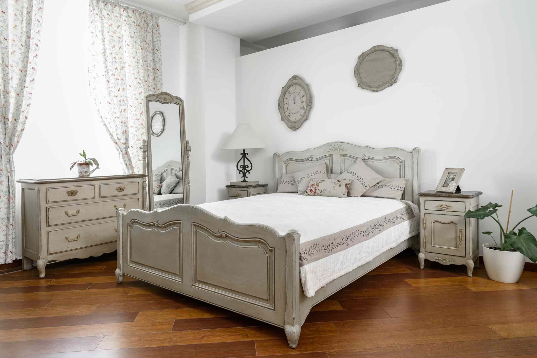
4) A Matching Bedroom Set That Looks Like a Furniture Showroom
The matching bedroom set is the decorating equivalent of ordering the same entrée as everyone else “so it’s easier.”
Matching sets are convenient, surebut designers often see them as a shortcut that drains personality from a room.
When everything matches, nothing stands out in a good way.
Why designers call it an eyesore
- It feels cookie-cutter. A room that looks purchased in one trip can feel staged instead of lived-in.
- No layering, no story. Bedrooms look best when they’re built over timedifferent finishes, shapes, and textures that still feel cohesive.
- It can look dated quickly. Sets tend to reflect a very specific style moment, and that moment doesn’t always age gracefully.
What to do instead
- Mix, but with a plan: You can combine wood tones, metal finishes, and erasjust keep one unifying thread (a shared undertone, a repeated color, or a consistent level of “modern vs. traditional”).
- Upgrade one anchor piece first: Swap the bed frame or dresser, then build around it. One great vintage dresser can make everything else look more intentional.
- Use “pairs” strategically: Matching nightstands can look polishedjust avoid the full-suite effect where every piece is identical.
Specific example
Keep your existing dresser, but replace the nightstands with smaller vintage tables or simple floating shelves. Add a bed frame with a different finish.
The room still coordinates, but it no longer looks like a catalog page you accidentally walked into.
5) “Bed-in-a-Bag” Sets That Look Flat and Predictable
If bedding could talk, bed-in-a-bag sets would say, “We included everything you need!” while quietly ignoring the fact that “everything”
is usually the same fabric, the same sheen, and the same vibe from pillowcase to bedskirt. Designers tend to dislike them because they look overly coordinatedand not in a chic way.
Why designers call it an eyesore
- It lacks depth. When all bedding pieces match perfectly, the bed can look one-notelike a display, not a nest.
- It can cheapen the room. Even if the furniture is nice, overly coordinated bedding often reads “big box bundle.”
- It doesn’t feel personal. Bedrooms should reflect you. A pre-packed set reflects… a warehouse.
What to do instead (designer-style layering, minus the drama)
- Start with a calm base: High-quality sheets in a solid or subtle pattern.
- Add a duvet with contrast: A textured duvet cover (linen, cotton percale, matelassé) in a shade slightly lighter or darker than the sheets.
- Finish with a throw: One cozy layer at the foot of the bedbouclé, wool, waffle weave, or a classic quilt.
- Keep pillows simple: Two sleeping pillows, two shams, and one accent pillow is plenty. Your bed shouldn’t need a seating chart.
Specific example
Instead of a gray “everything matches” set, try: crisp white sheets + a warm oatmeal duvet + a charcoal throw + one patterned lumbar pillow that repeats
those tones. It looks collected, not coordinated.
A Quick “Is This an Eyesore?” Checklist
If you’re not sure whether something in your bedroom is working, ask yourself:
- Does it dominate the room? (Fans, high-contrast walls, oversized furnitureusually guilty.)
- Does it look like it came from one purchase? (Full matching sets and bundled bedding often do.)
- Does it feel sterile or unfinished? (Plain white walls plus minimal texture can read cold.)
- Does it feel like a “trend snapshot”? (Some accents age faster than you think.)
- Does it help you relax? If the answer is “no,” your bedroom is filing a formal complaint.
Conclusion
Great bedrooms don’t have to be complicated. Designers keep coming back to the same idea: the room should feel cohesive, warm, and personal.
If you ditch the high-contrast accent wall, soften stark whites, right-size your ceiling fan, break up the matching furniture suite, and layer your bedding
like a human who lives there, your bedroom immediately looks more elevatedeven if you change nothing else.
The real secret is intentionality. “Pretty” isn’t about spending more; it’s about choosing fewer things that work harder:
better textures, calmer colors, and pieces that feel collected instead of packaged.
Extra: Real-World Bedroom Experiences & Lessons (500+ Words)
Designers often describe bedroom makeovers as less “dramatic reveal” and more “quiet relief.” The biggest changes usually aren’t about buying a dozen new things.
They’re about removing the few choices that constantly tug your attentionlike a feature wall that doesn’t match the rest of the room, or a ceiling fan that feels
like it’s hovering over your bed with main-character energy.
One of the most common real-world scenarios is the builder-grade starter bedroom: plain white walls, a matching furniture suite, and a bundled comforter set.
Nothing is offensively wrong, but the room feels oddly temporarylike you’re subletting your own life. The first “aha” moment usually happens when someone changes
just one element and realizes the entire room reacts.
For example, people who swap stark white paint for a warmer off-white (or a muted blue/green) are often surprised by how much calmer the room feels at night.
It’s not just the colorit’s the way the color behaves under lamplight. Suddenly the bedding looks richer, wood furniture looks warmer, and the room stops feeling
like it’s lit for a spreadsheet.
The second big experience designers hear about? Breaking up the matchy-matchy. Many homeowners feel nervous mixing finishes because they assume
“coordinated” means “identical.” But once they introduce one contrasting piecesay, swapping matching nightstands for a vintage table on one side and a simple
modern nightstand on the otherthe room often looks more intentional, not less. The space starts to feel collected. Like it belongs to a person, not a showroom.
Bedding is another area where real bedrooms transform fast. People who move away from bed-in-a-bag sets frequently describe the new look as “hotel-like,” even when
they didn’t spend much. The trick is layering: crisp sheets, a textured duvet, then one throw or quilt to add depth. The bed stops looking flat and starts looking
inviting. And yesmost people also report that fewer decorative pillows is a quality-of-life upgrade. If making your bed feels like solving a foam puzzle every morning,
it’s not “luxury”; it’s a hobby you didn’t ask for.
Ceiling fans are a quieter but surprisingly emotional change. When someone replaces a bulky, oversized fan with a sleek, correctly sized versionor removes it in favor
of a great ceiling lightthey often say the room feels “taller” and “cleaner.” It’s a classic example of how one disproportionate object can drag a whole room down.
Scale matters, especially in a bedroom where the ceiling is always in your sightline.
Finally, accent walls are where many people feel the most “seen.” Plenty of homeowners did one because it was affordable and felt bold. The frustration shows up later:
the room never quite feels finished. The experience designers describe isn’t shameit’s evolution. People move toward more cohesive choices: wrapping the room in a color
they truly like, using the ceiling as a “fifth wall,” or choosing wallpaper that feels intentional rather than performative. When it’s done right, the room stops feeling
like a collection of separate decisions and starts feeling like one calming idea.
The shared lesson across these experiences is simple: a bedroom looks expensive and thoughtful when it feels cohesive, layered, and personal. You don’t need a designer budget.
You need fewer “default” choicesand more choices that reflect how you actually want to feel when you walk in the door and collapse onto the bed like a victorious pancake.
