Red is the friend who shows up to brunch wearing sunglasses indoors and somehow pulls it off. It’s bold, emotional,
and impossible to ignorewhich is exactly why people love it… and also why they panic the second they try to pair it
with anything else.
The good news: there are tons of colors that go with red. The better news: once you understand
which red you’re using (tomato? brick? burgundy?) and what vibe you want (cozy? crisp? dramatic? playful?),
you can build a red color palette that looks intentional, elevated, and not like your room got dressed in the dark.
Why Red Works (Even When It “Shouldn’t”)
Red grabs attention faster than almost any other hue. That’s why it’s everywherefrom stop signs to logos to that one
throw pillow you keep moving around because it “almost” works. In design terms, red acts like a visual exclamation
point: it anchors a space, energizes a scheme, and adds depth when everything else feels too safe.
But here’s the trick: red doesn’t always need to “match.” Sometimes red works best when it’s the unexpected accent
that makes the whole composition feel sharperlike adding hot sauce to a dish that was fine, but now it’s memorable.
Pick Your Red First (Yes, Red Has Personalities)
1) Warm reds vs. cool reds
Warm reds lean orange or brown (think brick, rust, terracotta). Cool reds lean pink, berry, or blue (think cherry,
cranberry, burgundy). Warm reds love earthy partners; cool reds play beautifully with blues, purples, and crisp
neutrals.
2) Saturation matters
A bright primary red behaves like a spotlight. A muted red (like clay or dried rose) behaves more like a cozy lamp.
If your red is super saturated, pair it with calming or grounding colors so your space doesn’t feel like it’s yelling.
3) Finish changes everything
Glossy red feels punchy and modern. Matte red feels velvety and rich. A red lacquer cabinet is a statement; a red
painted wall in an eggshell finish can feel surprisingly softespecially with the right supporting colors.
21 Knockout Color Combinations That Go With Red
Below are 21 high-impact, real-life-friendly color combinations with red. Each one includes where it shines and how
to keep it looking polished (not chaotic).
1) Red + Crisp White
If red is the exclamation point, white is the clean page behind it. This combo feels fresh, bright, and timeless.
Great for kitchens, bathrooms, and anywhere you want energy without heaviness.
- Try it: Red island or barstools with white walls and simple hardware.
- Pro tip: Add natural wood or black accents so it doesn’t feel too “candy cane.”
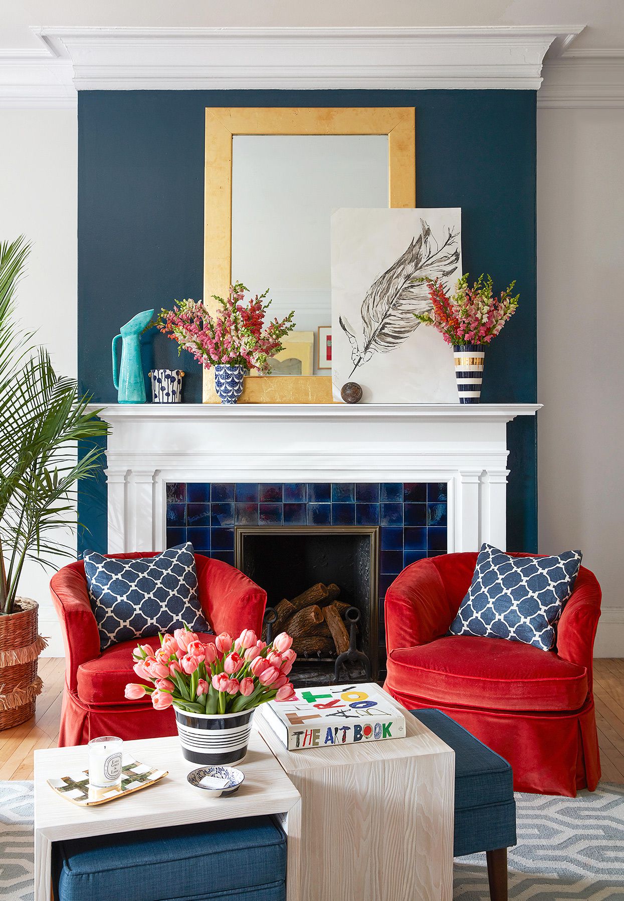
2) Red + Black
Red and black is classic drama: high contrast, high confidence. It can read glamorous, graphic, or edgy depending on
how you style it.
- Try it: A red accent wall with black-framed art and black lighting.
- Keep it elegant: Add warm neutrals (cream, tan) to soften the intensity.
3) Red + Charcoal Gray
Charcoal is black’s calmer, more grown-up sibling. Pairing red with charcoal keeps things modern and groundedideal
for offices, living rooms, and contemporary spaces.
- Try it: Charcoal sofa, red pillows, and a layered gray rug.
- Why it works: Charcoal absorbs visual noise so red can shine without taking over.
4) Red + Warm Greige (Stone/Putty/Soft Taupe)
When you want red to feel sophisticated and livable, pair it with warm greige. It’s cozy, balanced, and great in
rooms with less natural light.
- Try it: Muted brick red textiles against putty walls.
- Shortcut: If you’re nervous about red paint, use red in rugs and art first.
5) Red + Navy
Red and navy is crisp, confident, and slightly preppyin the best way. It works in traditional homes, coastal looks,
and modern spaces that need structure.
- Try it: Navy built-ins with red patterned curtains.
- Style note: Add brass or warm wood so it feels rich, not rigid.
6) Red + Powder Blue
Powder blue softens red instantly. This is a smart combo when you want red to feel cheerful instead of intense.
Perfect for bedrooms, nurseries, and airy living spaces.
- Try it: A pale blue wall with small red accents (vase, lamp, art).
- Best reds here: Cherry, strawberry, or slightly pink-leaning reds.
7) Red + Teal
Teal gives red a jewel-toned partner that feels bold but balanced. Together they look curated, especially in
mid-century and eclectic interiors.
- Try it: Teal velvet chair with a deep red rug.
- Make it cohesive: Repeat each color at least twice in the room.
8) Red + Turquoise
Turquoise brings a playful, energetic contrast that keeps red from feeling heavy. This pairing can lean global,
bohemian, or modern depending on pattern and texture.
- Try it: Turquoise accessories against warm red clay walls.
- Pro move: Add white or sand tones to keep it breezy.
9) Red + Emerald Green
This is the “luxury lounge” pairing: rich, saturated, and dramatic. Emerald and red work especially well when at
least one of them is deep (burgundy + emerald is a knockout).
- Try it: Emerald drapes, burgundy accents, and warm brass.
- Keep it refined: Use plenty of negative space (cream walls or lighter floors).
10) Red + Sage Green
Sage is a soft, dusty green that makes red feel warmer and more natural. This is a great “I want color but not a
circus” combination.
- Try it: Sage cabinetry with rust red textiles.
- Best reds here: Terracotta, brick, and muted tomato shades.
11) Red + Olive/Moss Green
Olive and moss ground red with an earthy, slightly vintage vibe. The combo feels warm, relaxed, and layeredgreat
for living rooms and libraries.
- Try it: Olive walls with a red Persian-style rug.
- Texture tip: Add leather, linen, and aged wood for depth.
12) Red + Mint/Seafoam
Mint and seafoam cool red down and make it feel lighter. It’s surprisingly good for small accents, retro looks, and
spaces where you want a fresh pop.
- Try it: Seafoam tile with a red runner in a kitchen.
- Watch the undertones: Keep mint slightly muted so it doesn’t turn cartoonish.
13) Red + Mustard Yellow
Mustard brings warmth and a vintage edge. Red + mustard can feel mid-century, artsy, and cozyespecially with a
little black or walnut wood.
- Try it: Mustard armchair, red artwork, and a neutral sofa.
- Balance: Use white or cream as a buffer color.
14) Red + Gold/Brass
This combo instantly reads “intentional.” Gold (especially aged brass) makes red feel richer and more tailored.
Ideal for dining rooms, powder rooms, and glam corners.
- Try it: Deep red walls with brass sconces and a warm mirror frame.
- Keep it classy: Add ivory, not stark white, for a softer glow.
15) Red + Blush Pink
Red and blush is warm, modern, and surprisingly versatile. It’s not “too sweet” if you keep blush dusty and use red
in controlled doses.
- Try it: Blush walls with red floral art and warm wood furniture.
- Best setting: Bedrooms, dressing areas, and cozy living rooms.
16) Red + Hot Pink/Fuchsia
If you want bold, this is bold. Red + fuchsia can be fashion-forward and playfulespecially in eclectic interiors or
maximalist styling.
- Try it: A red sofa with fuchsia pillows and lots of neutral backdrop.
- Rule: Pick one “main” and one “supporting” color so they don’t compete.
17) Red + Plum/Aubergine
Plum deepens red and creates a moody, sophisticated palette. This pairing feels luxe and cozylike velvet curtains
and a good playlist.
- Try it: Burgundy rug with plum pillows and warm cream walls.
- Lighting tip: Use warm bulbs so the tones stay rich, not muddy.
18) Red + Lavender/Lilac
Lavender gives red a modern, artistic contrast. It’s softer than pairing red with bright purple, and it can look
surprisingly elegant with the right shades.
- Try it: Lilac accent chair with a cherry-red vase and neutral walls.
- Best reds here: Cooler reds (cranberry, ruby) rather than orange reds.
19) Red + Terracotta/Orange
Red with terracotta or orange is a warm, layered “sunset” palette. It can feel Mediterranean, desert-inspired, or
just plain cozy.
- Try it: Rust textiles with a deeper red accent and creamy plaster tones.
- Prevent overload: Add a cool counterbalance (sage, denim blue, or stone).
20) Red + Honey Brown/Camel
Camel and honey browns make red feel mature and grounded. This combo is especially good with vintage rugs, leather,
and layered neutrals.
- Try it: Camel leather sofa + red patterned rug + off-white walls.
- Why it works: Brown acts like a neutral with built-in warmth.
21) Red + Natural Wood Tones
Natural wood (oak, walnut, maple) is the easiest “friend” red will ever make. Wood adds texture and warmth so red
doesn’t feel flat or overly sharp.
- Try it: Red accents in a room with wood floors and simple linen textiles.
- Fast upgrade: Add black metal or brass to make it look designed, not accidental.
Quick Styling Rules to Make Red Look Expensive
- Use the 60–30–10 idea: 60% base neutral, 30% secondary color, 10% red accent.
- Repeat red 2–3 times: One red item can look random; three looks intentional.
- Let texture do some work: Red velvet, wool, leather, and ceramics look richer than flat shiny plastic.
- Mind the lighting: Red can intensify at night; test it under evening light, not just daylight.
- Keep one element calm: If red is bright, make the walls soft. If the walls are red, keep furnishings quieter.
Common Mistakes (So You Don’t Accidentally Build a Carnival)
Mixing reds that fight each other
Not all reds play nicely together. A blue-based burgundy can look “off” next to an orange-based tomato red. If you
want multiple reds, keep them in the same temperature family.
Overusing high-saturation pairings
Red + bright green + bright yellow can be fun in tiny doses, but large areas can feel exhausting. When in doubt,
mute one color or add a neutral buffer.
Forgetting scale
A small red accessory can be exciting. A whole red ceiling can be… a lifestyle choice. Use red proportionally to your
comfort level and the room’s function.
Real-World Experiences With Red (An Extra of “Yep, Been There” Wisdom)
People tend to have the same first experience with red: they add one red thingusually a pillow, a vase, or a piece
of artthen stare at it like it’s a wild animal that wandered into the living room. The funny part is that the red
item almost always looks too strong on day one, and then completely normal by day three. Red has that
“shock value” at first glance, but your eyes adjust quickly once the rest of the room supports it.
Another common experience: red behaves differently depending on the time of day. In bright morning light, a red
accent can look crisp and lively. At night, under warm bulbs, the same red can look deeper and more dramatic. That’s
why people sometimes love their red in the afternoon and question every life decision after sunset. The fix is
simple: test red where you plan to use it, and check it in the lighting you actually live in (which, for many of us,
includes “overhead light I swear I won’t use”).
There’s also the “one red thing looks random” phenomenon. Many homeowners notice that a single red accent can feel
like it landed there by accidentlike a sock that escaped the laundry basket. The moment you repeat red once or twice
(say: a small artwork, a book spine, and a throw), the whole room snaps into place. Designers do this constantly:
repetition turns a bold color into a theme instead of a surprise.
In fashion, the experience is basically identical. A neutral outfit can feel unfinisheduntil you add a red shoe, a
red lip, or a red bag. Suddenly it’s “styled.” That’s why the “pop of red” idea keeps returning every few years with
a new name. Red is a shortcut to looking pulled together because it creates a focal point and adds contrast without
requiring a complicated palette.
People also learn quickly that red doesn’t have to match perfectly to work. A slightly off-red in a patterned rug,
a terracotta pot, and a cherry-toned artwork can still feel cohesive if the undertones are compatible and the room
has calming neutrals around them. The goal isn’t perfectionit’s harmony. If everything “matches” too precisely,
red can start to look themed, like you bought your decor from the “Red Room Starter Pack” aisle.
Finally, the most repeated experience: red is easier to live with when it’s used strategically. A red front door,
a red lamp, or red dining chairs often feels thrilling without becoming overwhelming. If you ever feel stuck, start
with red in moveable piecestextiles, art, accessoriesand only commit to red paint when you’ve learned what
shade and intensity you genuinely enjoy day after day. Red is powerful, but it’s also surprisingly flexible once you
stop treating it like a design “rule breaker” and start treating it like a design tool.
Conclusion
Red isn’t hard to decorate withit’s just honest. It shows up, makes a statement, and demands a little structure
around it. Whether you love red with neutrals, lean into jewel tones, or prefer earthy pairings like sage and wood,
the best red color combinations are the ones that balance energy with breathing room. Pick your red, pick its best
friend, repeat the accent, and let the room look like you meant it (because you did).