The United States looks familiar until you see it as data. Then suddenly your “I know this country” confidence
gets gently escorted out by a map showing that your drinking water, commute, accent, internet speed, storm risk,
and even your bedtime are all quietly shaped by geography.
In the spirit of a Listverse-style countdown (but fully rewritten, freshly analyzed, and based on real datasets),
here are 10 maps that don’t just show where things arethey show why America works the way it does.
Warning: you may start judging road trips, housing history, and “pop vs. soda” with the intensity of a professional cartographer.
Why these maps feel like plot twists
Good maps don’t just label places; they reveal hidden systems. They make borders look less like lines on paper and more like
the footprints of rivers, mountains, politics, industry, and history. And once you see those systems, you can’t unsee them.
(Which is greatunless you enjoyed believing traffic was a personal attack.)
1) The “Nighttime” Population Dot Map
What it shows
A dot-distribution view of where people actually live, not where state outlines suggest they live. Instead of shading whole states,
this style of map places dots across the landscape to represent peopleturning the U.S. into something that resembles a star field.
Why it changes your perspective
You instantly understand the “empty” West versus the dense corridors of the East, the Great Lakes, and coastal metros. The map
quietly explains everything from airline route patterns to why some states feel politically “louder” than others. It also makes clear
how much of the country’s population clusters around water, ports, and historical transportation routes.
Try this quick read
- Find the brightest corridor (Boston–NYC–DC) and notice how it behaves like one giant connected organism.
- Spot “islands” of light in the mountain Westmetros separated by vast stretches of very quiet darkness.
- Look for unexpected density pockets: agricultural valleys, energy booms, military hubs, and university towns.
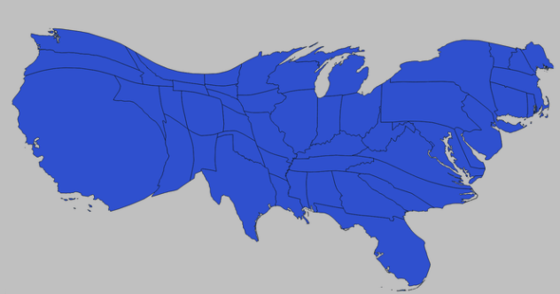
2) Watersheds: The Map That Ignores Your State Lines
What it shows
Hydrologic boundarieswho drains into which river systemrather than county or state boundaries. Watersheds define where rain and snowmelt go,
and that defines a lot more than weekend rafting.
Why it changes your perspective
This map is a reminder that water is the original network infrastructure. Pollution, drought, dam decisions, irrigation, and flood risk
don’t care about state borders. If you’ve ever wondered why upstream decisions can cause downstream arguments that last decades,
a watershed map is the “previously on…” episode you needed.
Practical takeaway
If you want to understand water conflicts, farming patterns, or why one town panics about a spill three counties away, start with the basin map.
It’s basically America’s plumbing diagramminus the part where you discover your sink has feelings.
3) Earthquake Hazard: The U.S. Isn’t Just “California Shaky”
What it shows
Seismic shaking hazard estimateshow likely damaging ground motion is over a given time windowbased on geology, fault behavior,
and historical records.
Why it changes your perspective
California absolutely earns its reputation, but the map also highlights parts of the Pacific Northwest, the Intermountain West,
Alaska, and areas east of the Rockies that many people forgetuntil they don’t. The point isn’t to panic; it’s to understand why building codes,
insurance decisions, and infrastructure design vary so much by region.
Specific example
A hazard map helps explain why two cities with similar populations can have wildly different construction standards. It’s not “overcautious bureaucracy.”
It’s physics, soil, and fault geometry doing their thing.
4) Tornado Maps: “Tornado Alley” Has More Than One Alley
What it shows
Tornado frequency and patterns over time, revealing where tornado reports cluster and how seasonal risk shifts.
Why it changes your perspective
People love a simple label like “Tornado Alley,” but the map tells a more complicated story: risk varies by season,
storm tracks shift, and the Southeast can be brutally active too. You also start to appreciate why warning systems,
building practices, and community preparedness are regional cultures, not just meteorology.
Look for the hidden lesson
The tornado map isn’t just about where tornadoes happen. It’s about how Americans adaptstorm shelters, sirens, weather radios,
and the local skill of spotting “that sky.”
5) U.S. Time Zones: The Borders That Decide Your Dinner Plans
What it shows
The official boundaries of time zones across the U.S. and territories, including the weird zigzags that exist because humans are involved.
Why it changes your perspective
Time zones look simple until you see them on a map. Then you realize they bend around cities, economies, and commuting patterns.
This is the geography of coordination: broadcast schedules, market openings, school start times, and why your “quick call” becomes a scheduling negotiation.
Fun reality check
If you’ve ever felt personally betrayed by daylight, it’s because time isn’t naturalit’s a treaty between the sun and commerce,
and commerce has a strong negotiating voice.
6) Broadband Availability: A Modern Utility Map
What it shows
Where internet service is reported as available, often down to fine geographic detailrevealing the gaps between “connected” and “actually usable.”
Why it changes your perspective
This map turns the phrase “digital divide” from an abstract concept into a street-level reality. It affects job options, telehealth access,
homework, small-business growth, and whether a town feels plugged into the national economy or stranded on buffering.
What to notice
- Rural coverage gaps that track low-density regions, rugged terrain, or underinvestment.
- Urban patches where service exists but affordability or competition changes real-world access.
- How “infrastructure” now includes invisible cables as much as visible roads.
7) Food Access: Where “Grocery Store Distance” Becomes Health Geography
What it shows
Census-tract-level indicators of how far people live from supermarkets or large grocery stores, often paired with income and vehicle access measures.
Why it changes your perspective
This is a map of everyday friction. When healthy food is far away, time and transportation become nutritional barriers. The map helps explain
why two neighborhoods in the same city can have dramatically different diets, health outcomes, and food costswithout blaming individuals
for structural distance.
Specific example
A neighborhood might look “fine” on a regular map, but on a food-access map it becomes obvious why residents rely on convenience stores,
why fresh produce is inconsistent, and why public transit routes matter as much as nutrition advice.
8) Obesity Prevalence Maps: Health Patterns Don’t Stop at the State Line
What it shows
Geographic patterns of obesity prevalence (often using large surveillance surveys), sometimes broken down by age or demographic groups.
Why it changes your perspective
This kind of map pushes you past stereotypes. It invites better questions: How do income, food access, walkability, healthcare access,
cultural habits, and stress cluster geographically? It’s not a map for shamingit’s a map for seeing where interventions, parks, sidewalks,
clinics, and community programs could matter most.
How to read it responsibly
Use it as a starting point, not a verdict. Public health mapping is about spotting patterns and guiding resources, not ranking communities like a scoreboard.
9) Life Expectancy by Neighborhood: The “Zip Code Can Predict Your Lifespan” Map
What it shows
Life expectancy estimates at fine geographic levels (often census-tract scale), revealing sharp differences within the same metro area.
Why it changes your perspective
This map can be emotionally punchy because it shows inequality in years, not dollars. You see that life expectancy can vary dramatically across
neighborhoods separated by a short driveconnected to chronic disease burden, environmental exposure, healthcare access, income, and opportunity.
What it helps explain
Why hospitals cluster where they do, why transit access is a health issue, why environmental policy is also healthcare policy, and why “community conditions”
often outvote personal willpower.
10) Redlining Maps: History You Can Zoom Into
What it shows
Digitized historical “residential security” maps that graded neighborhoodsoften with explicitly discriminatory logicand shaped lending, development,
and long-term wealth patterns.
Why it changes your perspective
These maps don’t just show where people lived; they show how policy and finance classified communities and then treated those classifications as destiny.
When you compare historical grades with present-day outcomes (housing values, environmental burdens, heat islands, and infrastructure gaps),
the past stops being “past.” It becomes a visible layer underneath the present.
A careful takeaway
The power of this map is accountability: it documents how inequality was structured and normalized. Seeing it mapped is a step toward recognizing
why “opportunity” is not evenly distributedand why rebuilding it takes more than telling people to work harder.
What these 10 maps reveal together
Put these maps side by side and you get a new mental model of the U.S.: people cluster where transportation and water made settlement possible;
hazards shape building rules; time zones and broadband shape modern coordination; food and health maps trace daily access; and historical policy maps
explain why many “natural” outcomes are anything but natural.
The best part? You don’t need to be a data scientist to read them. You just need curiosityand maybe the humility to admit that your hometown’s quirks
are not quirks. They’re geography wearing a disguise.
Map-Based Experiences: of “Try This” Adventures
No, you don’t need a drone or a graduate degree to experience these maps. Here are map-powered experiments you can do from a laptop (or a phone in bed,
which is a perfectly respectable research lab if you have snacks).
Experience 1: The “Two-Exit America” Road Trip
Open the population dot map and choose a random bright cluster in a state you rarely think about. Then “drive” outward mentally:
how quickly does density fade? This exercise makes you feel the difference between metro-based America (dense nodes connected by highways)
and rural America (long distances between services). It’s like turning the country from a patchwork quilt into a network diagram.
Experience 2: Drink Water Like a Watershed Detective
Look up your watershed and follow it downstream. Imagine a drop of rain traveling through creeks, rivers, reservoirs, and treatment plants.
Suddenly “upstream” stops being an abstract direction and becomes a list of communities you’re hydrologically tied to. If you’ve ever wondered why
water policy debates feel so intense, it’s because everyone in the same basin is sharing a single, moving resource.
Experience 3: The Hazard Reality Check
Compare seismic hazard and tornado patterns for three places: where you live now, where you grew up, and where you fantasize about moving.
Don’t use it to scare yourselfuse it to understand why houses look different, why basements are common in one place and rare in another,
and why some areas treat emergency prep like a hobby while others treat it like Tuesday.
Experience 4: Time Zone Diplomacy Practice
Pick two cities on opposite sides of a time zone boundary. Now schedule a 7:30 p.m. call that feels “normal” to both. You will discover
that geography has opinions about your social life. Time zone maps are a reminder that national culture is constantly negotiating with local solar reality.
Experience 5: The “Streaming Buffer” Inequality Test
Use broadband availability data as a proxy for modern opportunity. Imagine applying for remote work, attending virtual school, or using telehealth
in an area with limited service. The experience is less about Netflix and more about mobility: broadband determines whether a community can participate
fully in the digital economy or has to fight friction at every click.
Experience 6: The Grocery Geometry Walkthrough
With the food access map in mind, picture two households: one a half-mile from a full grocery store, the other several miles away without a car.
Walk through a week of meals for each. This isn’t a moral lesson; it’s logistics. You start noticing how sidewalks, bus routes, and store placement
can quietly shape nutrition.
Experience 7: The “Years, Not Miles” Neighborhood Comparison
Look at life expectancy patterns inside a single metro area. Then list the “invisible infrastructure” differences that could explain it:
clinic access, clean air, safe places to walk, stable housing, reliable transit, and economic opportunity. The experience lands hard because it
translates inequality into time. And it encourages a better kind of curiosity: not “What’s wrong with this place?” but “What’s missingand how do we fix it?”
Conclusion
These maps don’t just change how you see the U.S.they change what you notice. They turn everyday life into readable patterns: why some places grow fast,
why others struggle, why hazards shape architecture, and why history still shows up in the present like a watermark.
If you want a single takeaway, make it this: the United States is not one story told in 50 states. It’s thousands of local stories stacked on top of shared systems
water, weather, infrastructure, policy, and peopledrawn in lines, dots, and colors that are way more honest than your “I’m pretty sure I know that area” instincts.